What is abstraction in art and photography ?
Abstraction is not every day art it does not refer to every day events and themes.Abstraction in photography is when photographs
are induvidual and do not depict every day objects . Alot of abstract photographs are created using objects from every day life and can represent what ever the artist wants to convey to the audience. Some abstract photographs cannot be recognized for what they are they make the audience think about what message the photograph is trying to send to the audience.Some examples of abstract art are :Impressionism ,Cubism and Futurism.Some people argue that all forms of art are abstractions but work considered abstract photography may look different and different techniques may have been used to create the image. When I did my first group of abstract photographs I was more focused on the light and shadows instead of taking a perfect photo of nature or the school. This is how abstract photos do not fit in to what is considered every day photographs.
are induvidual and do not depict every day objects . Alot of abstract photographs are created using objects from every day life and can represent what ever the artist wants to convey to the audience. Some abstract photographs cannot be recognized for what they are they make the audience think about what message the photograph is trying to send to the audience.Some examples of abstract art are :Impressionism ,Cubism and Futurism.Some people argue that all forms of art are abstractions but work considered abstract photography may look different and different techniques may have been used to create the image. When I did my first group of abstract photographs I was more focused on the light and shadows instead of taking a perfect photo of nature or the school. This is how abstract photos do not fit in to what is considered every day photographs.
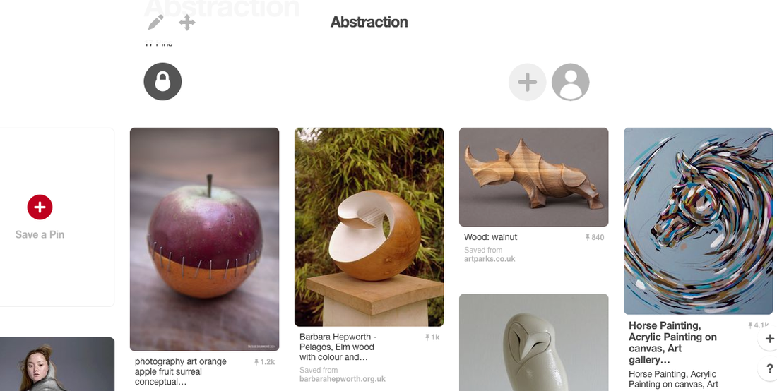
My abstraction Pinterest board :
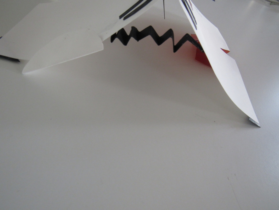
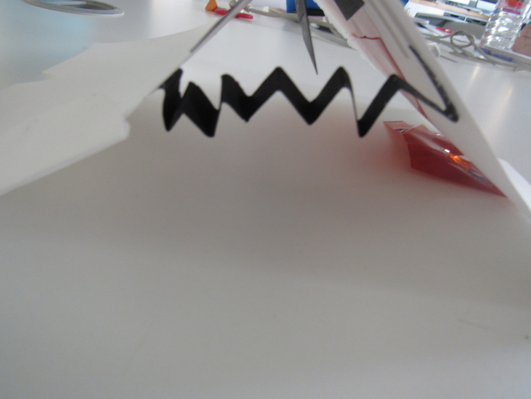
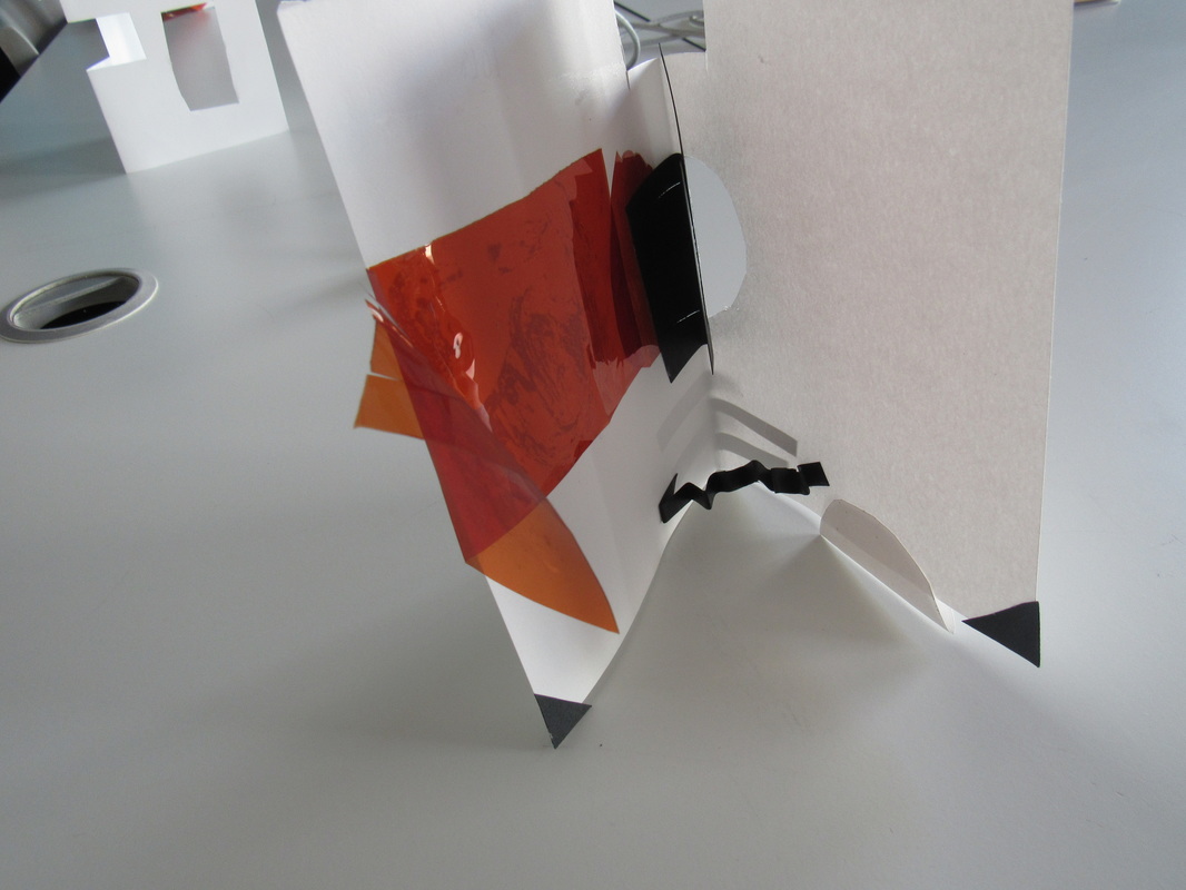

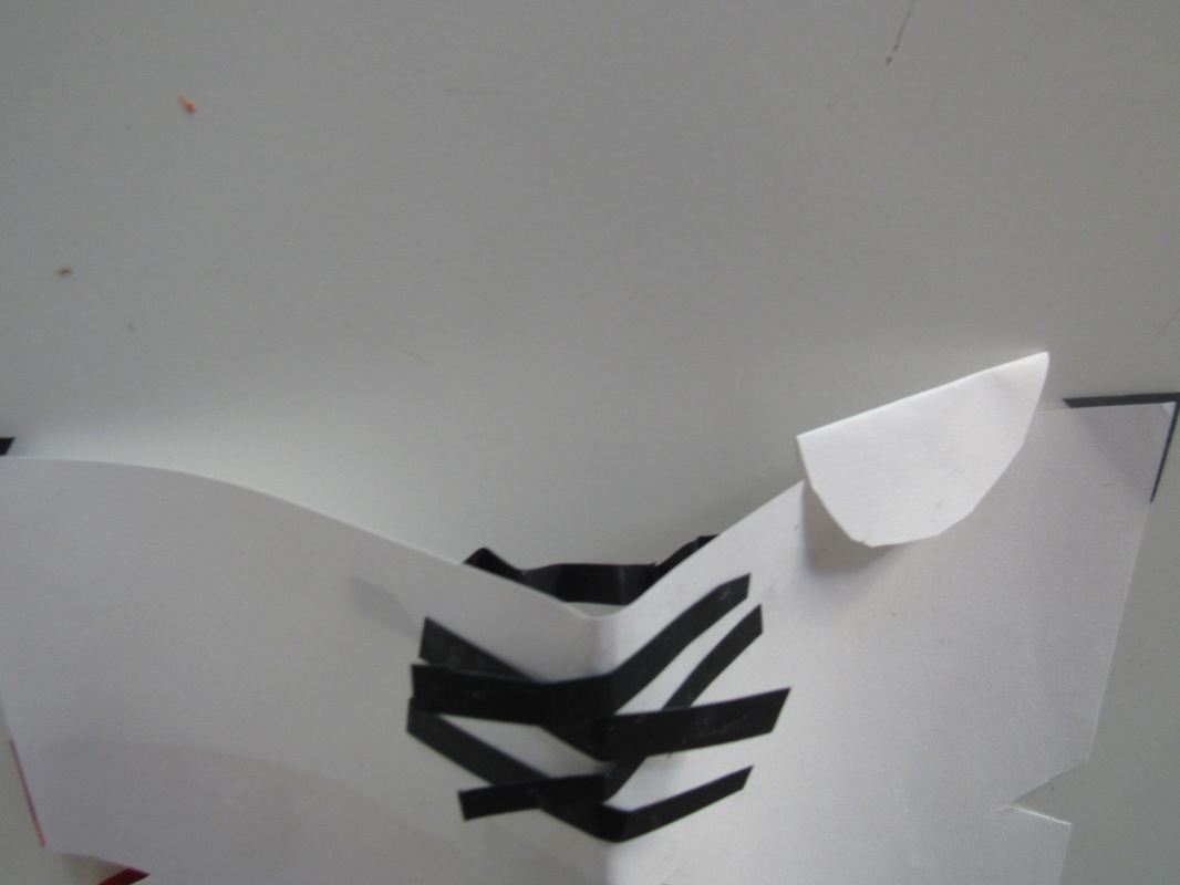
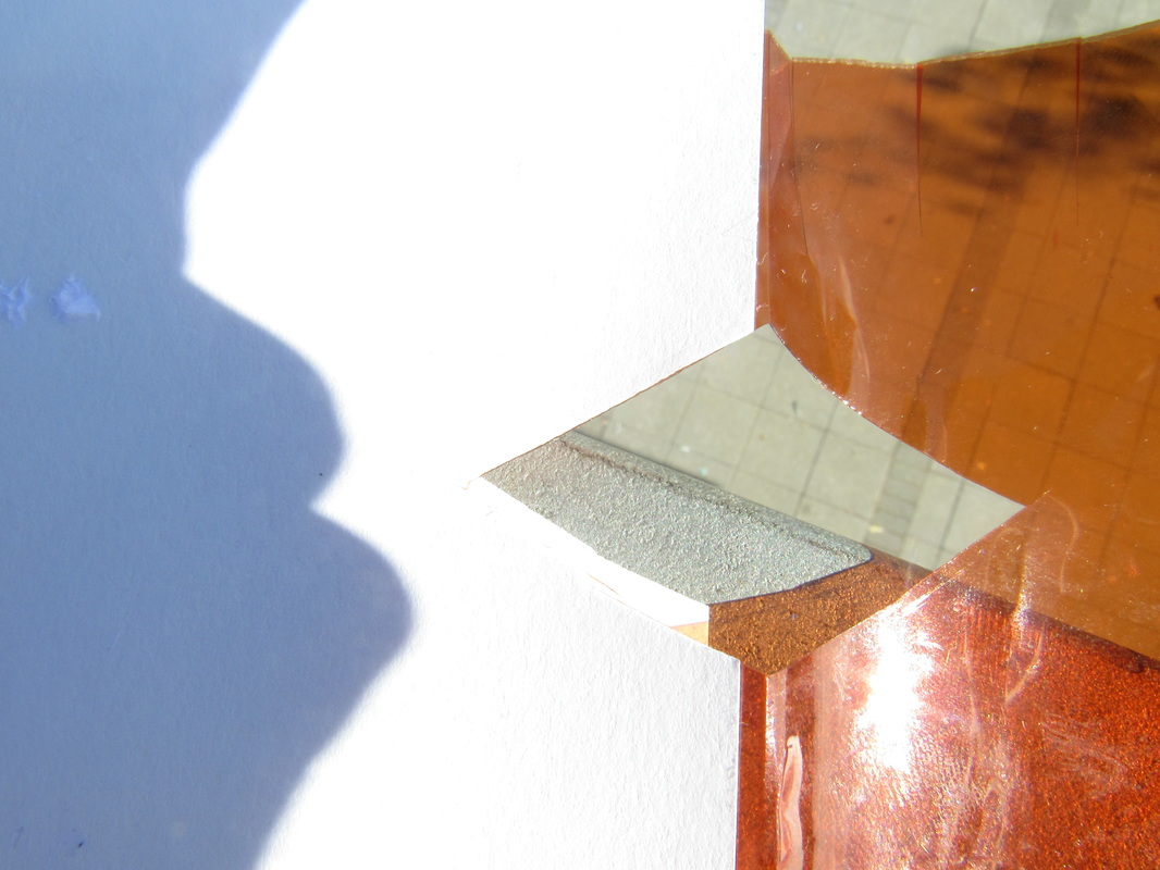
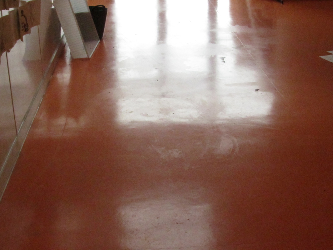
The photographs above are my first attempt at creating abstract photographs . I made these photographs with the sculpture I made last lesson . I wanted to capture the shadows they create and the light in the photograph. I made them slightly abstract to make my photographs more interesting with the light , white background and vibrant colours in the sculpture. I photographed them in different angles by being in different positions myself while taking the photo : I leaned over the photo to get the shadows from above and sideways to capture the shadows across the table. I always tried to be in a different position while taking the photo to capture different play of light.In my photograph I was always careful about there being no objects in the background or foreground . I was the most careful about this because I didn't want any objects to change the amount of shadows or how the shadows looked in a photograph. I wanted the photo to just feature my sculpture as I thought this would lead to a more abstract photo with interesting shadows. My inspiration for this piece of art was Anna Lucas's video on abstraction ,in her video she used lots of different sculptures to create shadows and colours . I like the different shapes she used and the shadows they created and how the shapes were stuck on and off the sculpture as it made me inspired in my own work.
My home work :Breaking the formal elements of photography :
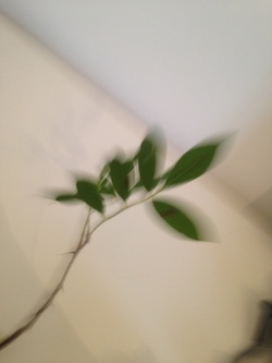
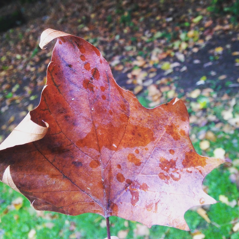
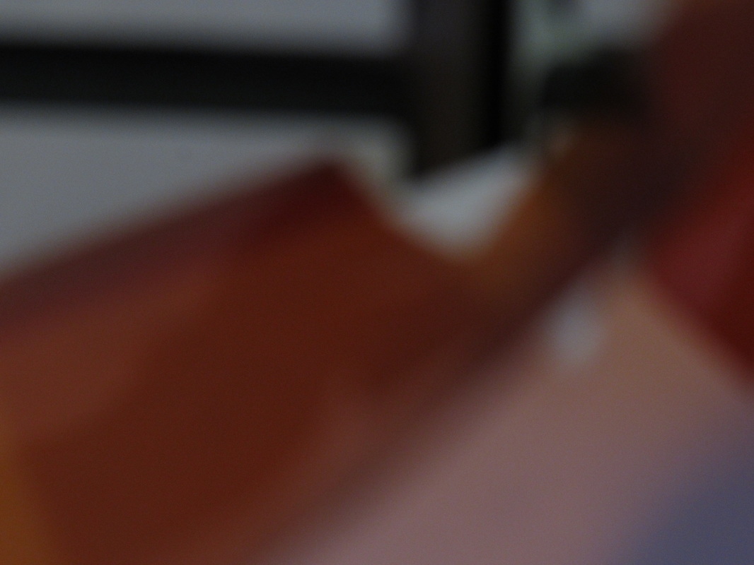
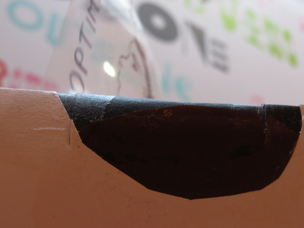
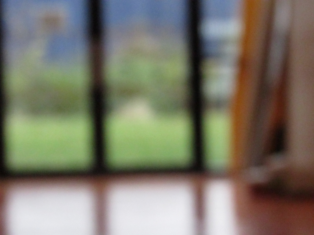
For this home-work task we were asked to create an image that broke the formal elements and could be considered abstract .I think I have succeeded in this task as I captured an image that is out of focus and that I took at a tilted angle. I tried to make this image more abstract than the last one I took .When I went to take this image I thought that I would make it out of focus to make it look more abstract as it may give the leaves a new shape and texture .I took a branch from a tree and positioned it on my desk ,I thought that if I took the image on a clear white surface and blurred out the leaves it would make the image more abstract as you wouldn't be able to see the background of where the branch was very clearly .I would say that this image is abstract as it looks very out of the ordinary .I normally take images of nature and I decided to incorporate this with my desk to make the image stand out .I enjoyed this task because it took me away from what I normally do and make me take an image that I normally wouldn't like the look of but I now like abstract images more.
For this home-work task we were asked to create an image that broke the formal elements and could be considered abstract .I think I have succeeded in this task as I captured an image that is out of focus and that I took at a tilted angle. I tried to make this image more abstract than the last one I took .When I went to take this image I thought that I would make it out of focus to make it look more abstract as it may give the leaves a new shape and texture .I took a branch from a tree and positioned it on my desk ,I thought that if I took the image on a clear white surface and blurred out the leaves it would make the image more abstract as you wouldn't be able to see the background of where the branch was very clearly .I would say that this image is abstract as it looks very out of the ordinary .I normally take images of nature and I decided to incorporate this with my desk to make the image stand out .I enjoyed this task because it took me away from what I normally do and make me take an image that I normally wouldn't like the look of but I now like abstract images more.
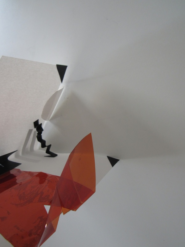
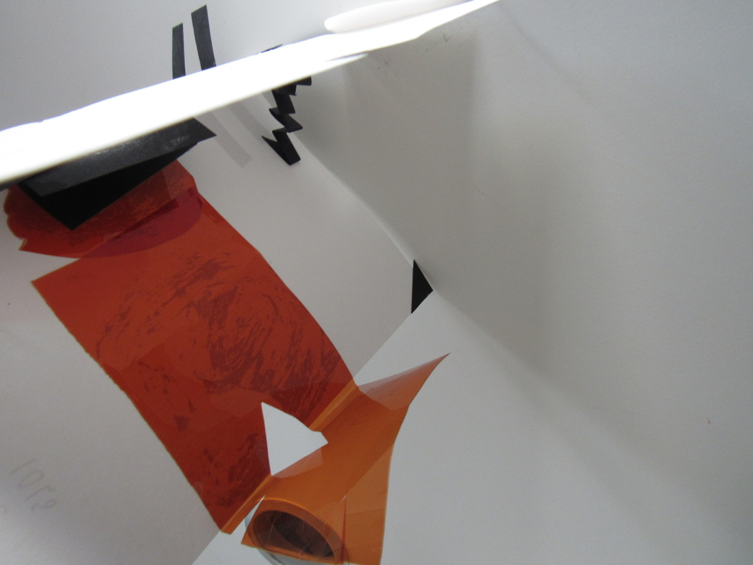
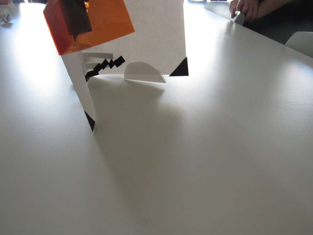
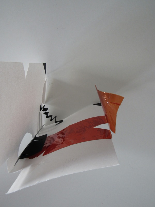
Set two of abstract photos with my sculpture

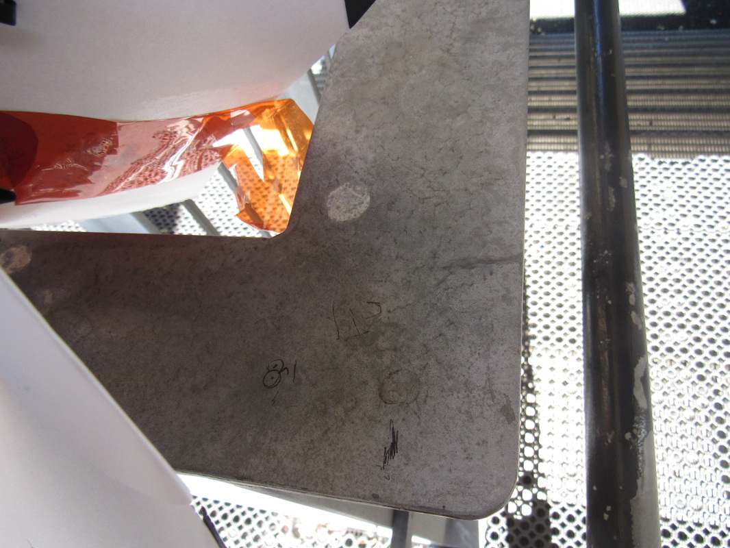
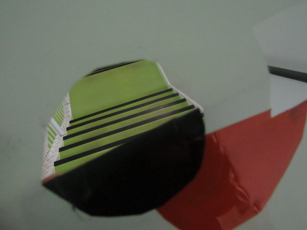
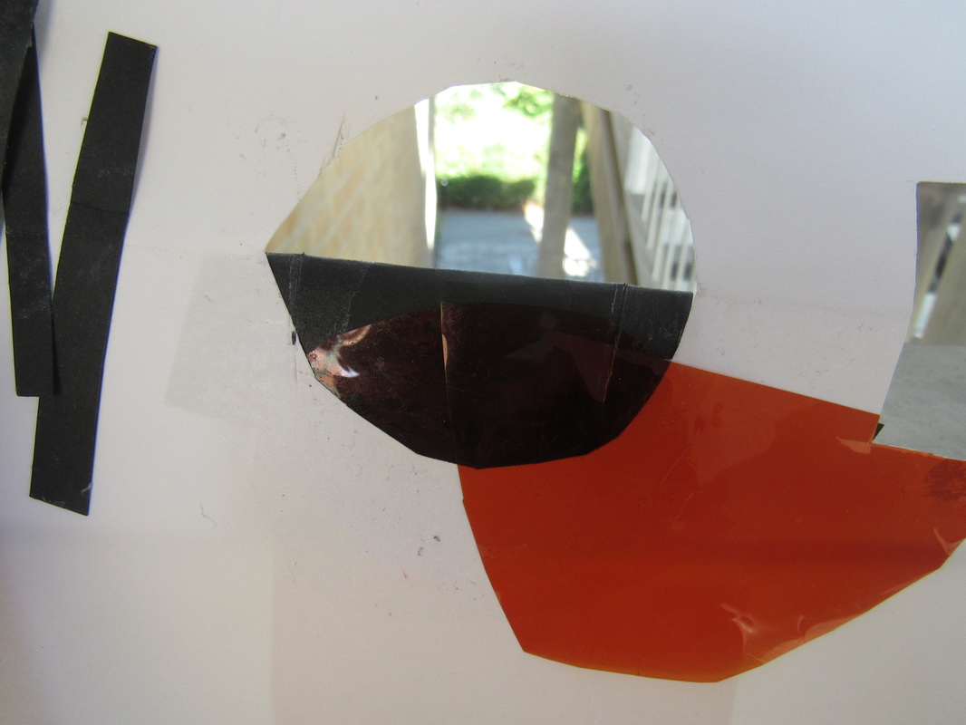
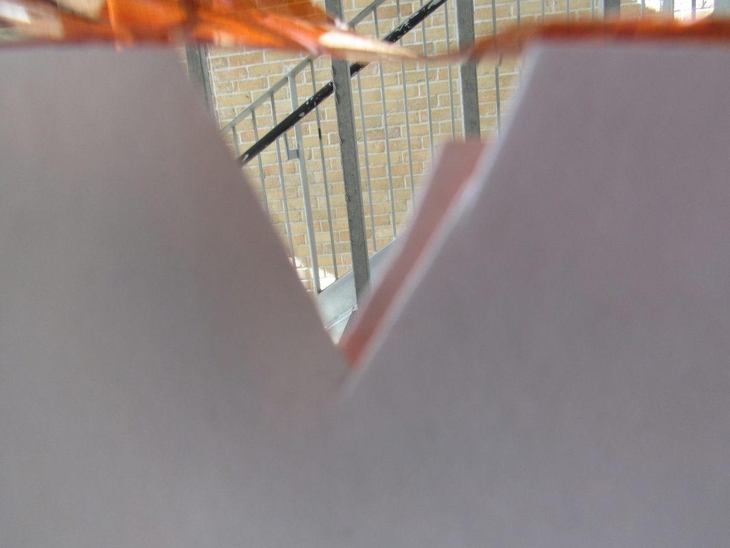
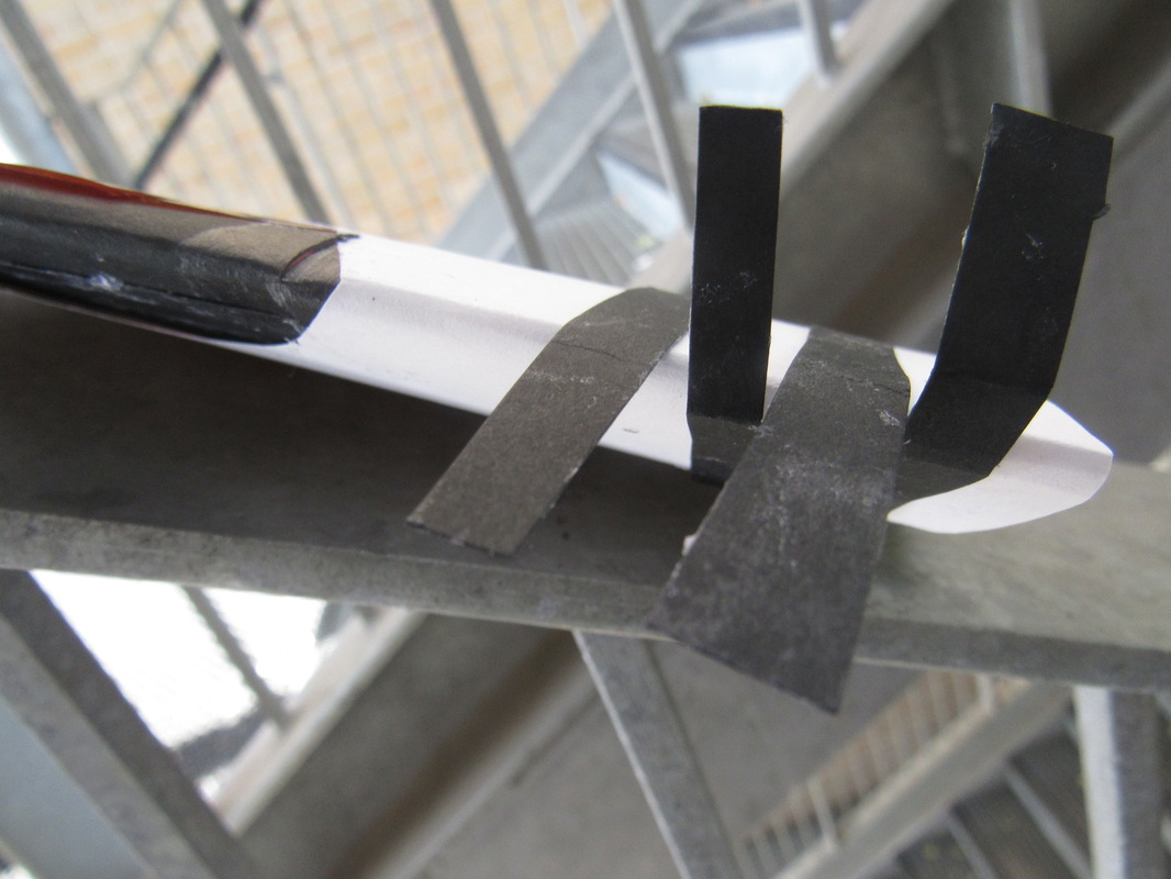
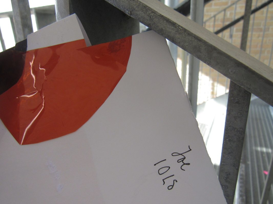
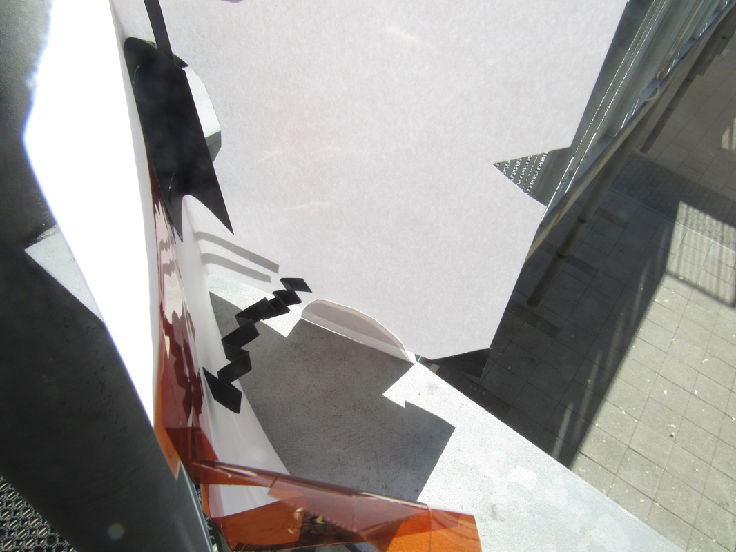
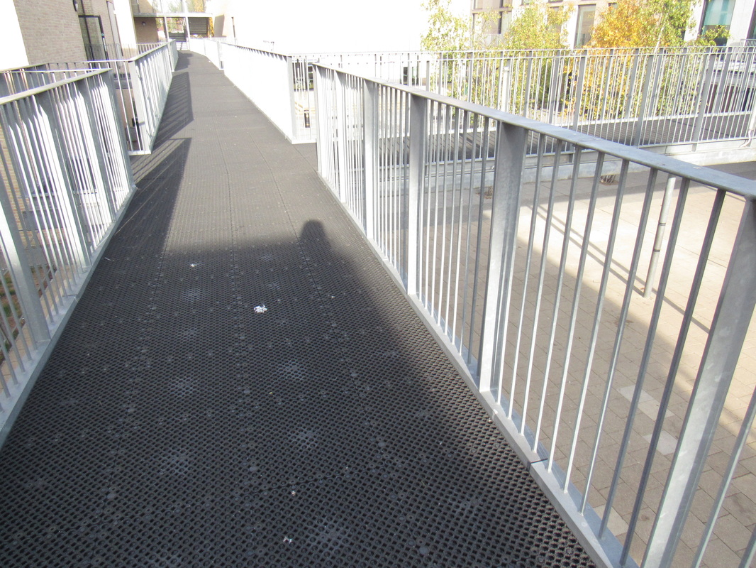
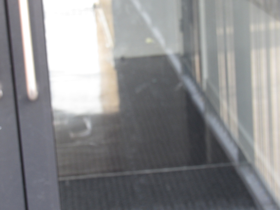
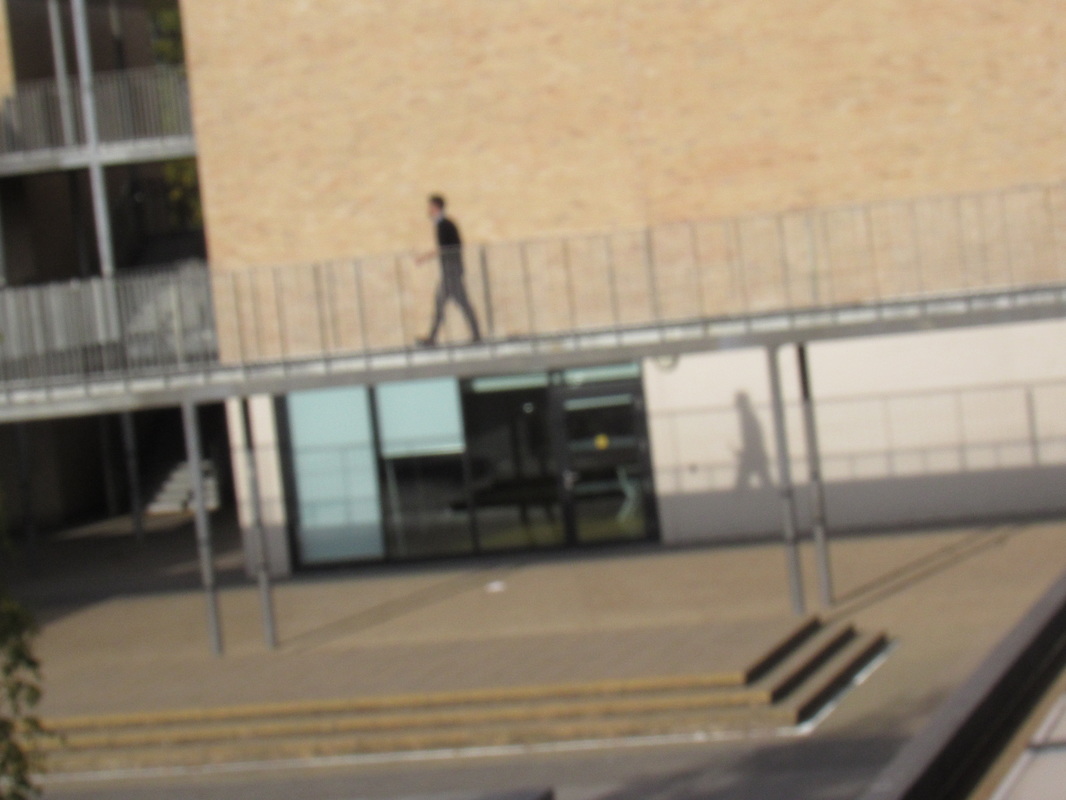
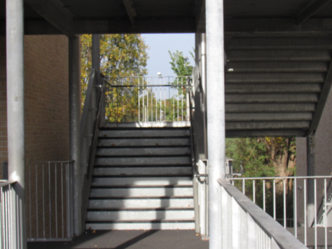
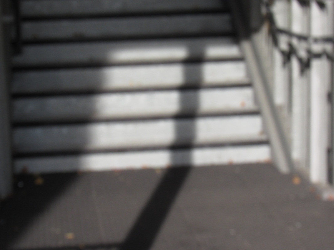
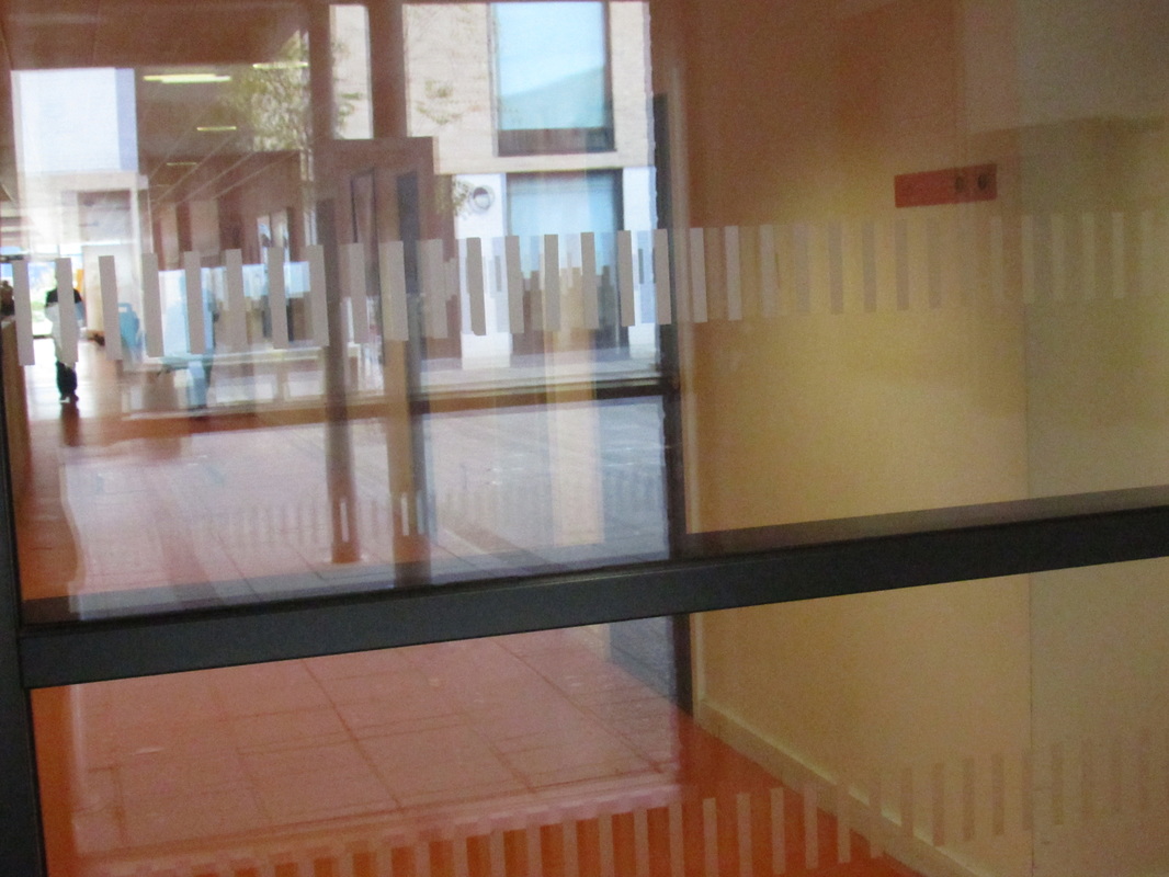
These photographs are my second attempt at creating abstract photographs . In this task however , we were allowed to go outside of the school and on to the concourse . This gave me more opportunity to create photographs with the natural shadows that may come of parts of the school building. The task we were assigned was to cover parts of the building with the shapes from our sculpture : for example I covered part of the trees with my see-through paper but left the diamond shape in the middle so that part of the natural tree colours could be seen.I think I succeeded in this task although I like some of my pictures better than others . My favourite photo is the one of the circle shaped peace of of paper with the view of the stairs through the circle ,I like this photo the best as it shows what I can see through my lens but through the circle . My least favourite photograph is the first photo I took as I do not think that it is very interesting as it does not cover parts of the photo like I wanted my abstract photos to , However overall I think that I have succeeded in this task as I managed to cover parts of the building with my photos and create images that are out of the ordinary.
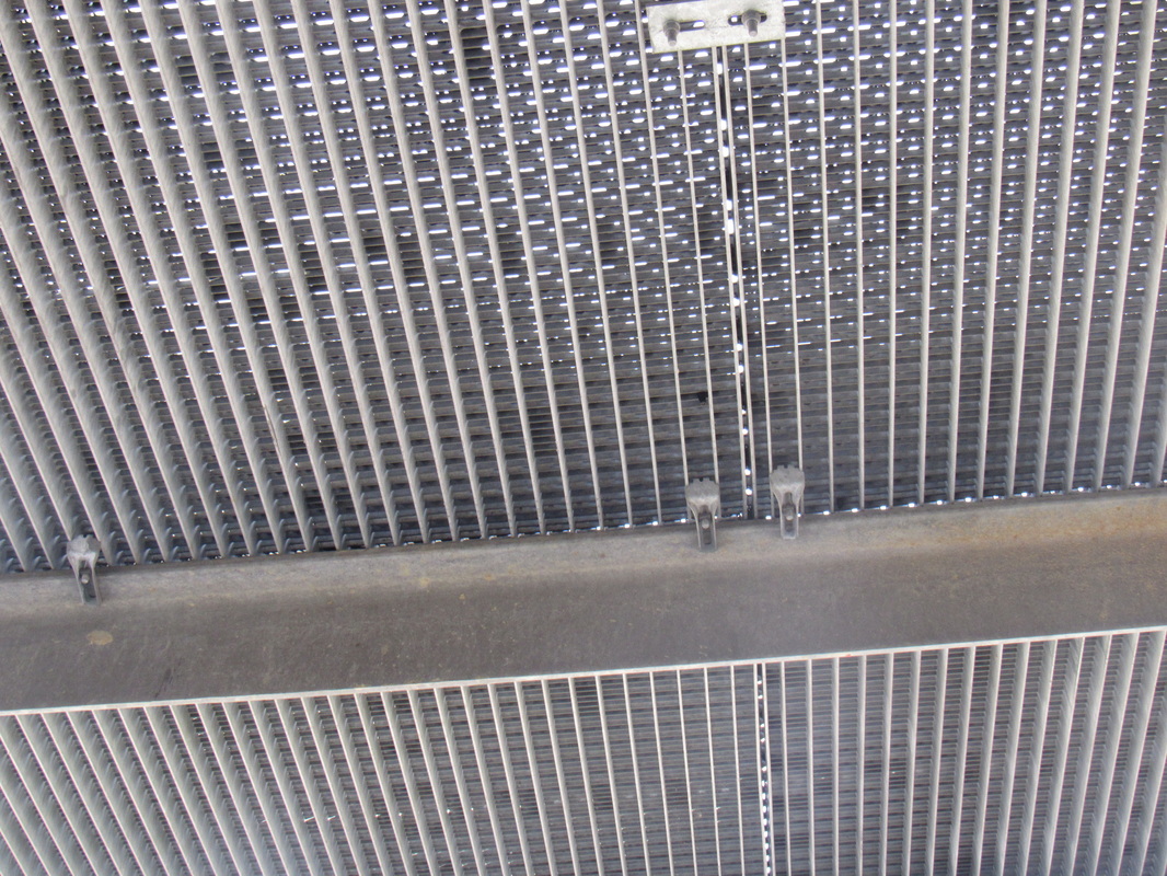
Example of an abstract image - evaluation
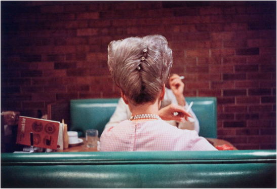
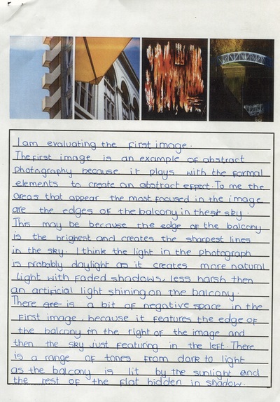
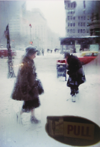
In my opinion this photograph is a key example of abstract photography . I think that this photograph is abstract because it shows lots of different photographs placed together.We can not see the full image just parts , which makes this photograph out of the ordinary something that defines abstract photography.This image is very interesting to me as it plays with the formal elements. The light,the shapes and the texture.all come into play in this image .The texture : the texture is smooth and although it has straight lines going along the image they are not jagged .The shapes: there are very dramatic shapes in this photograph made by strong lines that over lap each other all of the lines appear man made as they have such strong lines no curves at all.The light : the light appears to be quite dim as there is not harsh light shining on the image.I would say thee lighting in this image is natural as it is not to harsh but seems like daylight on a cloudy day.
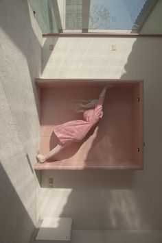
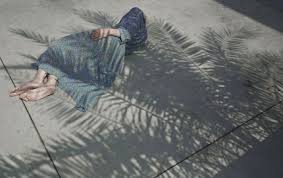
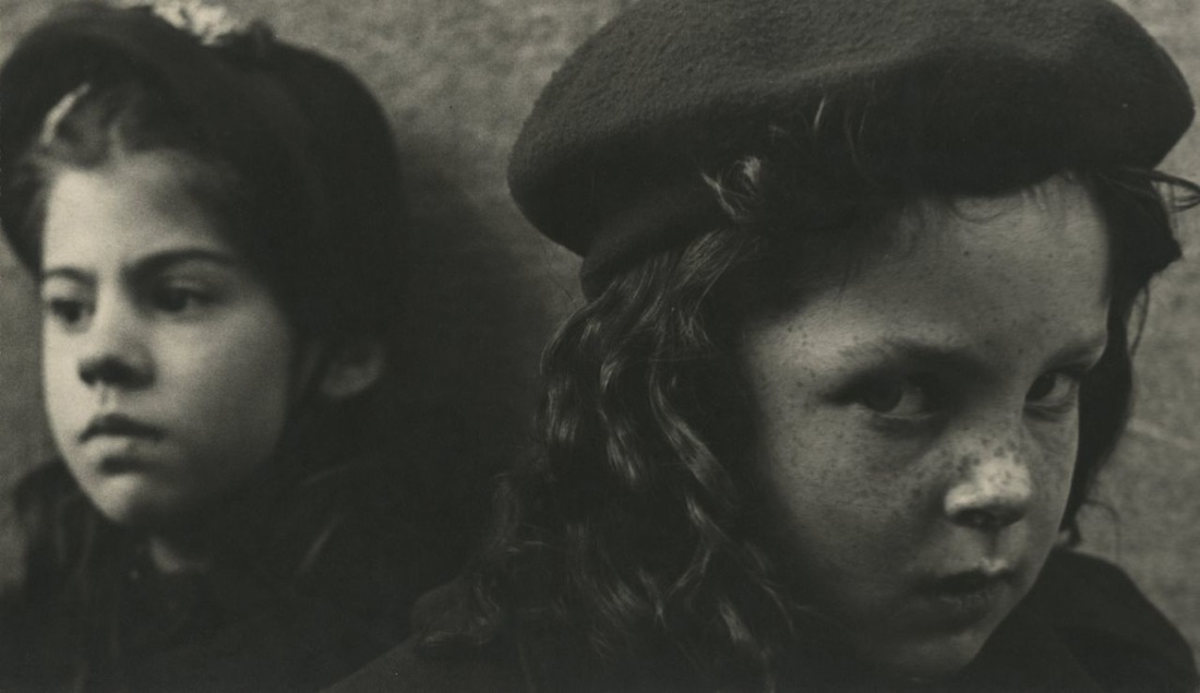
Unusual Framing choices- Cristina Coral
"My approach to photography and its development was almost entirely self-taught.
My father was a composer, music and art have always been a very important part of my life. I have chosen the camera as my main artistic expression. Photographing has become an imperative language."
"My approach to photography and its development was almost entirely self-taught.
My father was a composer, music and art have always been a very important part of my life. I have chosen the camera as my main artistic expression. Photographing has become an imperative language."
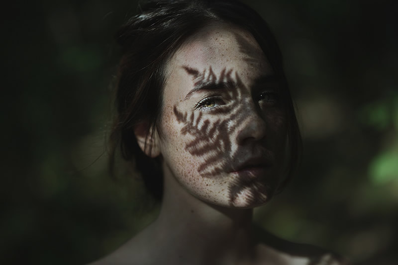
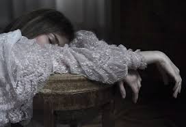

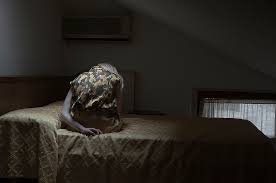
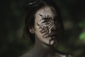
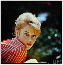
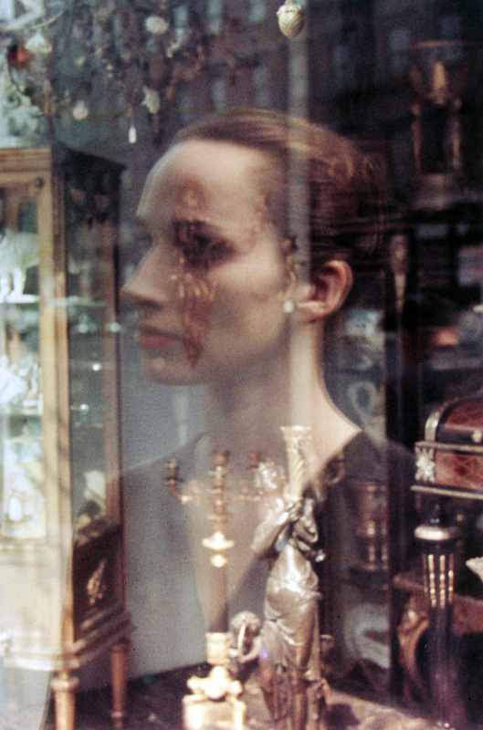
In this image the parts that appear the clearest are the woman's face and the shadows on her face .The rest of the image is out of focus.To me the lighting in this image is very interesting. It looks like it could be afternoon time in the woods.I think this because there is day light but it looks slightly darkened by the trees overhead.Even though there are no trees that I can see in the image I can see the shadow of a leaf on the girls face.The shadows of a leaf create lines on the woman's face .They are not straight lines they are jagged and spiky.I think they show movement because they could portray the leaves rustling and the shadow looks like it was captured quickly before leaves moved and the shadow moved as well.I think there is great depth to this photograph ,there is no negative pace as the image mainly features the gels face and the little back ground you can see is out of focus.I think that the objects in the image looks smooth.The only real person I can see is the girl and I think her face looks smooth and has shape lines ,making her look quite striking.In this image there is a range of light and dark tones,half of the girls face is in the dark and the rest is in the light.The part of her face hidden by shadow is the right,so I would say that is the darkest part.The lightest part is probably the left side as it is not covered in shadows but brightened by sunlight.
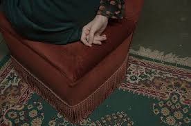
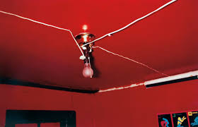
William Eggleston-Exressive colour
"I don't have a burning desire togo out and document any-thing.It just happens when it happens."
"I don't have a burning desire togo out and document any-thing.It just happens when it happens."
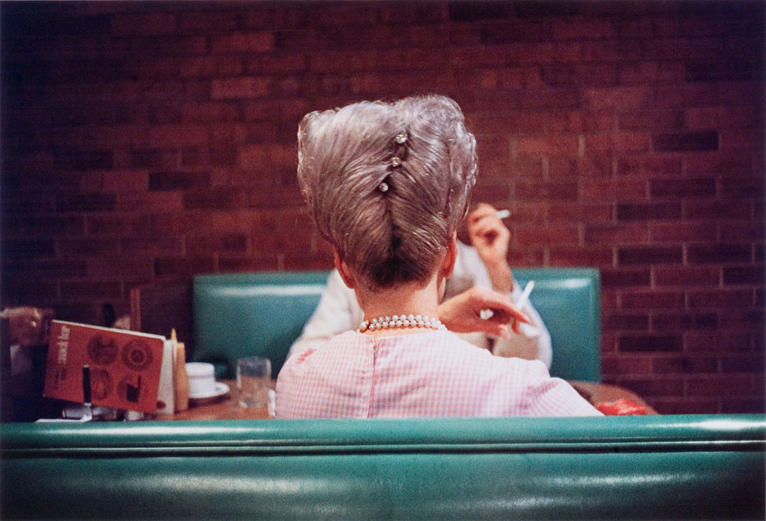

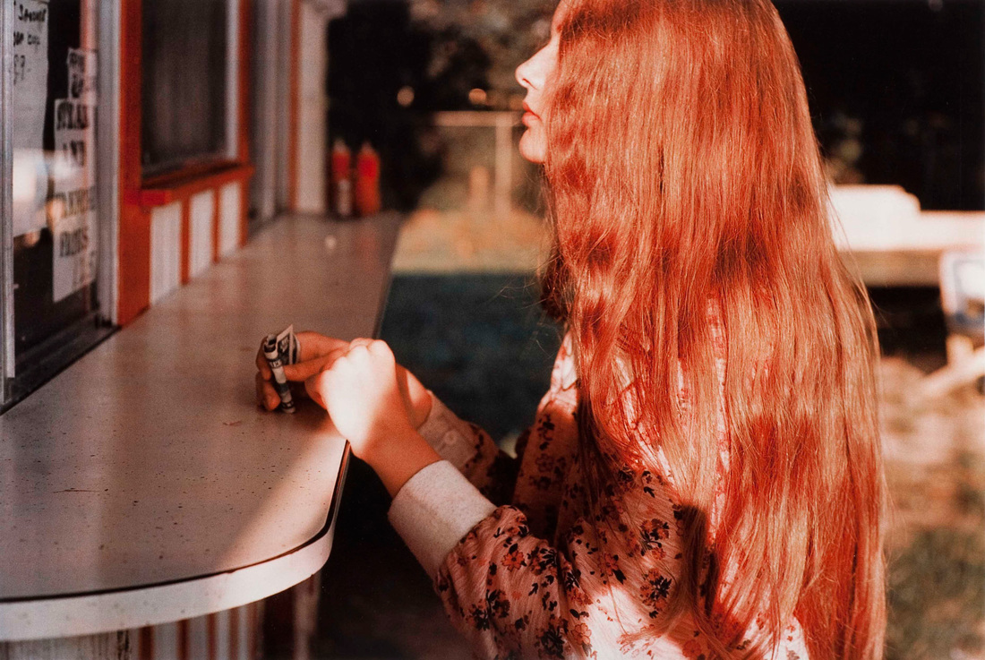
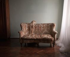
In this photograph the whole image is in focus. Nothing is out of focus although part of the image round the sides is hidden in shadow.The lighting in this image is very interesting because the woman and the sofa she is on is so brightly lit it seems artificial but the sides of the wall are in shadow.This makes me think that maybe a light is shining from the back of the sofa because it does not seem reach the back edges of the wall.There are a lot of shapes in this image.They are curved on the woman's hair.And the straight lines on the sofa create sharp shapes.There is actually repetition in this image ,unlike the first one .The colours repeat :the white cigarette held by the woman and man,the light colours of their shirts and the very bright colours of the sofa.There is a bit of empty space round the sofa ,but I think it looks fine as it draws attention to the sofa .Which is the big pop of colour in the image.The texture of the image looks shiny .I think this is created by the shiny leather sofa and the woman's shiny jelled hair.There is lots of different tones in this image from the light shining brightly on the sofa,to the dark edges round the wall.
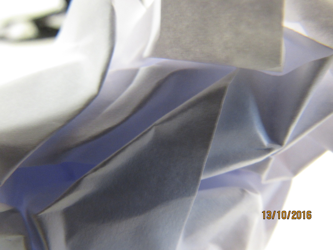
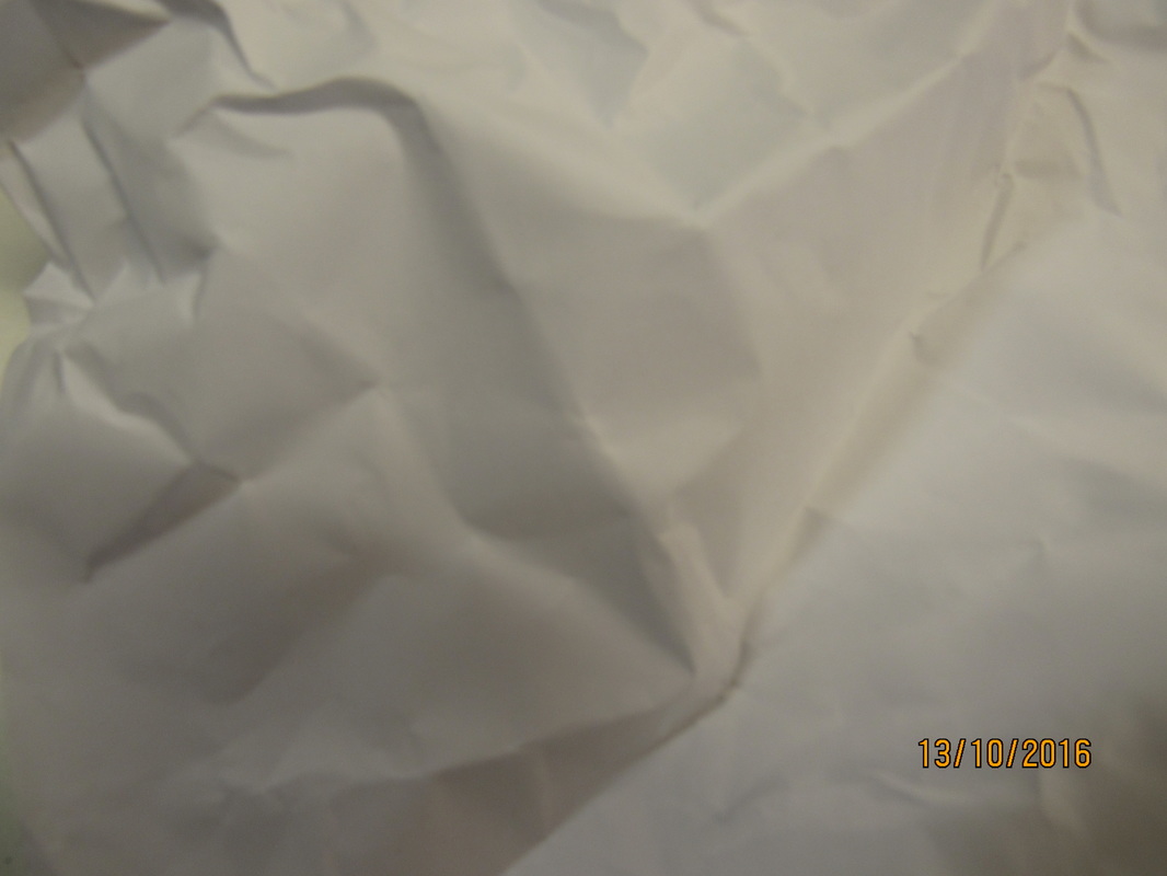
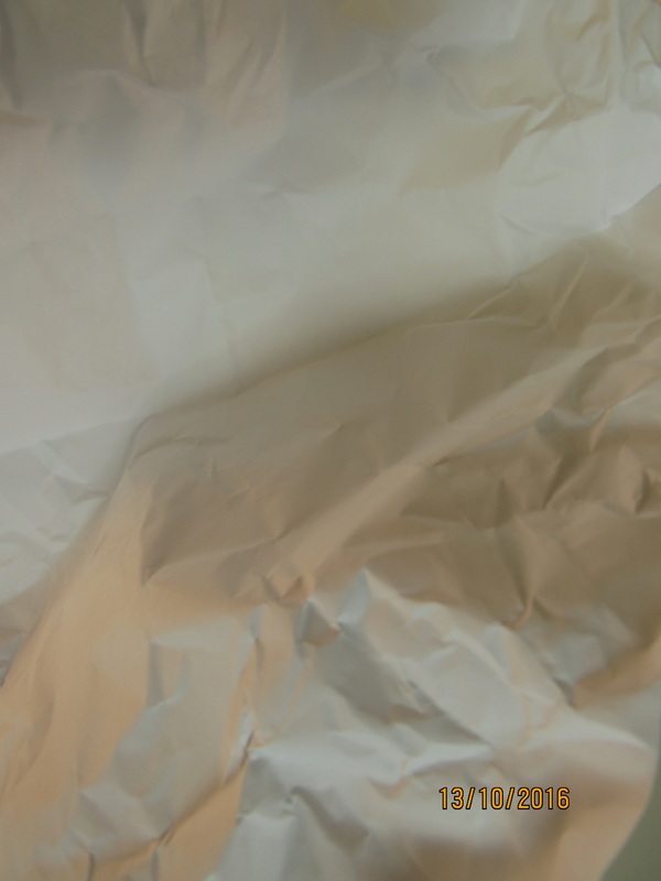
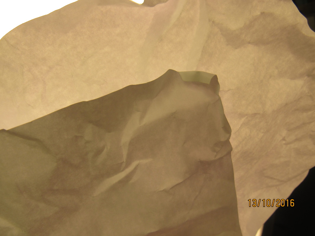
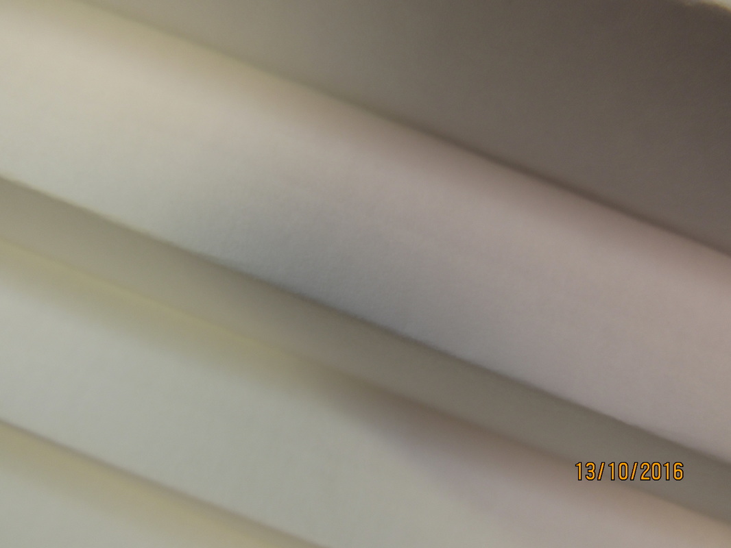
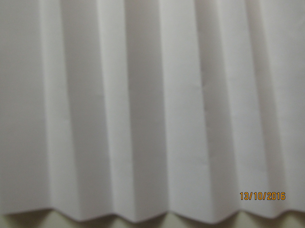
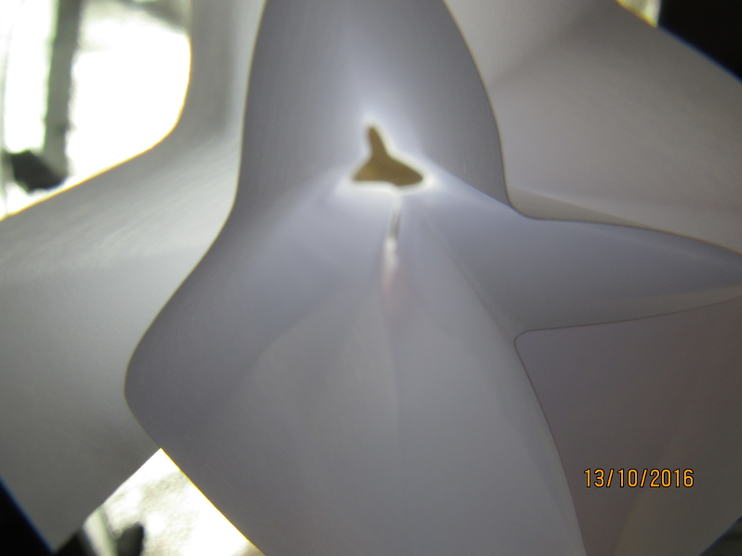
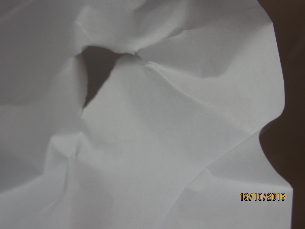
Abstraction task with paper - 'Making something beautiful out of something simple'
Evaluation :
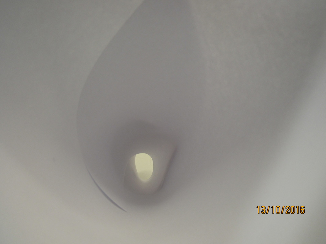
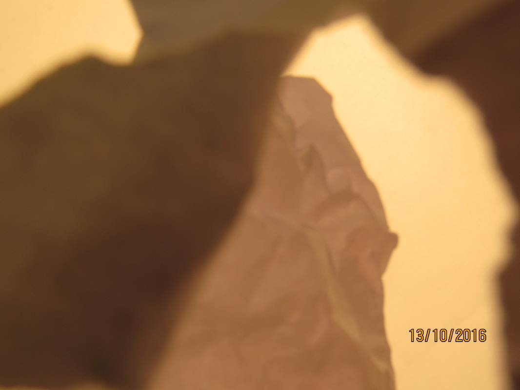
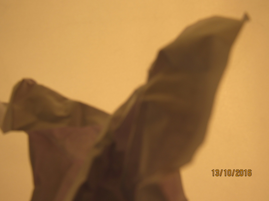
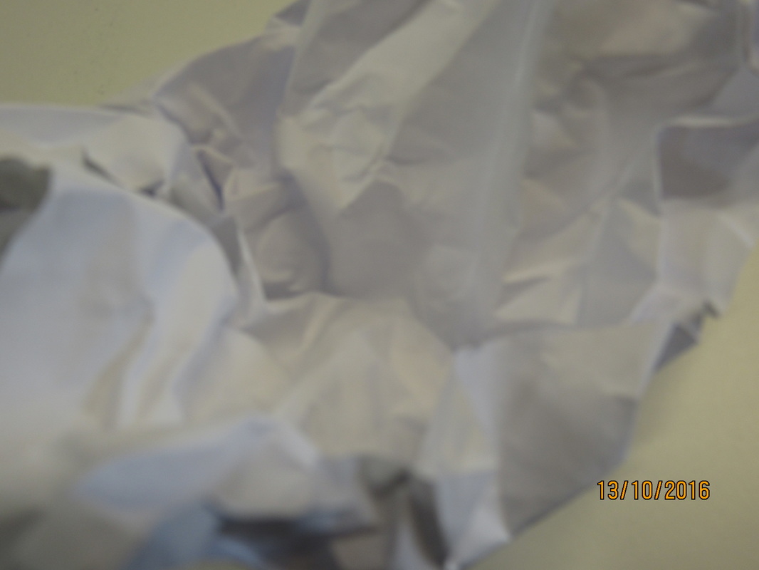
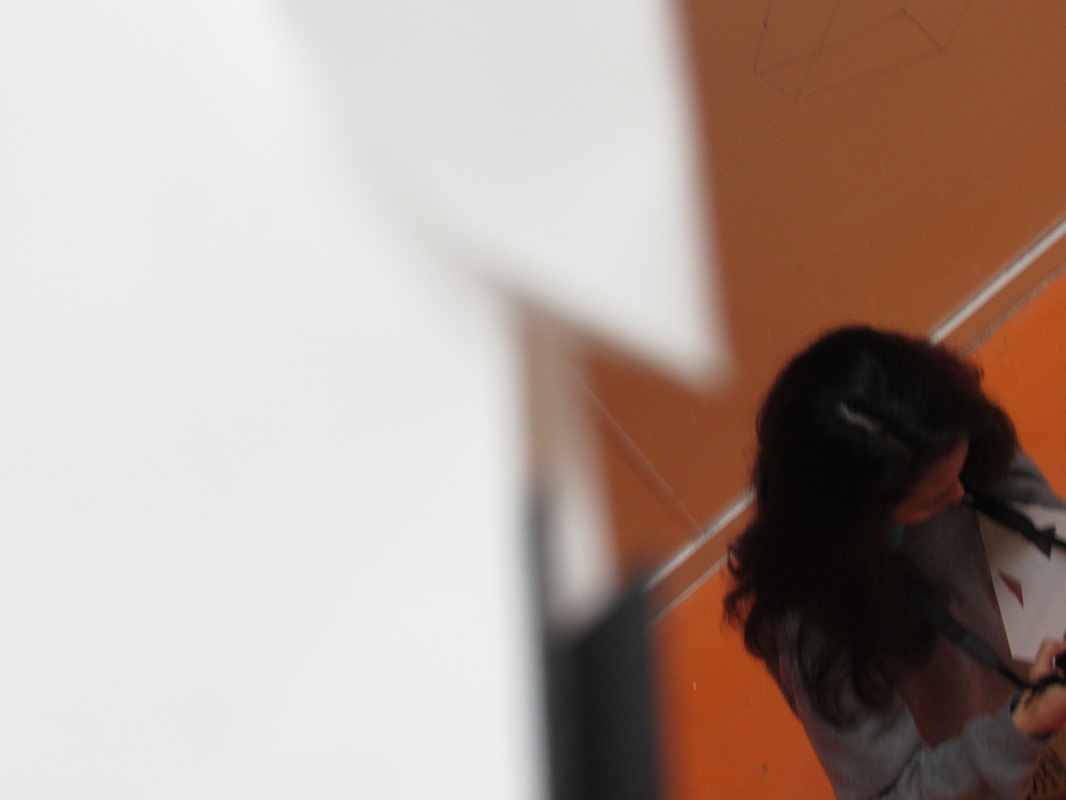
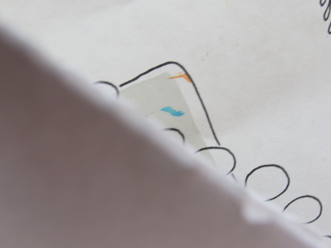
In this task we were asked to take images using the paper to create abstract images .I found this task difficult because it required doing lots of close-ups and using the light to create sharp shapes and shadows on the paper.I got to try different techniques
to get an interesting image for my weebly . An example of this is that I zoomed right in on the paper and put the paper right in front of the light.I liked the camera to be in hight focus when taking these images as I think that when camera is in high focus it can capture
all the detail , for example all the folds on the paper when its scrunched up and the shadows around the paper that either create organic or geometric shapes.The types of task that I normally enjoy the most are taking photographs of nature , I found this task to be different from most photography I do as I do not normally take images of close ups .This task did give me inspiration for my own work
though as it made me use more techniques to get a better image and I think it has helped me expand my use of techniques that will hopefully help me take better images in the future.I would say that my images are abstract because they do not look like very-day images and play with the formal elements.
|
|
|
|
|
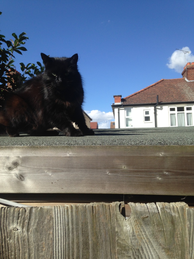
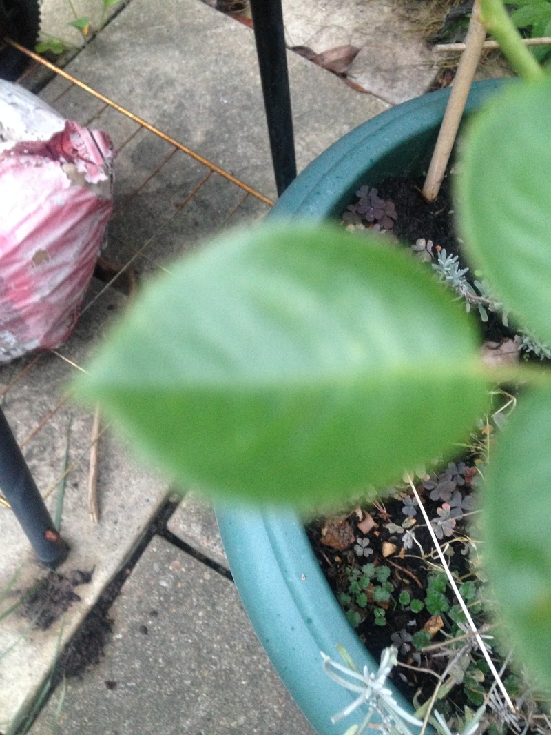
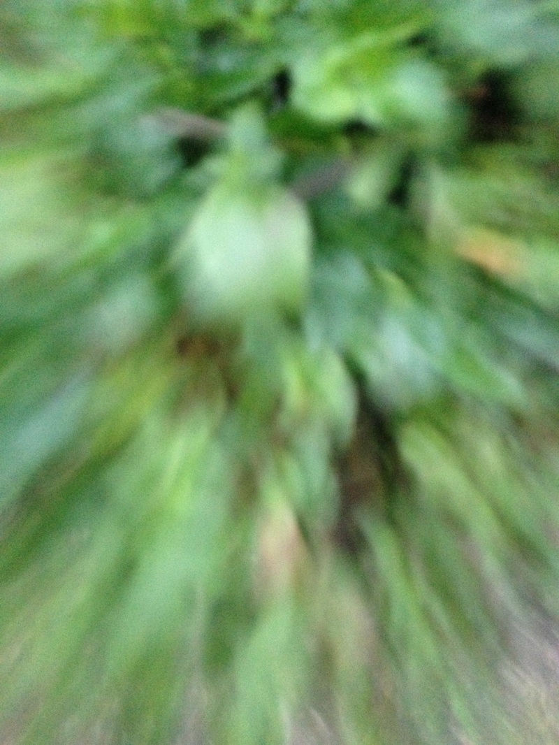
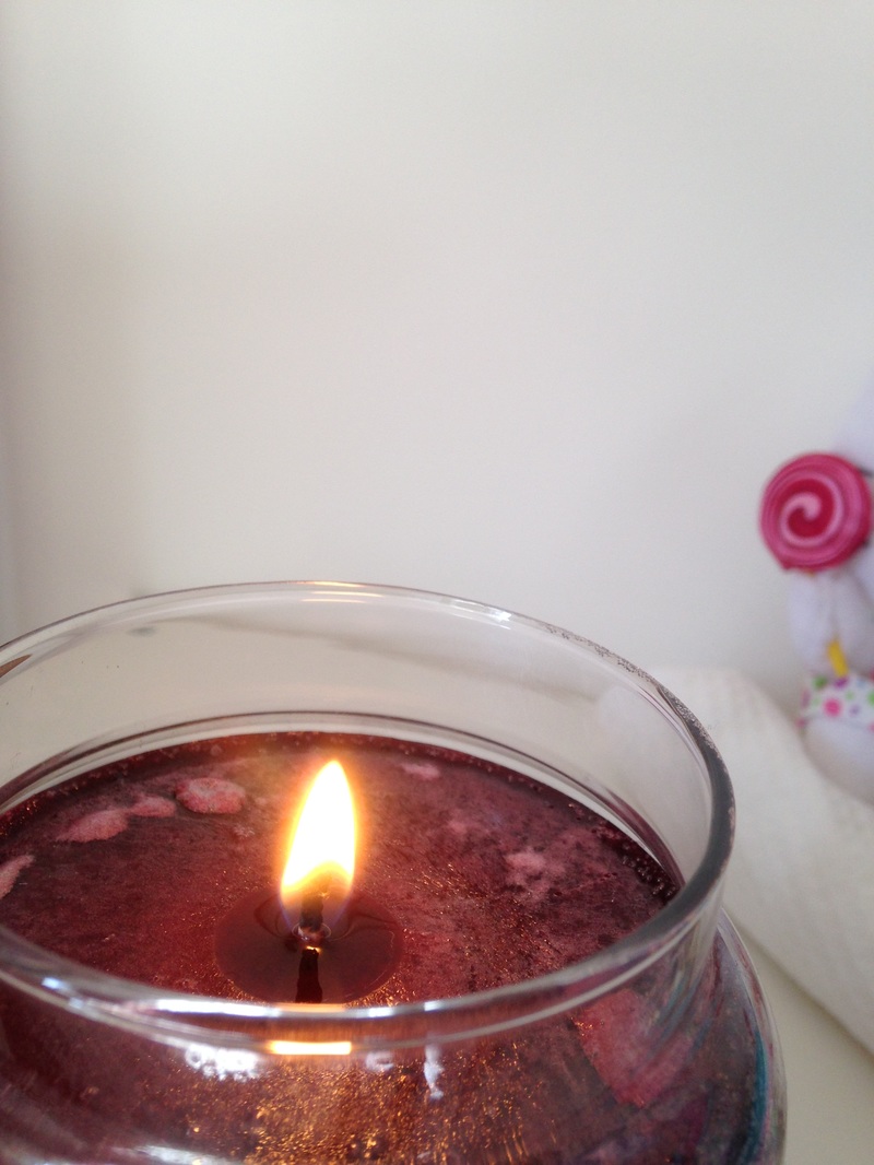
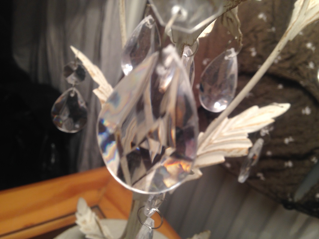
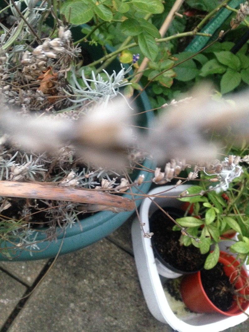
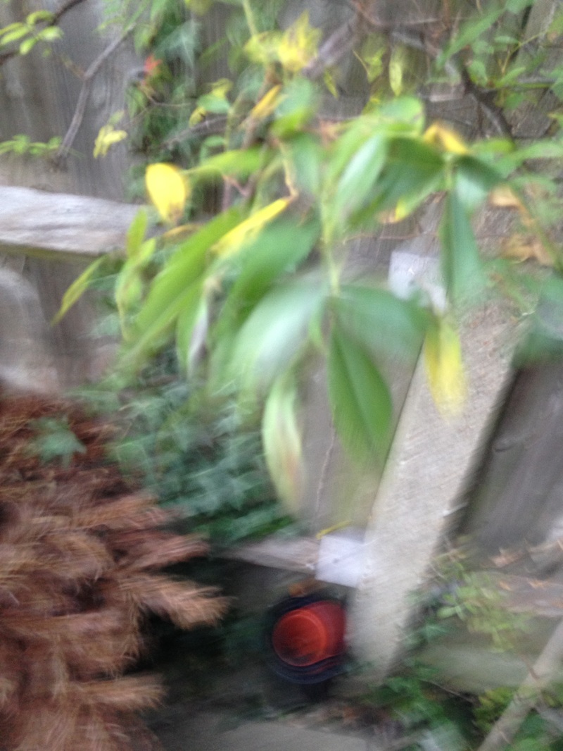
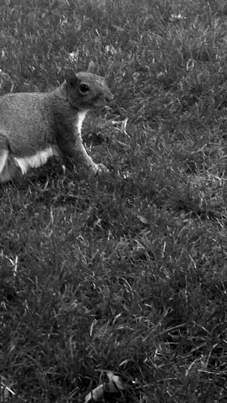
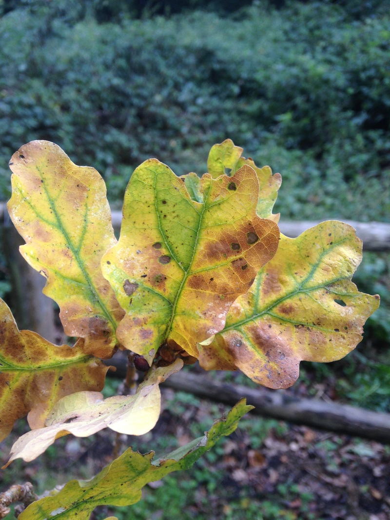
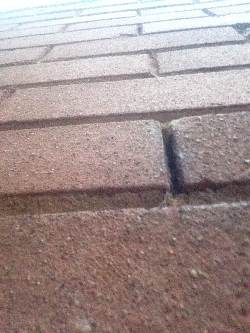
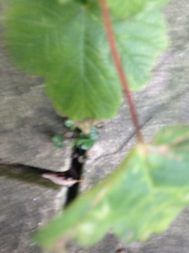
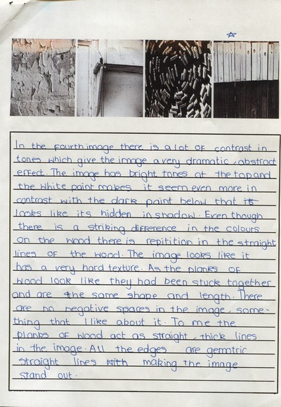
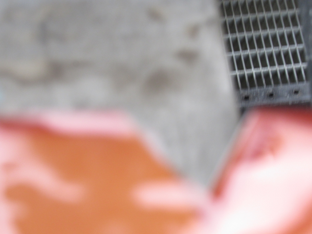
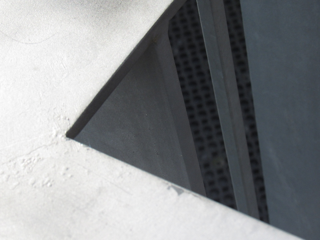
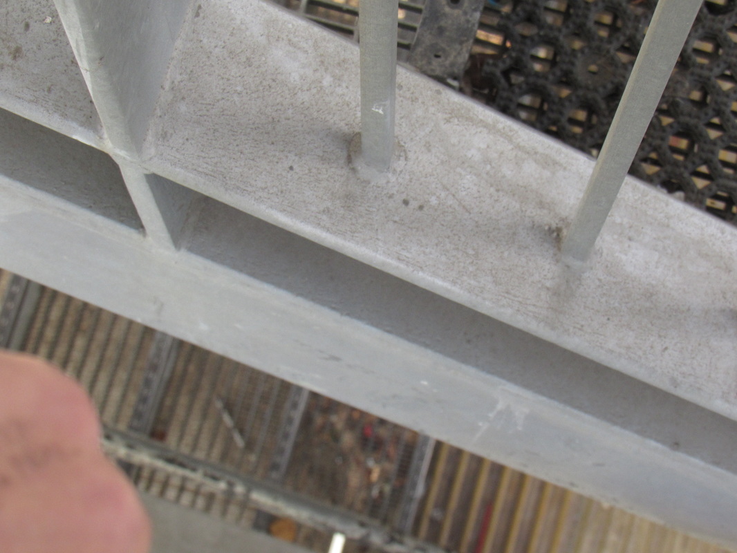
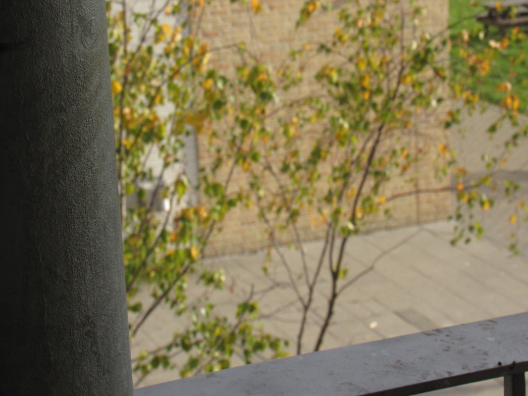
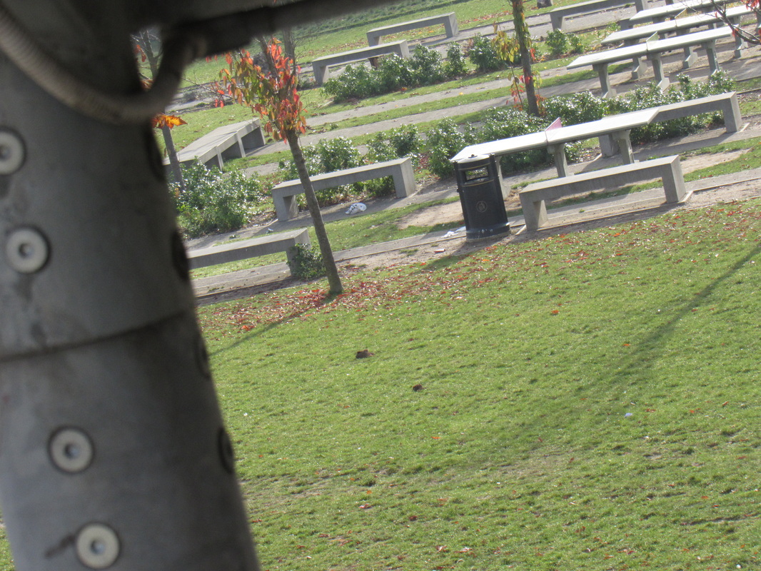
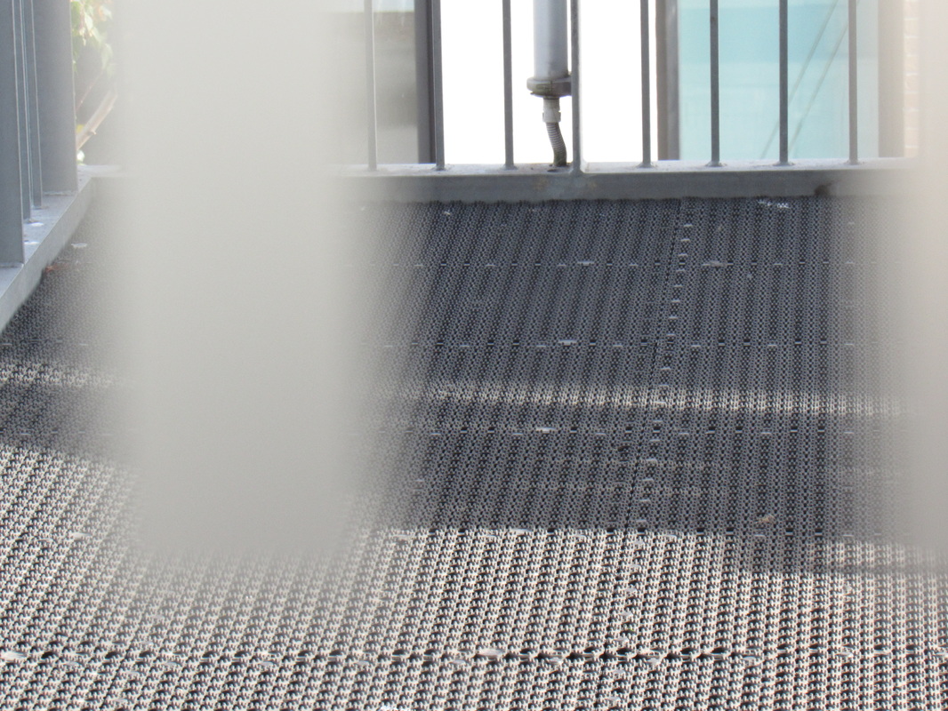
The home-work task this week was to take a series of 16 images that use and abuse the formal elements .We were meant to take images that were extreme close ups or out of focus or had played with light. I enjoyed this task a lot because it gave me lots of options to capture images with a whole range of different objects that were outside or around my house .I find it hard in photography when I am given a particular thing to capture and make look abstract ,however here I could use lots of different objects in order to create abstract images .An example of this is when I took a photo of a bush in my garden , I zoomed in on the bush extremely quickly so that the camera didn't have time to focus before I captured the image . I think that this made the image abstract as you cannot see what the image is clearly you can just see the green with lots pf shapes which is something I like about abstract images .In some of my other photos I used different textures like with the squirrel and the grass ,the squirrels fur looks soft but the grass looks jagged and rough .I played with the contrast of the colours and the shadows and being in and out of focus which is why I think I enjoyed and completed this task well.
Focus Mask images
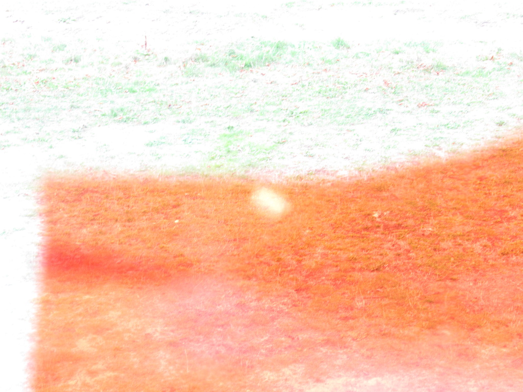
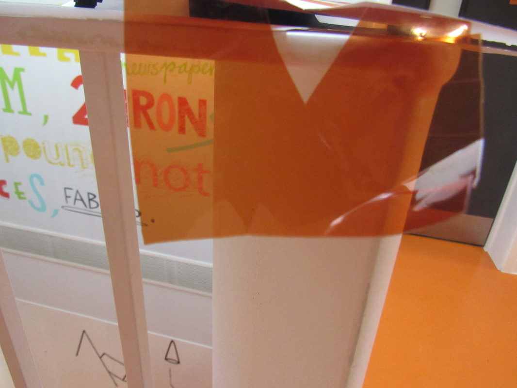
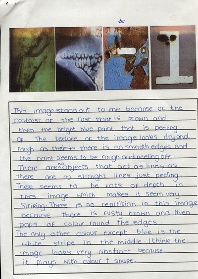
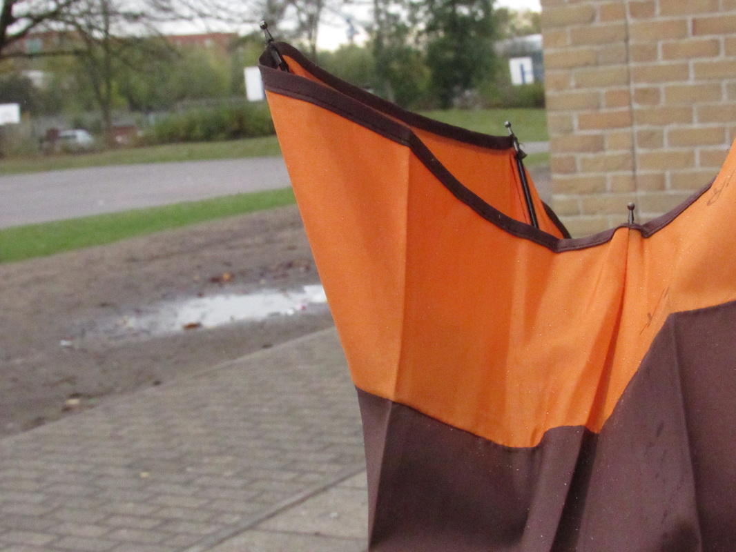
In this task we were ask to use the sculptures we made a few lessons ago to cover certain sections of the image and create a mask.I wanted to use the different shades and textures of the school to create unique abstract images.An example of this is when I covered a certain part of the grass with the transparent orange part of the sculpture ,I like this image the most as it shows the different texture of the grass and then the shiny orange plastic.I found this task hard because I ha no idea how I was going to make image interesting with my sculpture.I thought that my images would end up looking all the same as I had not much inspiration of how to make each image unique.In the end I think I have succeeded as each image looks different to the next one it was hard to get parts of the image out of focus in the end I zoomed in as much as I could and parts went out of focus and when I saw this I captured the image straight away.Even though I found the task hard I did enjoy it because the abstraction topic has made me experiment with lots of different techniques to get images which I at first did not like but now find extremely interesting .I think I also experimented with the formal elements as quite a few of the images have strong lines and sharp shadow which I find makes them all the more abstract.
|
|
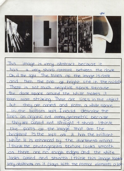
Abstract images - set 1
|
Abstract images - set 2

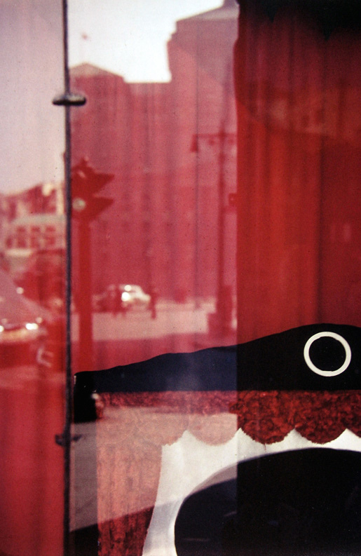
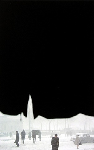
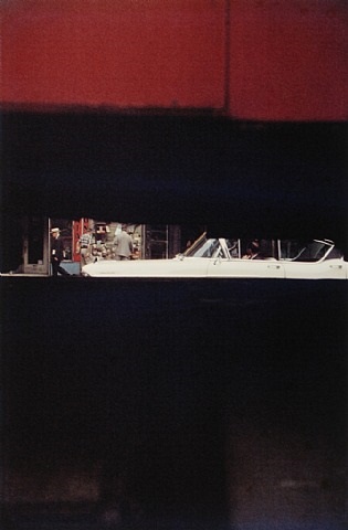
Saul Leiter -Photographs
''A window covered with rain drops interests me more than a picture of a famous person ''
''A window covered with rain drops interests me more than a picture of a famous person ''
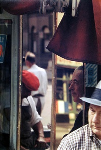
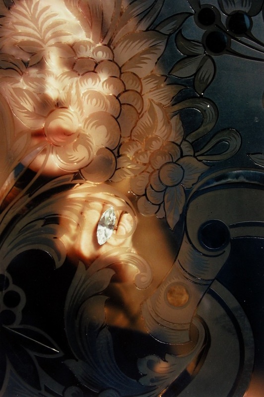
Saul Lieter image evaluation
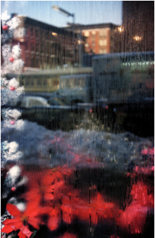
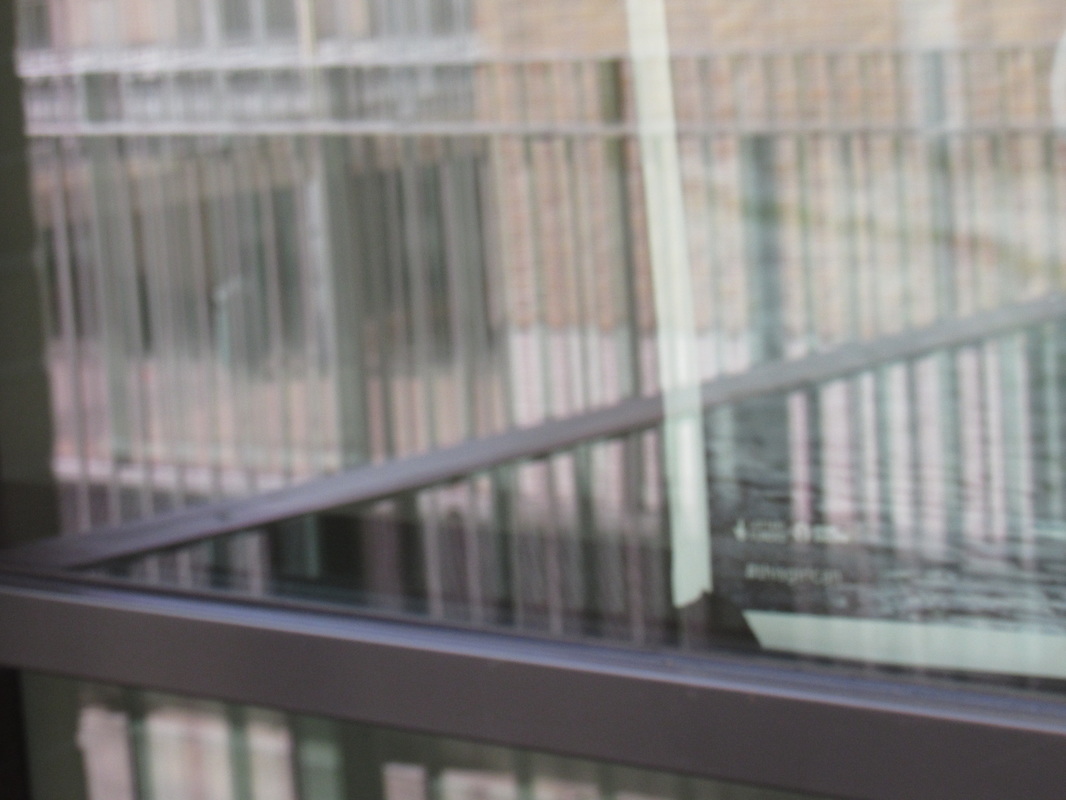
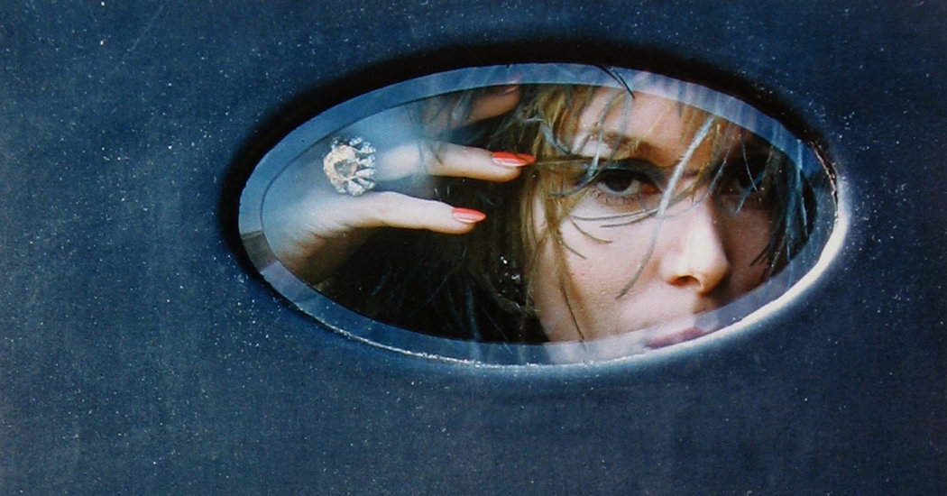
I chose to evaluate this image by Saul Lieter because it plays with the formal elements and is a prime example of Lieters work which makes it very abstract .I like the different textures in this image as you can the smooth window and then the sharp geometric shapes of the buildings in the city back ground. This image has bright red plant in the foreground which shows Lieter's use of depth of field. I think that Lieter has managed to use reflections in his image as well because it looks like he has managed to capture the city scene from a window reflection. I like the way that he has managed to capture all f the detail in the window from the perspiration on the window to the bright colours in the foreground and the city scene in the background .I think that Lieter was positioned sitting down when he captured this image as there are no strange angles- i.e nothing is slanted int he image and it looks as though litter just captured every thing he saw in the window. I think that this image shows abstract techniques like colour , texture and cropping because you can see that Lieter has thought about what he was doing before he captured the image , some thing that makes a good abstract image .
Evaluation of all my work so far -
In this topic of abstraction I have been inspired by many artists and have tried to recreate their techniques to make my images abstract and stand out . In my work I have tried to include techniques that I do not use very often i.e reflections and cropping . I found this quite hard as I really had to think about what I captured before I actually captured the image . Sometimes I would see hat I wanted to capture and I wouldn't be able to capture it as I knew it wouldn't look abstract and wouldn't feature any of the techniques that abstract artists use . I also found making my photos out of focus hard - I didn't like the look of out of focus images at first and then it was hard trying to get the camera to go out of focus but , overall I found this unit very interesting and I think it has changed my style of photography a lot .If I were to do this topic again in the future I would make sure that I didn't try to rush everything I was doing but try to get a few images that were good quality - not lots that didn't look good or meet my aims. Some of the artists that I have been inspired by are ; Saul Leiter , Cristina Coral and William Eggleston , even though these artists all have different styles I like the way they think about what they are going to capture and how everything in their images has a meaning. My favourite part of my work is where I was able to take images that were at home I enjoyed this because I was able to use a bigger range of materials to make my images more interesting i.e the objects and colours around my neighbourhood . Overall I think my work has been quite good on this topic as I have been able to expand my techniques and make abstract images out of everyday objects .
In this topic of abstraction I have been inspired by many artists and have tried to recreate their techniques to make my images abstract and stand out . In my work I have tried to include techniques that I do not use very often i.e reflections and cropping . I found this quite hard as I really had to think about what I captured before I actually captured the image . Sometimes I would see hat I wanted to capture and I wouldn't be able to capture it as I knew it wouldn't look abstract and wouldn't feature any of the techniques that abstract artists use . I also found making my photos out of focus hard - I didn't like the look of out of focus images at first and then it was hard trying to get the camera to go out of focus but , overall I found this unit very interesting and I think it has changed my style of photography a lot .If I were to do this topic again in the future I would make sure that I didn't try to rush everything I was doing but try to get a few images that were good quality - not lots that didn't look good or meet my aims. Some of the artists that I have been inspired by are ; Saul Leiter , Cristina Coral and William Eggleston , even though these artists all have different styles I like the way they think about what they are going to capture and how everything in their images has a meaning. My favourite part of my work is where I was able to take images that were at home I enjoyed this because I was able to use a bigger range of materials to make my images more interesting i.e the objects and colours around my neighbourhood . Overall I think my work has been quite good on this topic as I have been able to expand my techniques and make abstract images out of everyday objects .
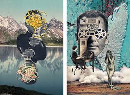
John Baldersarri - ''Theres no such thing as a bad photograph''
John Baldessari pinterest page
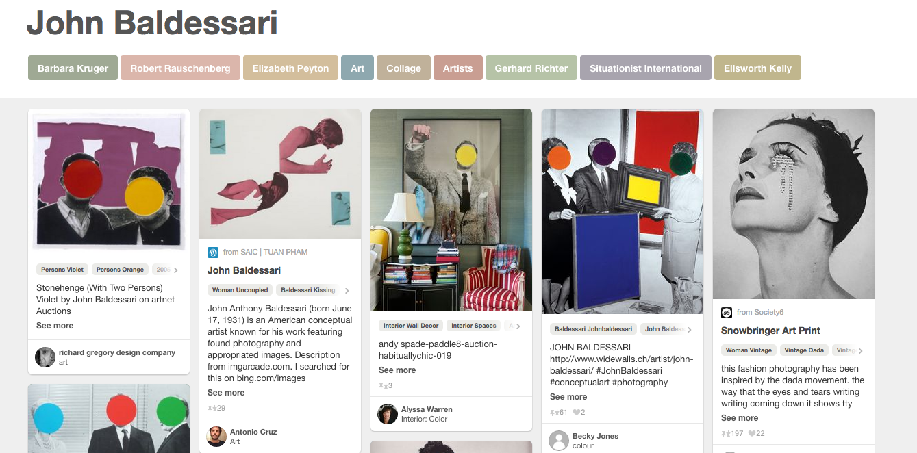
16 of John Baldessari images


Evaluation of John Baldesarri images -
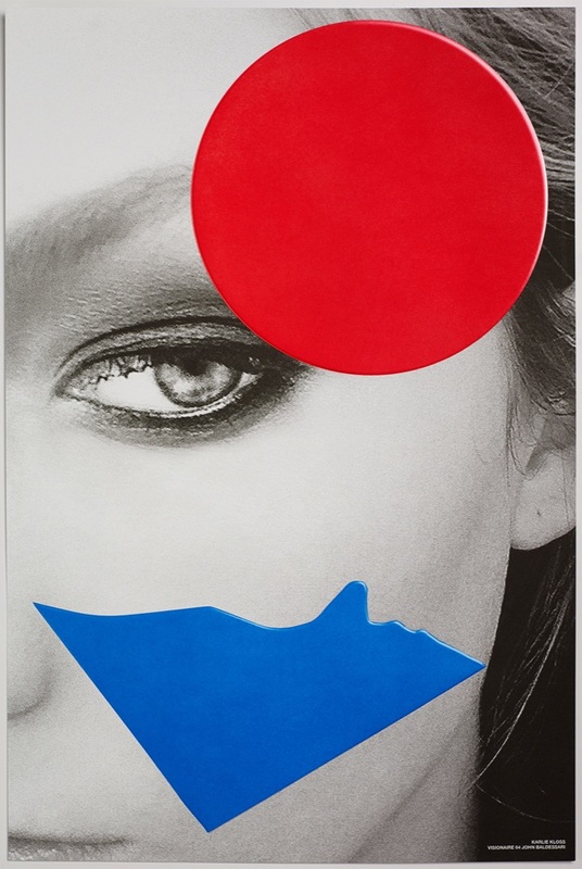
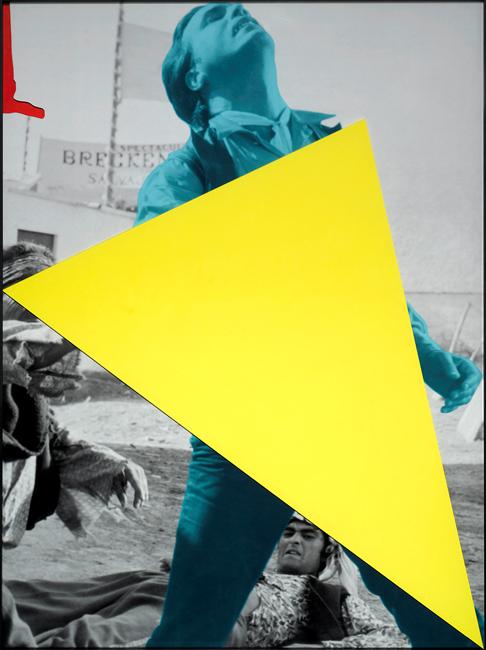
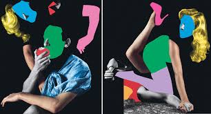
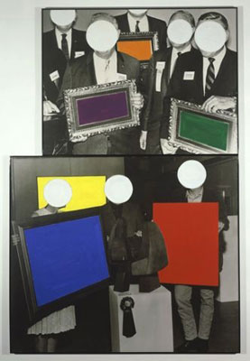
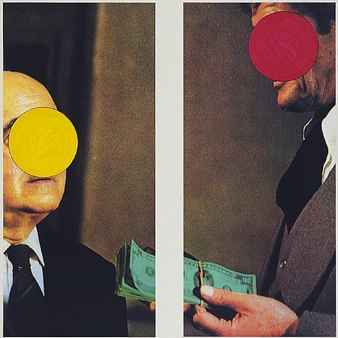
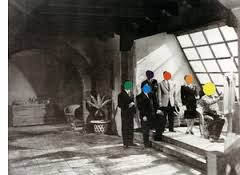
John Baldesarri (born June 17, 1931), never wants to make his work 'boring' so he uses a range of techniques to make his work abstract
and more interesting . In a clip we watched John Bladesarri said that he once used to go to the same street every day and take pictures so that his images were always different. Baldesarri mentioned that he used to get old pictures from bins in order toedit them to make them more interesting . I think he is a very interesting artist as he manages to take images that were once someone elses art and turn them into something abstract and new . Which is definitley a skill.I think that the way Bladesarri covers the faces of the people in the images makes them anonymous and even more interesting as you are not looking at their faces you are looking at Baldesarris use of colour . Bladesarri often uses the formal elements to make his images stand out , he uses the bright colours to contrast whith the dark surroundings of the images which makes them stand out.I also like Baldesarri's use of cropping for example he cut one in=mage in half and put it back together again . I think Baldesarri's use of cropping and colour makes his images unique and abstract.Baldesarri's use of space means that often the circle of colour in the middle is what you first see I think that by using that technique Baldesarri makes the people in the images seem like characters . From Bladesarri's art I have learned lots of ways to edit photos so that they become even more interesting and abstract.
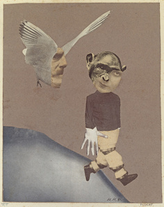
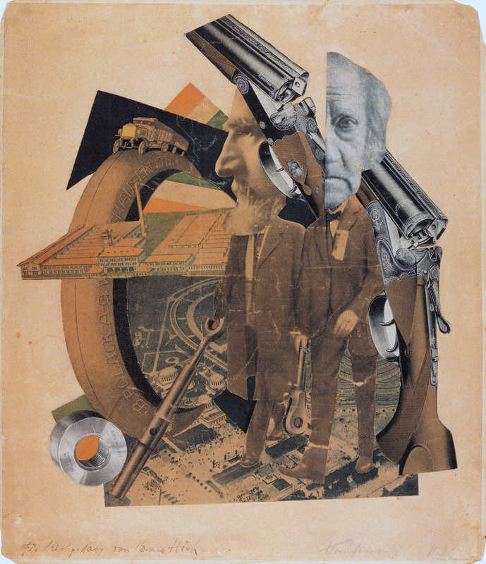
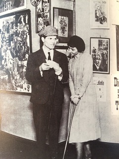
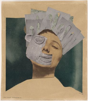
Hannah Hoch - '' I would like to show the way an ant sees the world today and tomorrow as the moon sees it''
Hannah Hoch Pinterest page
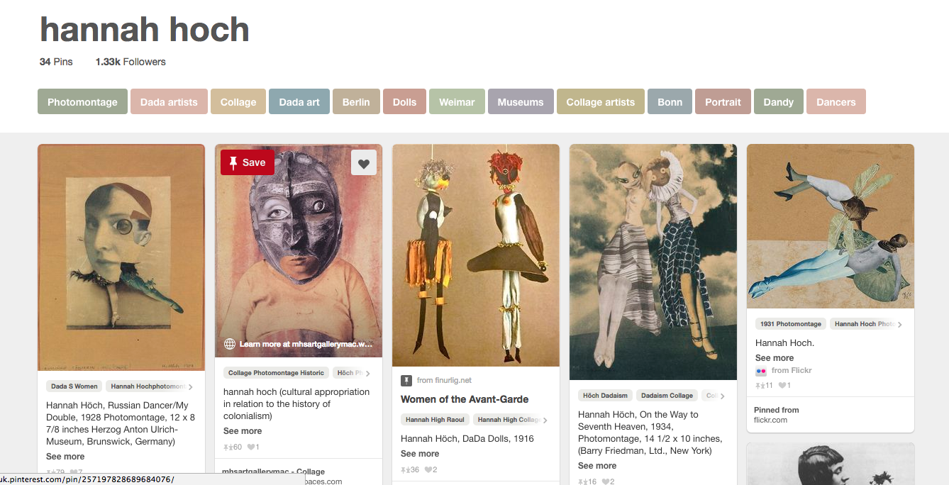
Hannah Hoch 16 images
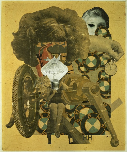
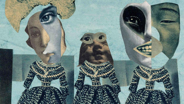
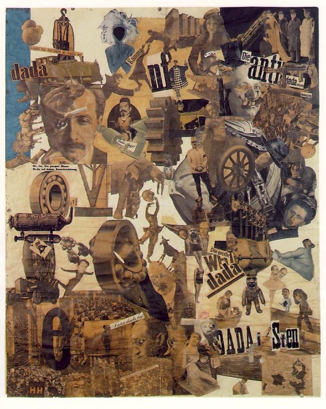
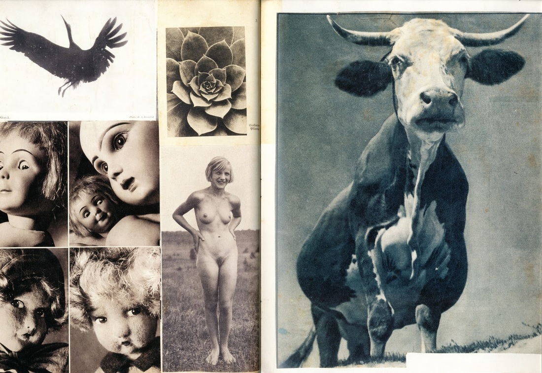
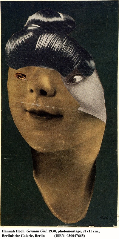
Evaluation of Hannah Hoch's work -
November 1, 1889 – May 31, 1978
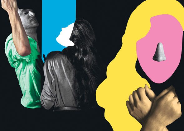
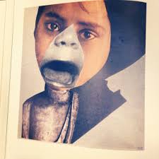
Hannah Hoch could be considered more of an artist than a photographer as the work here shows photographs put together rather than photography that she has taken. I think that she is a photographer because she has used image from real life to make art that looked interesting and abstract . I like her work because I think that she has managed to use lots of aspects of art and photography to create really abstract images . I also like how she uses black and white photography with colour photography to make constrasting cropped images .I think there is repitition in her work as she uses a lot of nature and a lot of eyes in all of the images they mainly feature eyes and nature. I think that her images use different textures that make her images look almost 3d which stands out as quite different to other photographers work to me.I think that in her photography she wanted to give the message to the audience that lots of different people have different perspectives and she wants every one to see her perpective through abstract art, which I find interesting as feel that in her images she creates lots of different faces that seem to have different personalities from the expressions that Hoch makes them have . When I created my own work I used magazines and I tried to recreate her work because I think her use of the formal elements to create abstract work in photography is extremely unique. I can see that Hannah Hoch uses lots of different images to create her work so I tried to include this in my work to make it fit in with the theme of abstraction.
November 1, 1889 – May 31, 1978
Hannah Hoch could be considered more of an artist than a photographer as the work here shows photographs put together rather than photography that she has taken. I think that she is a photographer because she has used image from real life to make art that looked interesting and abstract . I like her work because I think that she has managed to use lots of aspects of art and photography to create really abstract images . I also like how she uses black and white photography with colour photography to make constrasting cropped images .I think there is repitition in her work as she uses a lot of nature and a lot of eyes in all of the images they mainly feature eyes and nature. I think that her images use different textures that make her images look almost 3d which stands out as quite different to other photographers work to me.I think that in her photography she wanted to give the message to the audience that lots of different people have different perspectives and she wants every one to see her perpective through abstract art, which I find interesting as feel that in her images she creates lots of different faces that seem to have different personalities from the expressions that Hoch makes them have . When I created my own work I used magazines and I tried to recreate her work because I think her use of the formal elements to create abstract work in photography is extremely unique. I can see that Hannah Hoch uses lots of different images to create her work so I tried to include this in my work to make it fit in with the theme of abstraction.
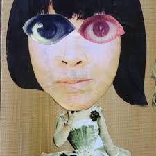
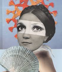
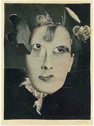
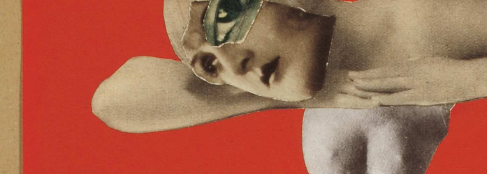
My attempts at John Baldesarri and Hannah Hoch art
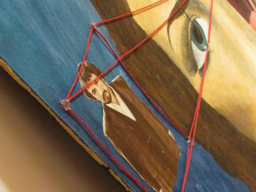
My Final Piece Explanation :
For my final piece I wanted to create something inspired by Hannah Hoch and John Baldesarri's work . I chose these artists becuase I found the range of techniques they use interesting and wanted to apply them to my work to hopefully get the best grade I can for my final piece . I would like to use vintage photos from around the era that Hannah Hoch was from and edit them using tallis stickers and parts from other photos to make them abstract . I would like to write on the top of the board that I am mounting the photos on "The path the abstraction" because this work shows the range of techniques Hannah Hoch used to make her photos abstract. I was originally going to use photoshop for my work but then I decided to do this by hand because that is what Hannah Hoch would have done , I mainly chose photos with peoples faces in because I find people easiest to edit and I saw in Hannah Hochs work that she normally covers peoples faces with dots so as to make a mask so no one knows what the person looks like .
The equipment I will need is :
Vintage photographs from around Hochs era.
Stickers , Parts of other photographs and colouring pens to edit the photos.
A board to mount the photos on .
Evaluation of my final piece:
In my chosen exam theme I tried to replicate Hannah Hoch's work as her images are imaginative and skilful and I was keen to explore how to respond to the message of her work . I had researched many abstract artists ( such as Hannah Hoch, Cristina Coral and John Baldesarri ) during this topic that I had discovered from studying photography GCSE .The artists I have learned about inspired me and I was intrigued about what lead them to abstraction and what materials they used so I had an idea of where to get started and what experiments to carry out .I selected a clear theme of taking an ordinary photo and making it abstract like how John Baldesarri and Hannah Hoch did and I had a clear idea of what I wanted to do when I started this project but my final piece ended up being slightly different to what I first imagined. This was a positive thing for me because I got to be critical about my work and explored different processes to try and perfect my work. .I liked being able to play with the composition, light .tone and texture within the images and using the school's resources such as photoshop to decide how I could best get the message I wanted across to the person who would view my art. An example of the resources that I used from the school was the mounting boards - I wanted to use these as they are a simple way of portraying your art without detracting from the art at all. To begin with my project at first I began by taking 8 vintage images in black and white and sticking the Tallis habits stickers on them .In photos with people's faces on them I stuck the stickers over the persons face as this is a technique that Baldesarri and Hoch used which first made their work stand out to me . I then decided against using just vintage images and used 6 of my own images and just two vintage images I then put all the images in the same black and white filter before cutting to size and adding the Tallis habits stickers . To refine my work I got rid of some of the images that came out bigger than the other ones and I had to get rid of a set of the original images because they had come out in a different filter to how I wanted them . I can remember stopping at each stage to evaluate my work and check that my work was following the direction I wanted it to. I wanted my work to stay very similar to my original idea because I believe that I had made a very meaningful response to the topic of abstraction as I have taken an old artists idea of what is abstract photography and put it into my work while using modern techniques such as an iPhone camera and photo editor to make my response more up to date and effective. I always made sure to try and include the formal elements in my work and use everything I know about abstraction (from both year 9 and year 10) so that I was always confident when I began experimenting with my final piece and I knew that if things went wrong with the experiments it would not matter as I was just refining my final piece. The final outcome of my final piece 'The path to abstraction' was a set of 8 images displayed on a mounting board with the Tallis habits stickers stuck on parts of the images .In the end I think that if I had had more time to explore the theme of abstraction I would have taken more time to try and take images that looked more abstract without me editing them however I think I just find certain techniques in abstraction very challenging like making the camera out of focus and that is why it took me a very long time to make real progress in the theme of abstract photography however, I think my photos are a very personal response because I took the time to think about what the viewers of my work would think when they saw the images and I am pleased with my final outcomes because they are very clear about how I feel about the theme of abstract photography.I have learned a number of new skills during this project such as : how to get the images the same size on iphoto , how to create layers on photoshop and how to put images together from other images so that they look like Hannah Hoch's work .In my opinion my final piece was very succesful as it had a clear message behind it and I had spent a long time improving it and learning new skills along the way.
In my chosen exam theme I tried to replicate Hannah Hoch's work as her images are imaginative and skilful and I was keen to explore how to respond to the message of her work . I had researched many abstract artists ( such as Hannah Hoch, Cristina Coral and John Baldesarri ) during this topic that I had discovered from studying photography GCSE .The artists I have learned about inspired me and I was intrigued about what lead them to abstraction and what materials they used so I had an idea of where to get started and what experiments to carry out .I selected a clear theme of taking an ordinary photo and making it abstract like how John Baldesarri and Hannah Hoch did and I had a clear idea of what I wanted to do when I started this project but my final piece ended up being slightly different to what I first imagined. This was a positive thing for me because I got to be critical about my work and explored different processes to try and perfect my work. .I liked being able to play with the composition, light .tone and texture within the images and using the school's resources such as photoshop to decide how I could best get the message I wanted across to the person who would view my art. An example of the resources that I used from the school was the mounting boards - I wanted to use these as they are a simple way of portraying your art without detracting from the art at all. To begin with my project at first I began by taking 8 vintage images in black and white and sticking the Tallis habits stickers on them .In photos with people's faces on them I stuck the stickers over the persons face as this is a technique that Baldesarri and Hoch used which first made their work stand out to me . I then decided against using just vintage images and used 6 of my own images and just two vintage images I then put all the images in the same black and white filter before cutting to size and adding the Tallis habits stickers . To refine my work I got rid of some of the images that came out bigger than the other ones and I had to get rid of a set of the original images because they had come out in a different filter to how I wanted them . I can remember stopping at each stage to evaluate my work and check that my work was following the direction I wanted it to. I wanted my work to stay very similar to my original idea because I believe that I had made a very meaningful response to the topic of abstraction as I have taken an old artists idea of what is abstract photography and put it into my work while using modern techniques such as an iPhone camera and photo editor to make my response more up to date and effective. I always made sure to try and include the formal elements in my work and use everything I know about abstraction (from both year 9 and year 10) so that I was always confident when I began experimenting with my final piece and I knew that if things went wrong with the experiments it would not matter as I was just refining my final piece. The final outcome of my final piece 'The path to abstraction' was a set of 8 images displayed on a mounting board with the Tallis habits stickers stuck on parts of the images .In the end I think that if I had had more time to explore the theme of abstraction I would have taken more time to try and take images that looked more abstract without me editing them however I think I just find certain techniques in abstraction very challenging like making the camera out of focus and that is why it took me a very long time to make real progress in the theme of abstract photography however, I think my photos are a very personal response because I took the time to think about what the viewers of my work would think when they saw the images and I am pleased with my final outcomes because they are very clear about how I feel about the theme of abstract photography.I have learned a number of new skills during this project such as : how to get the images the same size on iphoto , how to create layers on photoshop and how to put images together from other images so that they look like Hannah Hoch's work .In my opinion my final piece was very succesful as it had a clear message behind it and I had spent a long time improving it and learning new skills along the way.
"Wandering Bears is a creative studio & photographic led community – A centre for new work, ideas and collaborative projects."
The wandering bears workshop that we took part in last week involved two artists
who had different examples of abstract photography .We had to try and replicate
this photography from contemporary artists or put our take on the work and change it in some way. My favourite piece
of art to replicate was a sculpture made of fruit. I liked this because we had never studied
photographs of food and they had managed to make the fruit look abstract by arranging it around
a table and on a metal stick I found the fruit hardest to replicate though so I just made my ow take on the work which was easier and i'm glad we were allowed to do . However the easiest to replicate was
a sculpture of bricks but I did not find this interesting to replicate . This workshop did change my
perspective of photography because I did not like some of the abstract images and I did not
enjoy trying to replicate some of the ones that involved posing or being photographed but it did make me think
that you can take images more freely now and it dosen't matter really if your photograph looks asthetically pleasing as long as
it looks inetersting and can make people think it can be considered abstract.
