Edges - In photography edges is a way off showing shapes either in an urban or natural setting . When trying to capture edges you can use the colour , texture and shapes of what is around you to make your photos stand out . If you learn how to capture edges in your images effectively you can make your work look more interesting and abstract . Edges can help you learn how to compose your images differently so you learn how to draw the viewers attention to certain parts of the image and make them forget the rest .In this project I have learned more about capturing geometric shapes and editing my images so that they have a clear theme and look abstract . This project can make you think more about how your images look and pushes you to use techniques to turn photos of lines and shapes into abstract art .
|
|
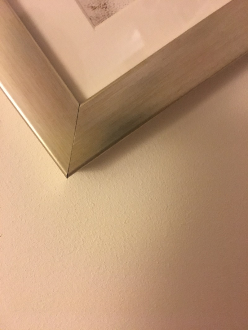
My 30 images of edges :


Evaluation of my images :
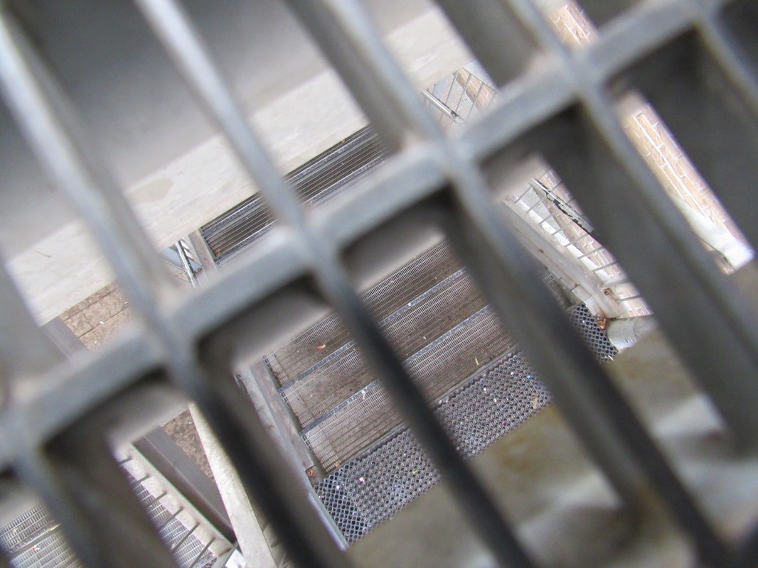
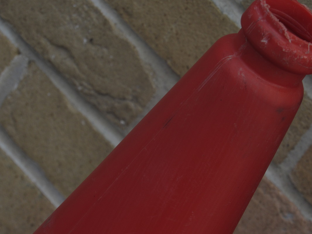
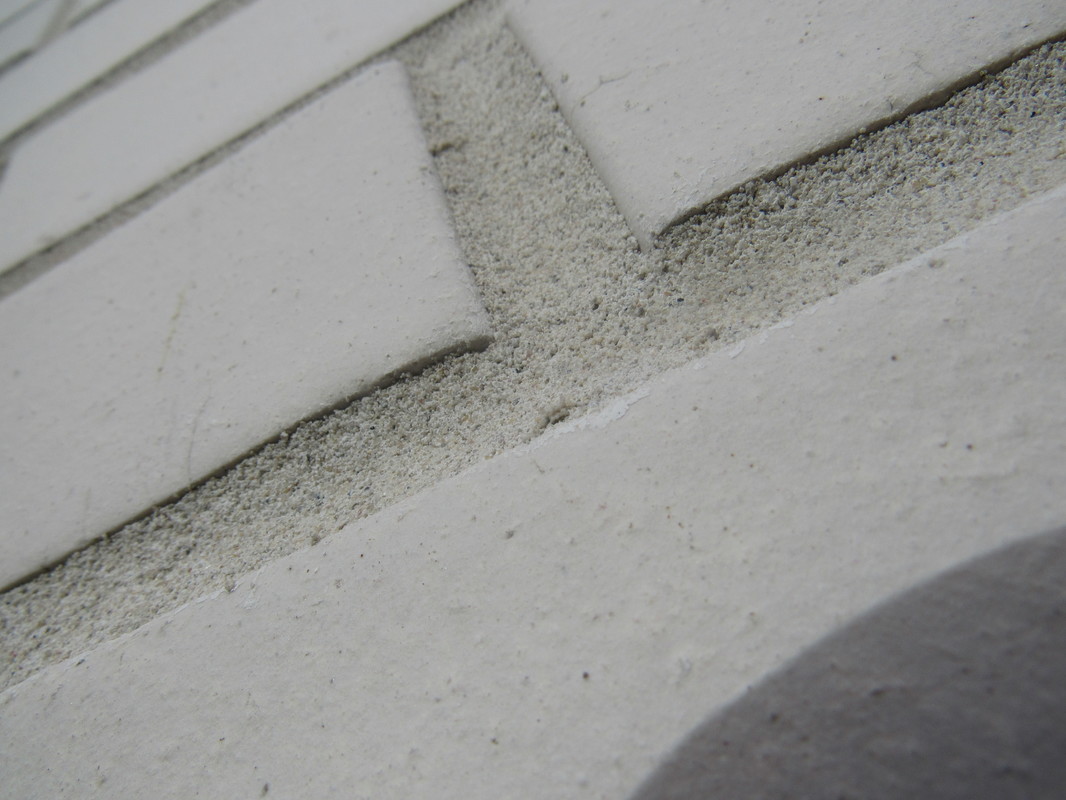
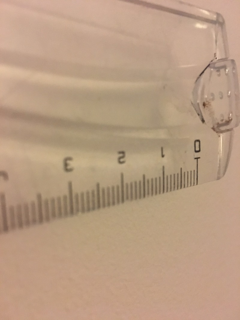
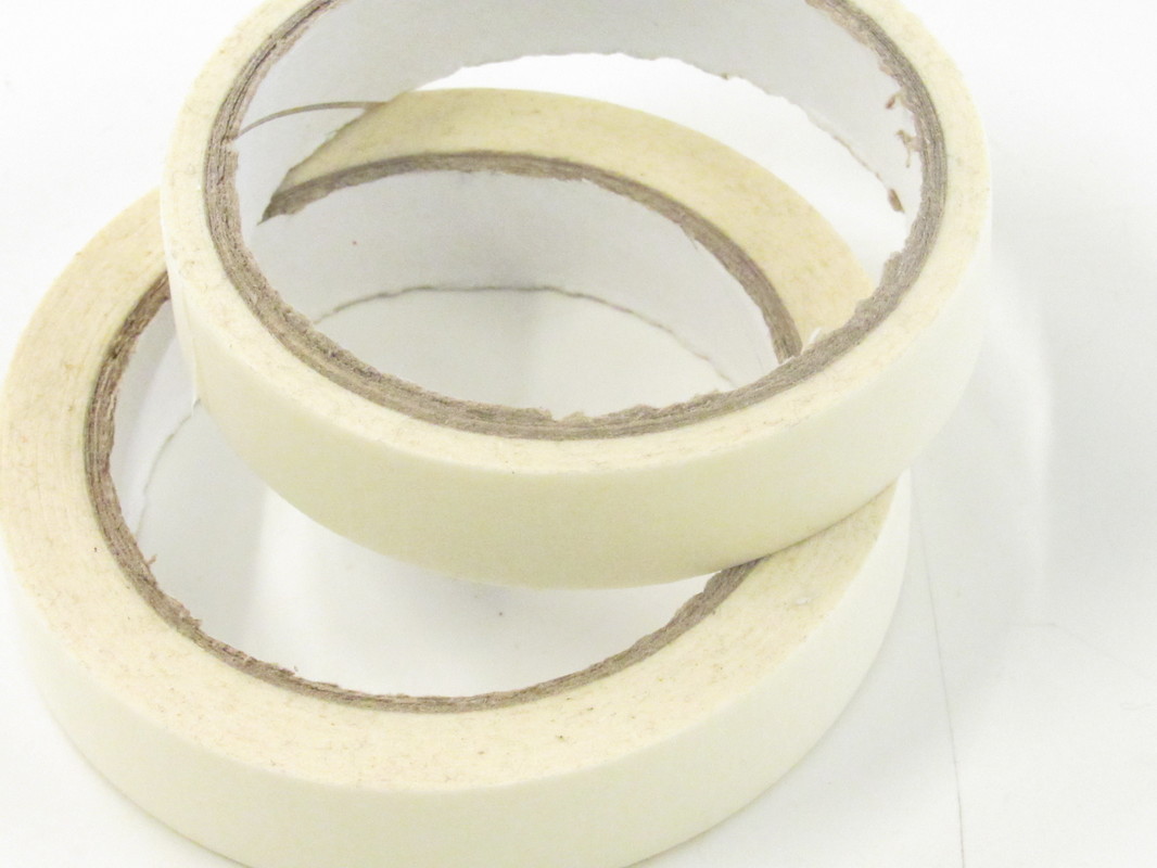
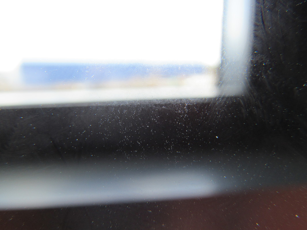
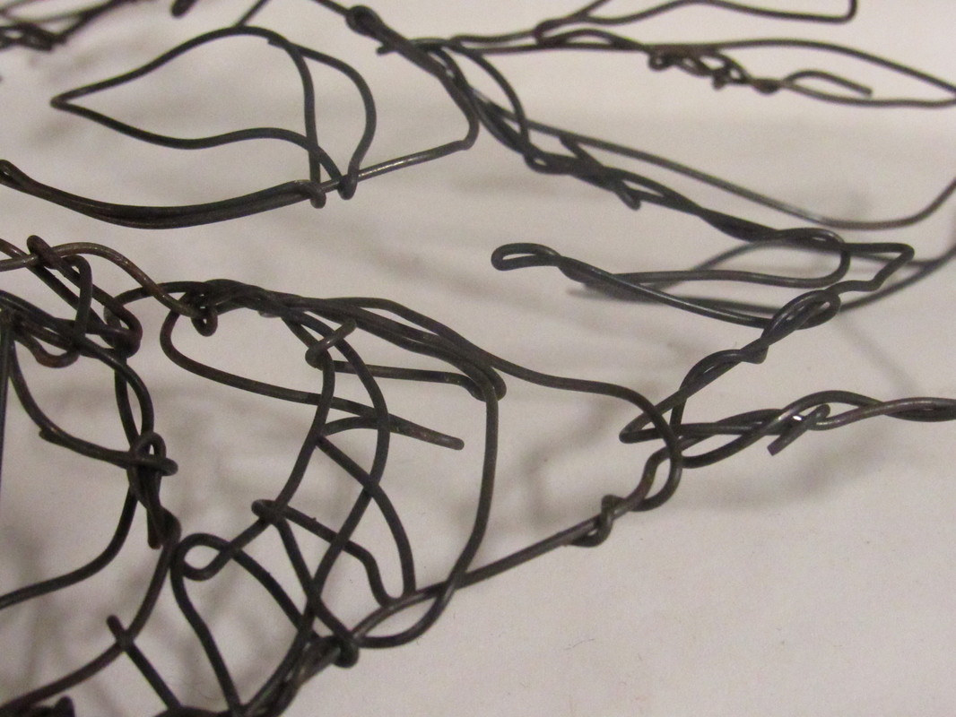
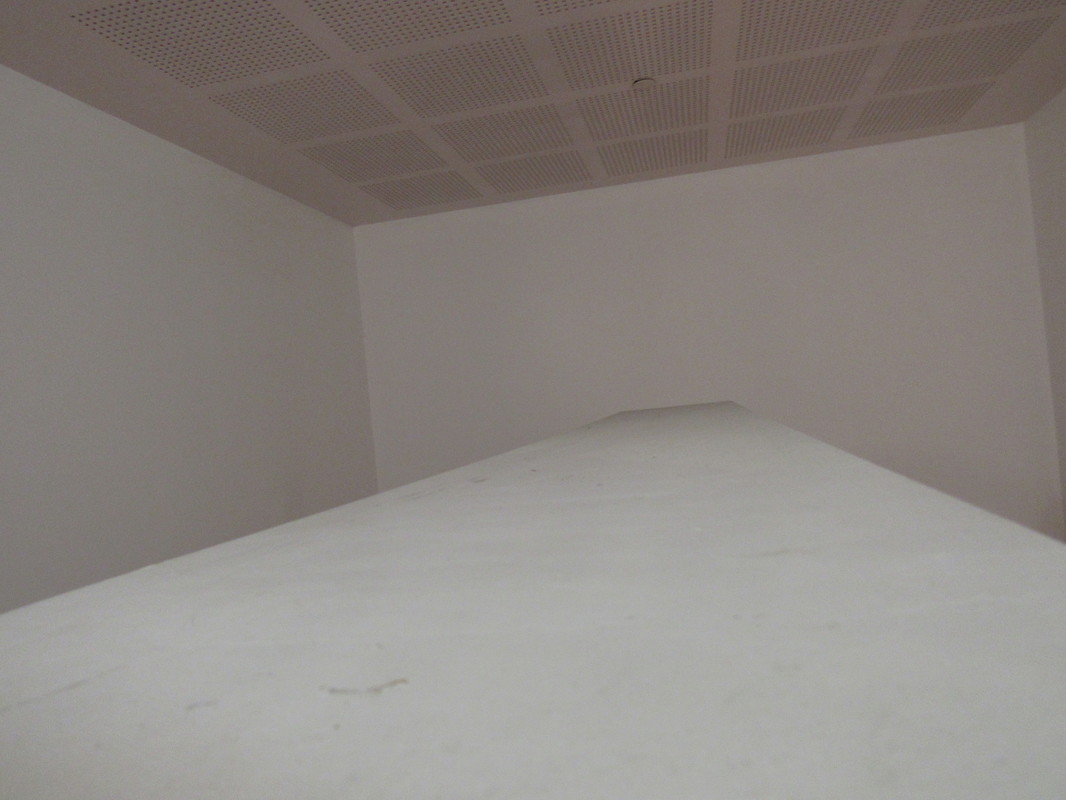
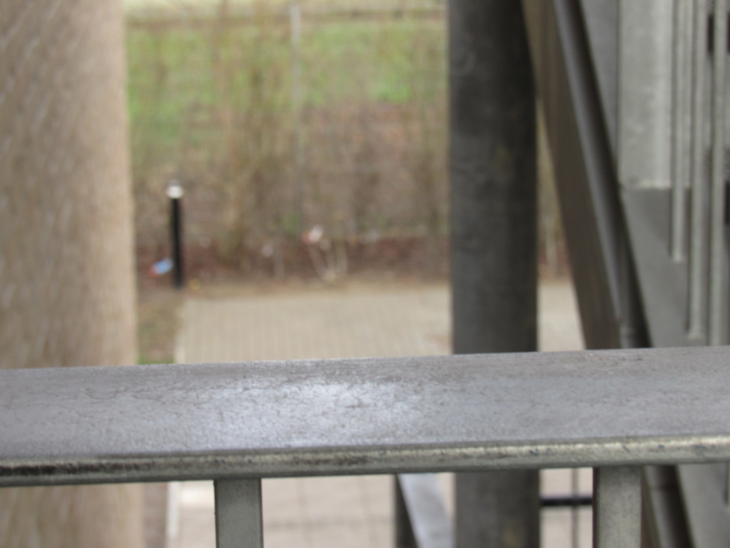
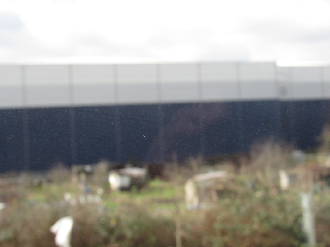
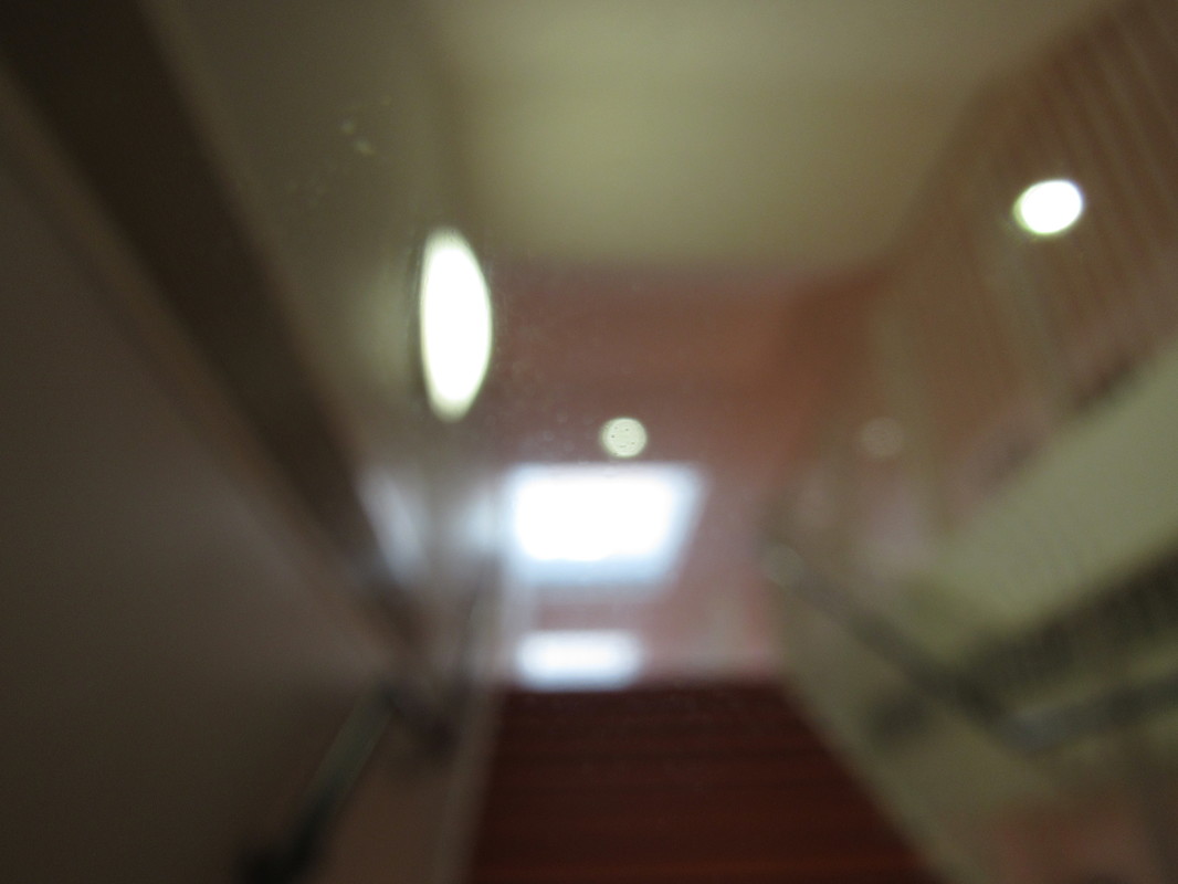
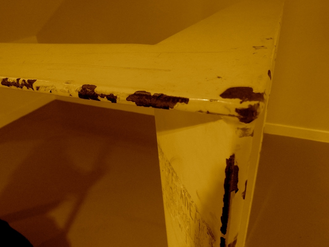
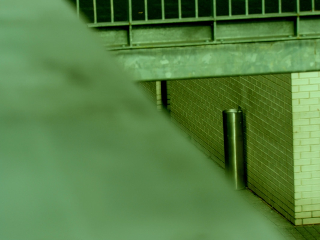
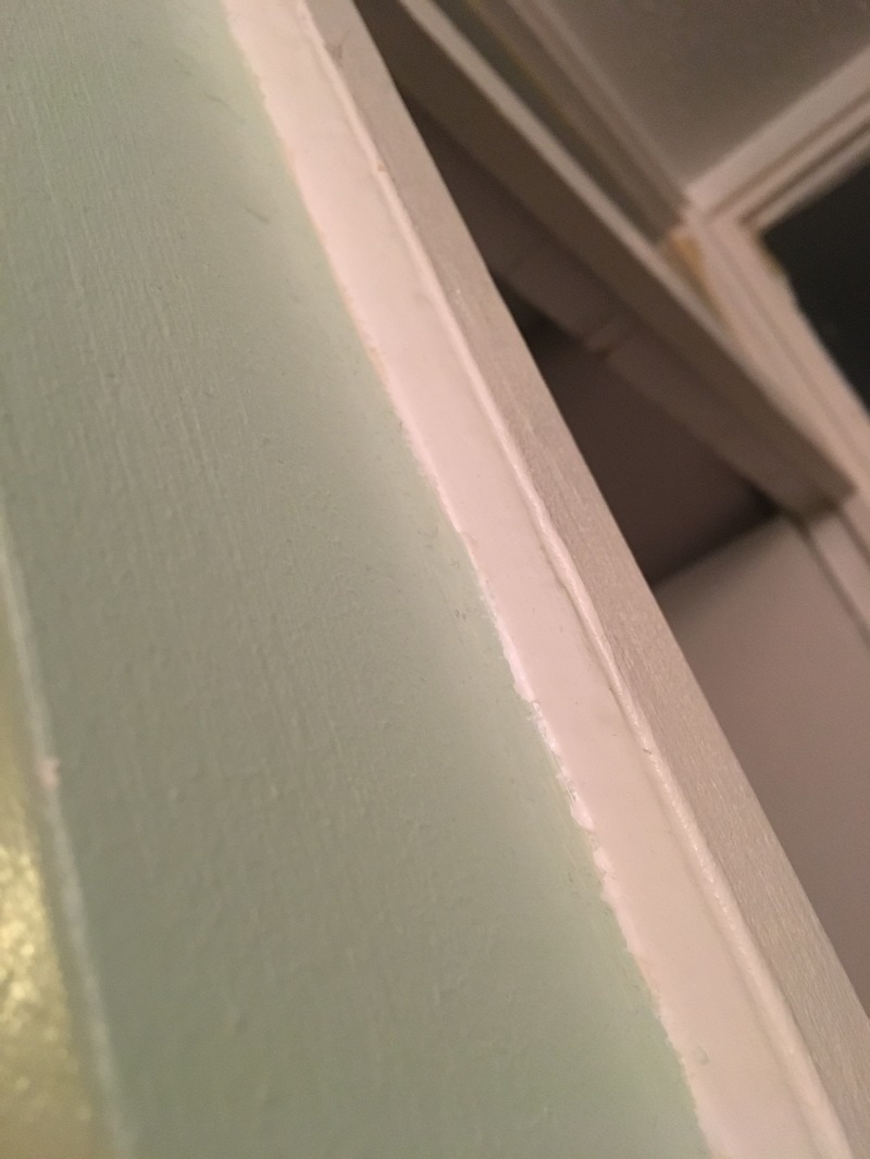
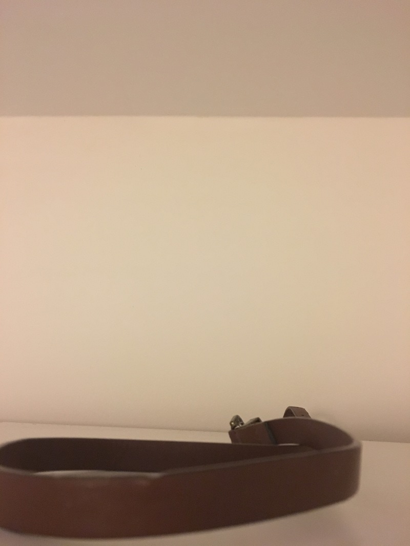
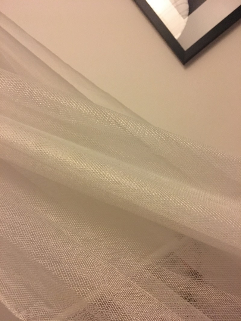
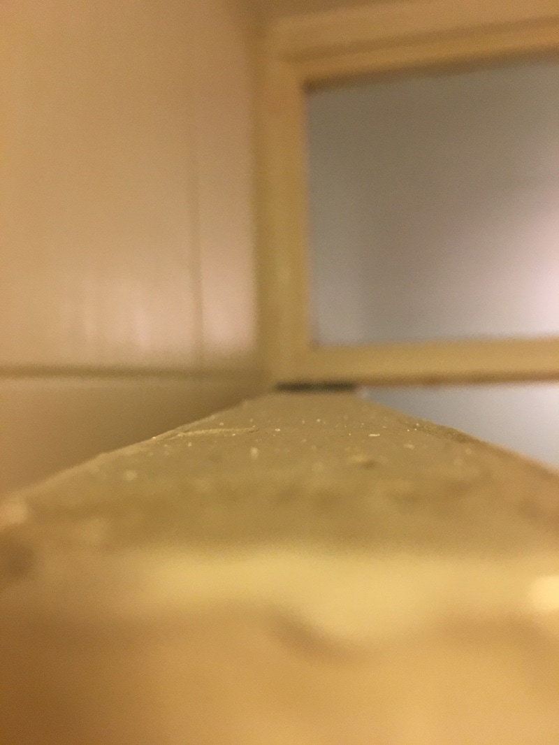
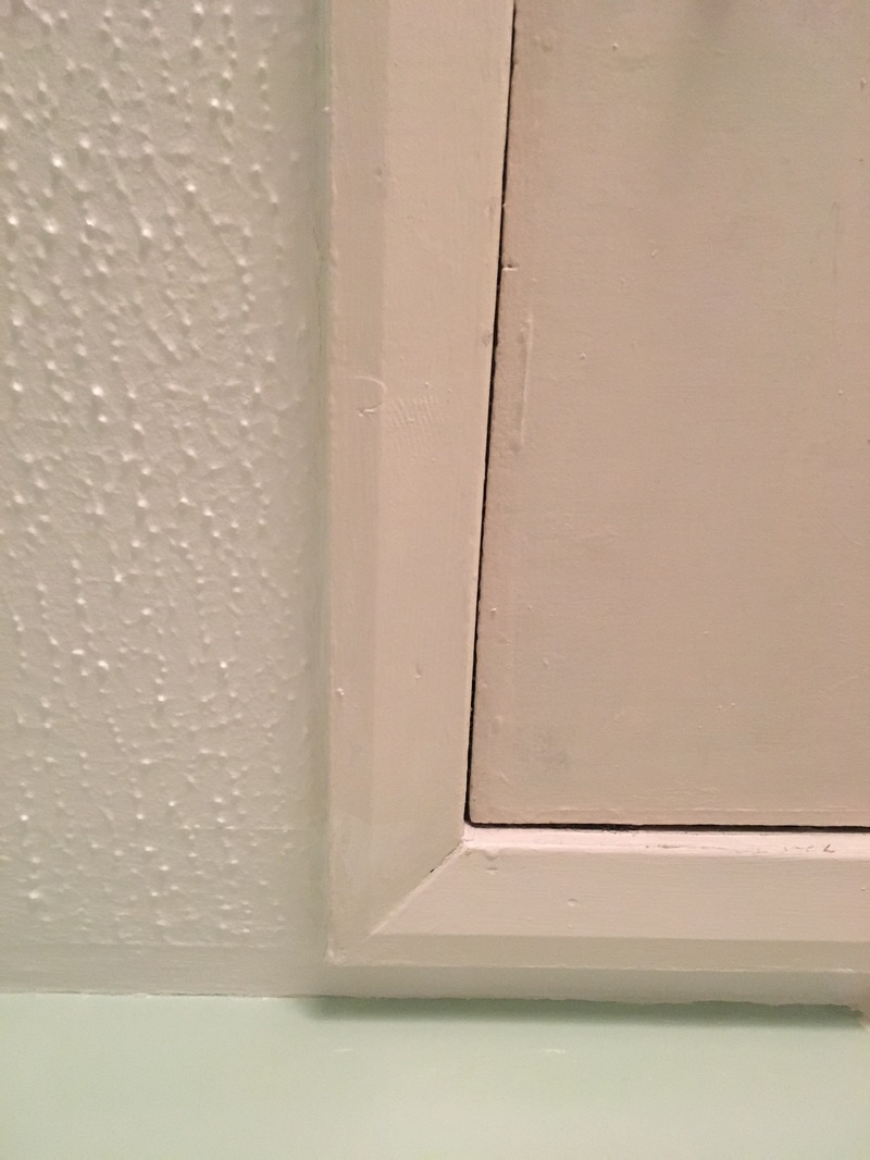
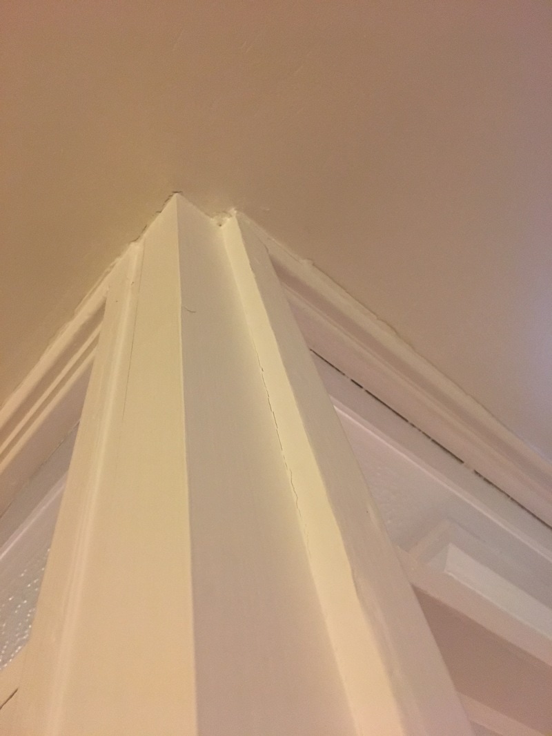
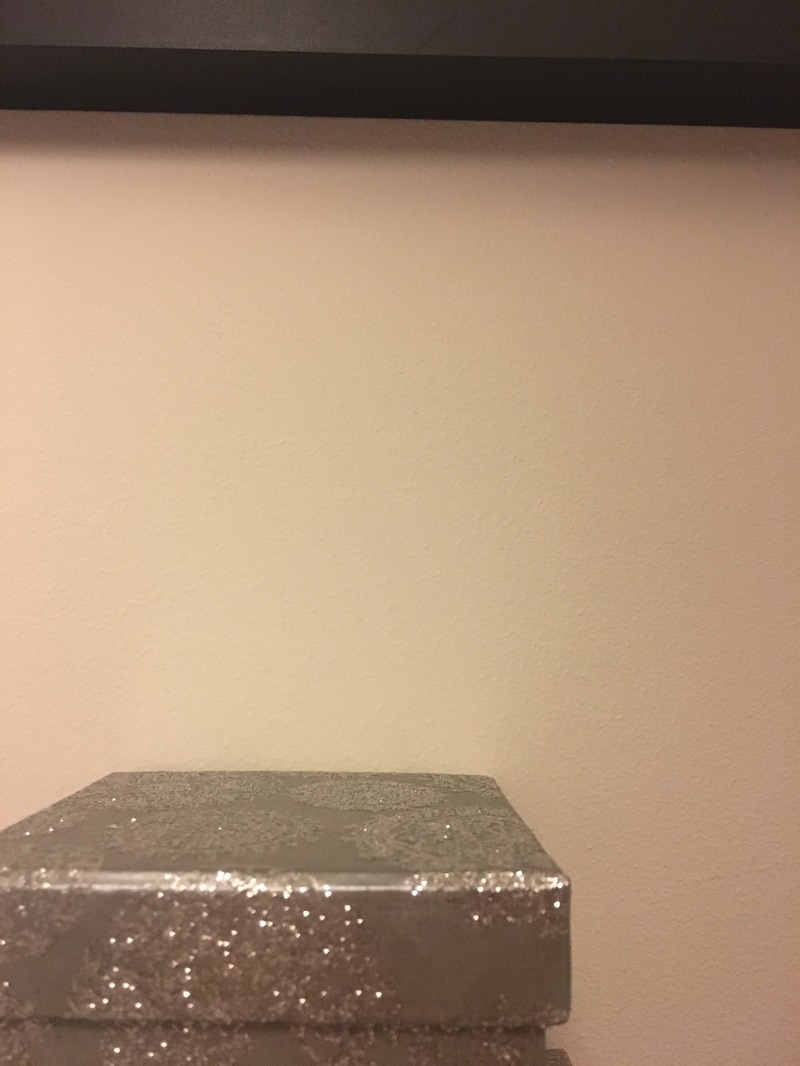
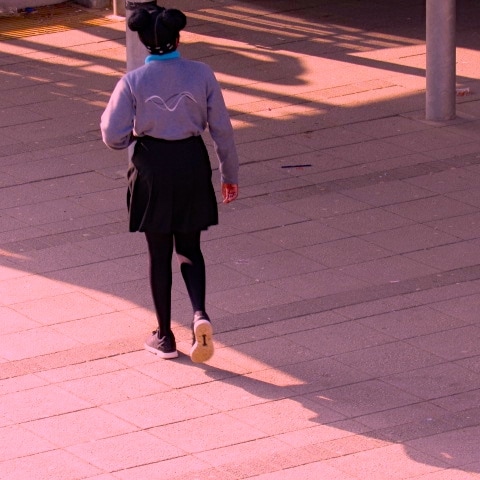
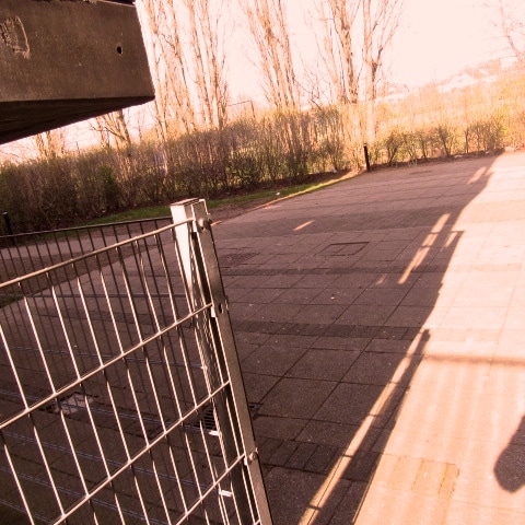
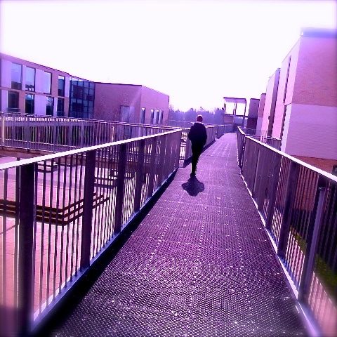
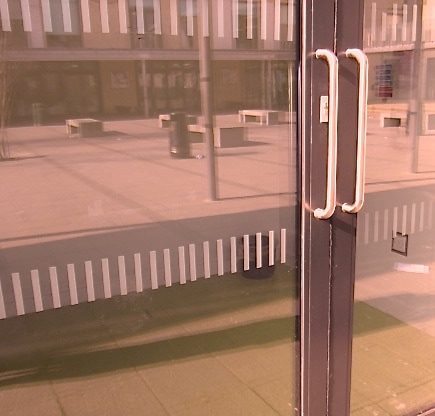
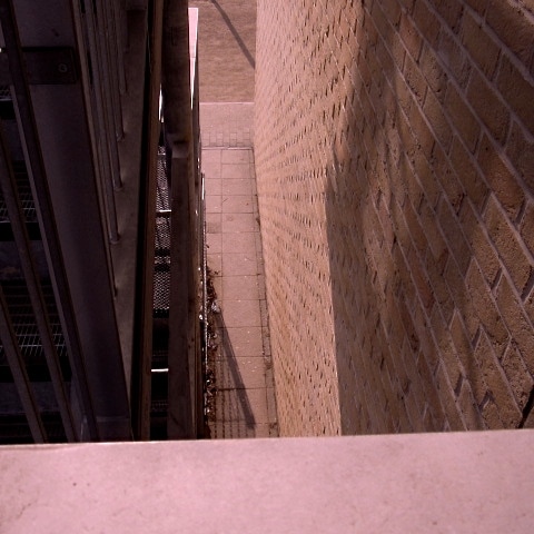
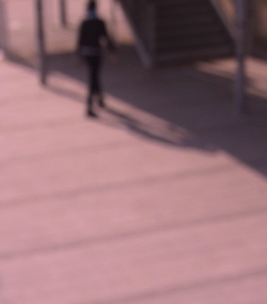
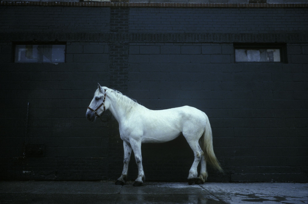
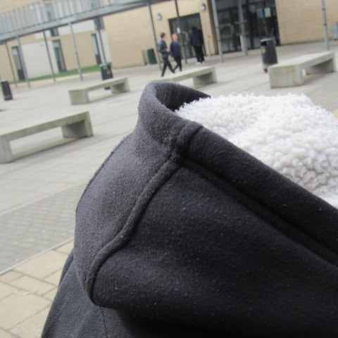
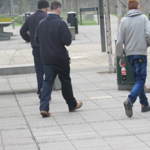
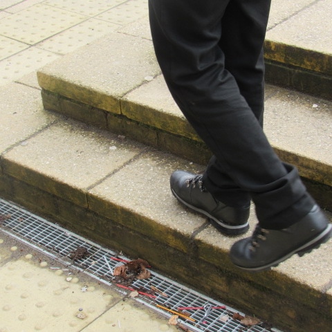
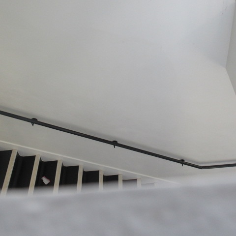
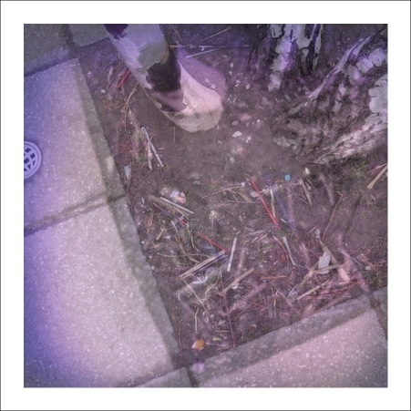
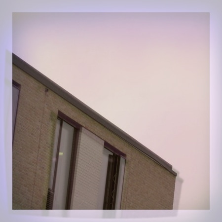
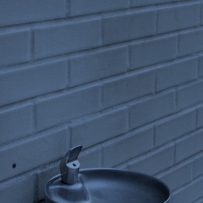
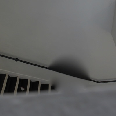
This task was the first task in our project ''edges'' . We were asked to take photographs around the school of different edges , we had 2 hours to complete this task so that we could think very carefully about how we would compose our images and how we would show off the shapes that are in the school . I found this task challenging because in photography I find it hard to accentuate shapes in an image and I also find it hard to know how to compose an image like the edges photographer had on pinterest. These photographs are more abstract than naturalistic as I mainly photographed man made objects such as keyboards or wires and not nature . I think it took me more time than I usually do to take these images because I had to make objects such as windows look abstract and try and make sure that the person who is viewing my work would be able to see the edges in the window . I managed to use techniques that I had learned from last term to make parts of the image out of focus and also I used the bright colours of the school to contrast with white backgrounds in order to make my images stand out. I think I achieved most of the lessons objectives (although I like some images more than others) because one of our objectives was to be able to incorporate the edges of another part of the school into the frame of the edges I was trying to take a photo off and I have managed to do this in quite a few of my images . I think that these photos are effective because they portray the schools edges and geometric shapes very well and also I feel as though I have managed to experiment more with taking images that are not of nature which I like.
This task was the first task in our project ''edges'' . We were asked to take photographs around the school of different edges , we had 2 hours to complete this task so that we could think very carefully about how we would compose our images and how we would show off the shapes that are in the school . I found this task challenging because in photography I find it hard to accentuate shapes in an image and I also find it hard to know how to compose an image like the edges photographer had on pinterest. These photographs are more abstract than naturalistic as I mainly photographed man made objects such as keyboards or wires and not nature . I think it took me more time than I usually do to take these images because I had to make objects such as windows look abstract and try and make sure that the person who is viewing my work would be able to see the edges in the window . I managed to use techniques that I had learned from last term to make parts of the image out of focus and also I used the bright colours of the school to contrast with white backgrounds in order to make my images stand out. I think I achieved most of the lessons objectives (although I like some images more than others) because one of our objectives was to be able to incorporate the edges of another part of the school into the frame of the edges I was trying to take a photo off and I have managed to do this in quite a few of my images . I think that these photos are effective because they portray the schools edges and geometric shapes very well and also I feel as though I have managed to experiment more with taking images that are not of nature which I like.
My favourite images :

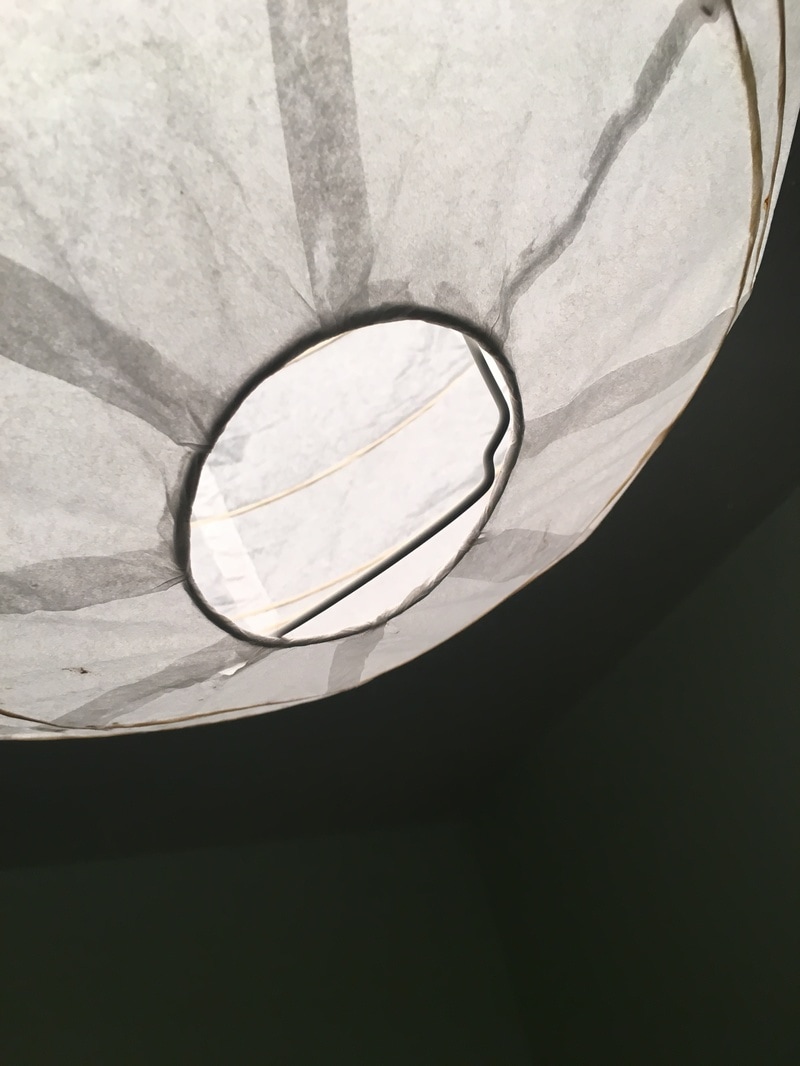
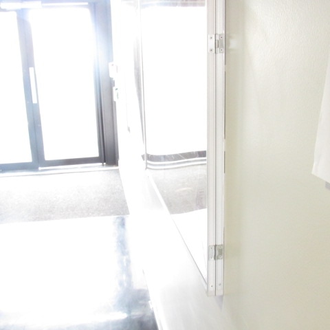
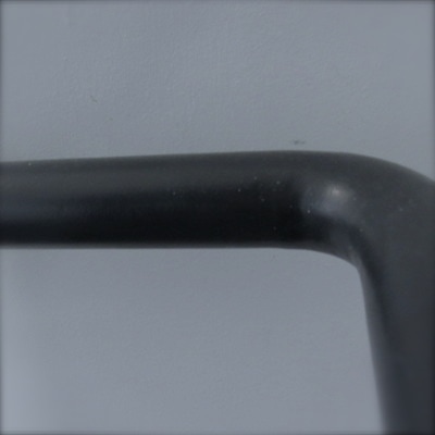
These 6 images are my favourite images because of the minimalistic style they have to them .I like how I have managed to not include much of the background in each image so that the viewer can really focus on the geometric shapes in the images. When I took these images I tried to focus heavily on what was in the background of the images so that there was no-one in the background. These photographs remind me of the images I did with paper in my topic of abstraction last term . I did not have to crop anything out these images as the background was clear or just featured even more edges which was one of the lesson objectives . I tried to make the geometric lines or just the shapes in the school the focus of the image . I think these images best show of this and that is why I like them the best. I used natural light in these images and tried to play around with what would be in the foreground and background in order to make the best images possible. Overall these are my favourite images because they show off edges the best and I like the simple style of them . I think these images show of the theme I was trying to create the best I like how they are different from the images I normally create I also like how I used a wider range of techniques and spent more time than I usually would on this set of images .
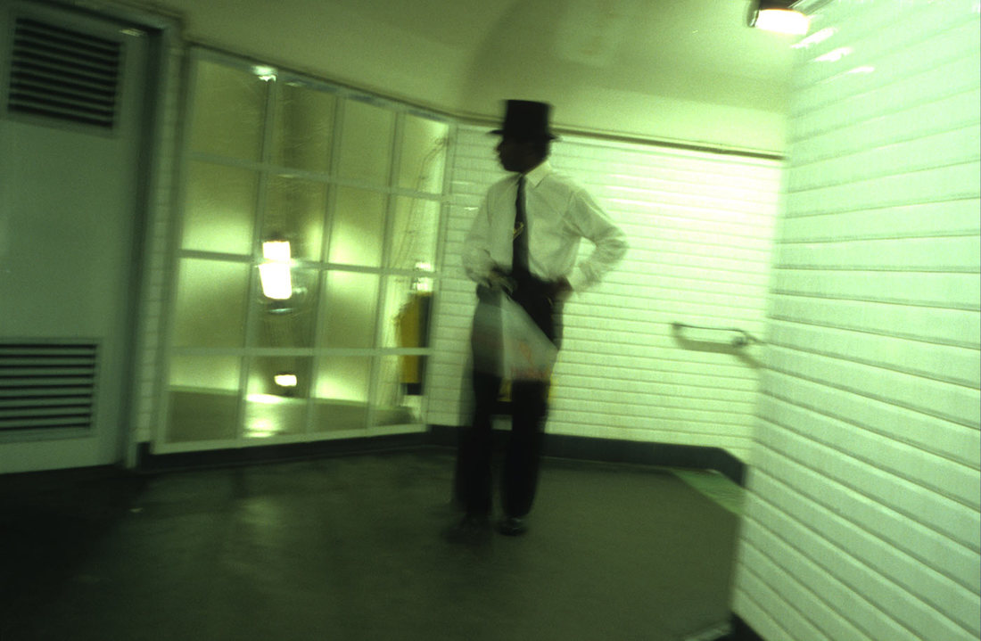
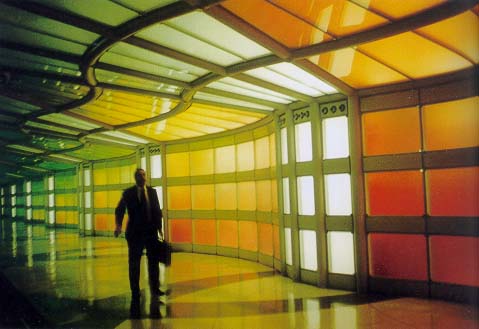
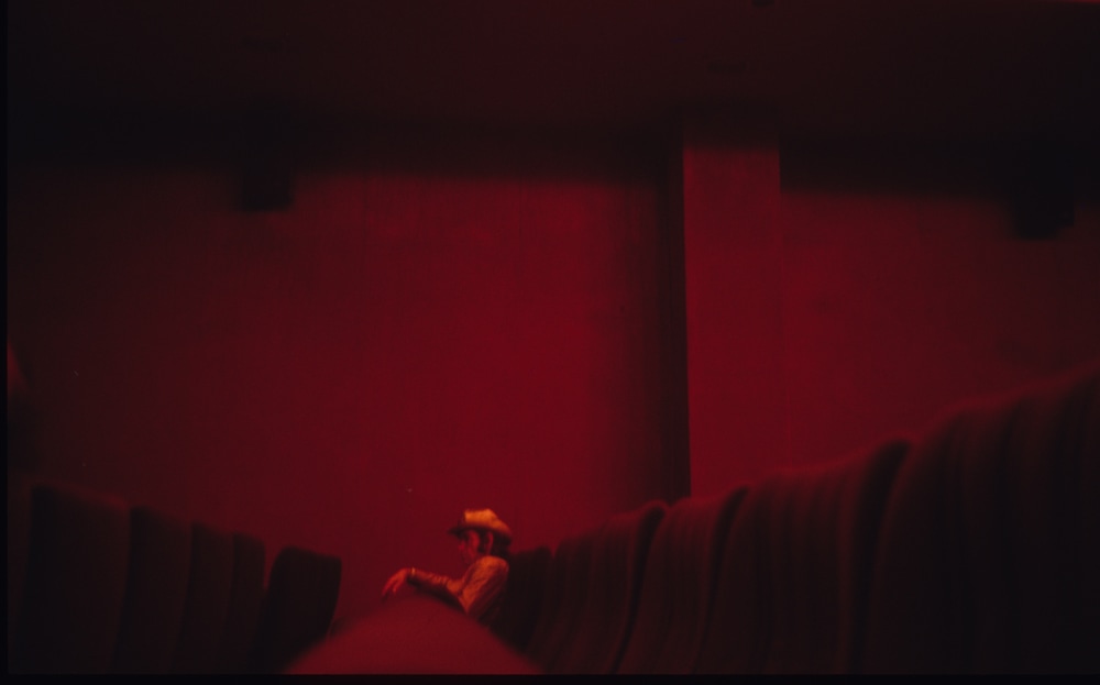
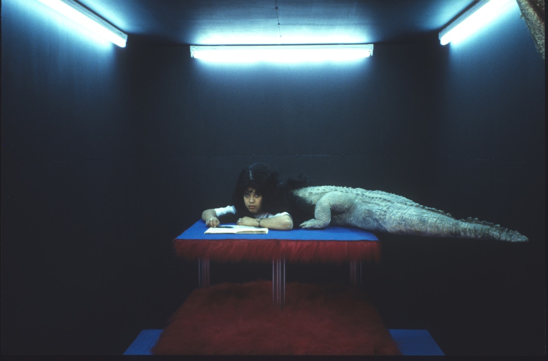
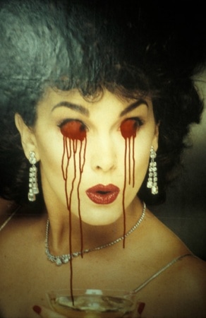
Dolores Marat 'Edges'
Dolores Marat is a French photographer and artist . Many people say her photography has
a dream like quality and looks very abstract although she manages to create images of
nature and architecture . In this task we were asked to choose six of her
images and then evaluate one . We then had to chose a theme of hers and produce our
own images .
6 Images of Dolores Marat -
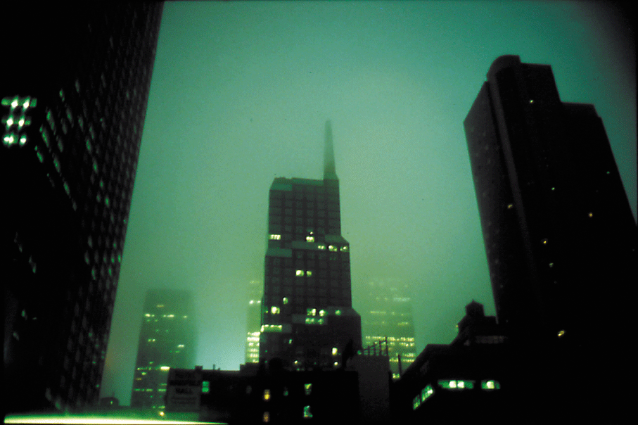

I chose to evaluate this image by Dolores Murat because I like the theme of architecture that she went for. I like how she has placed the buildings in the foreground in focus and the background of the rest of the city slightly out of focus . The artists has managed to use the whether in this image to pronounce the edges of the buildings the most. She has framed the image so that you can see only part of an image in the corner so you can see the bright lights of the offices which contrast with the black of the skyscraper . I think the artist may have edited this image slightly because the sky looks almost green . This image is different from other images of edges that I have seen before because most artists I have seen do not feature nature or the outside world in their images. This artist has managed to make the edges stand out even in a busy city landscape . I like how she has managed to think of using the sky as a background so that the person who views her work is not distracted by the city landscape. I think that I will take inspiration from this photo because there is lots of architecture in my school and I think it would be interesting to see what I could do with the schools building and the nature around it . I think this image has an abstract feel to it because the colours are very bright and contrasting and because Murat has managed to make you focus on the edges in her photograph so the buildings almost don't look like buildings any more. The part of the image that I find the most interesting is the sky because I wonder what type of equipment age has used to make the sky that colour and keep the buildings looking back and shiny . Overall I chose to evaluate this image because I found all the formal laments in it interesting and also how pronounced the edges of the architecture are.
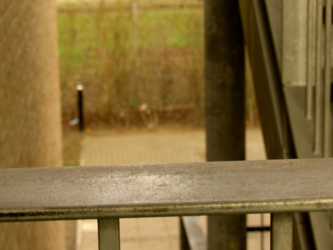
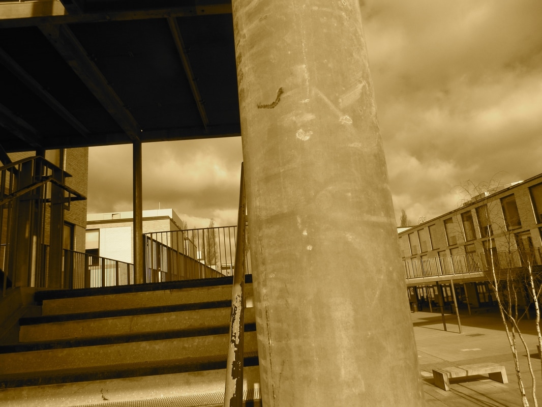
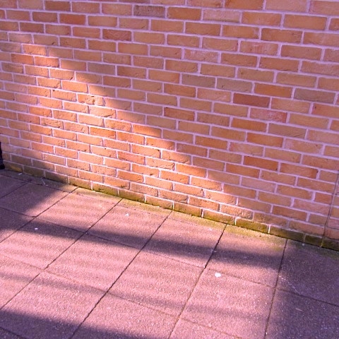
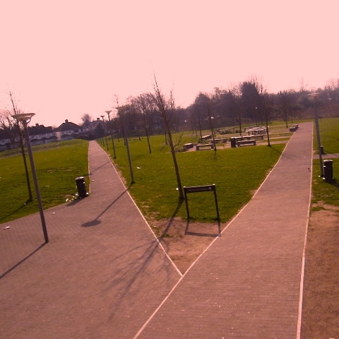
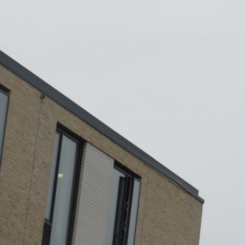
My 12 images of architecture and edges round the school
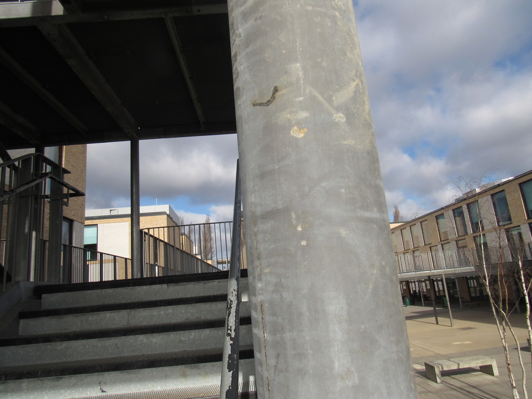
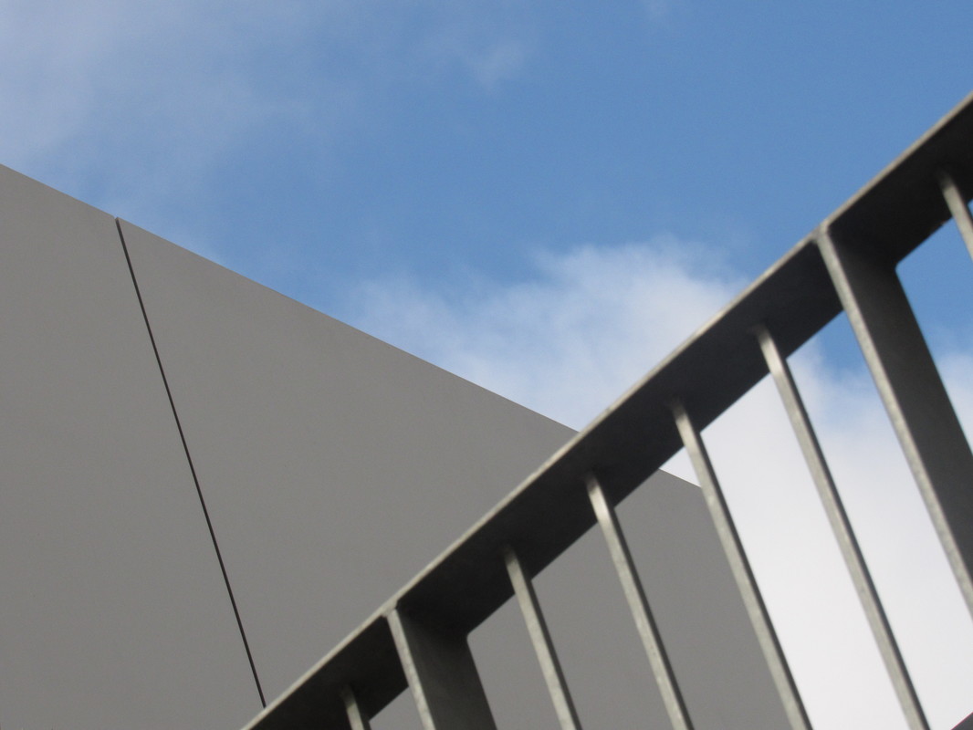
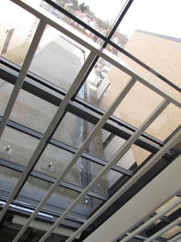
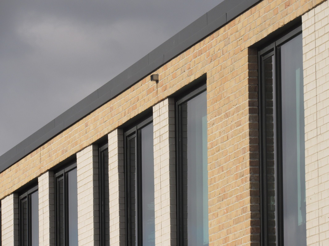
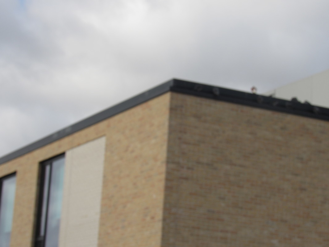
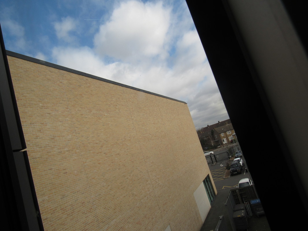
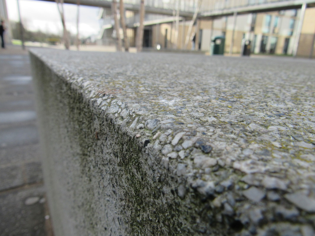
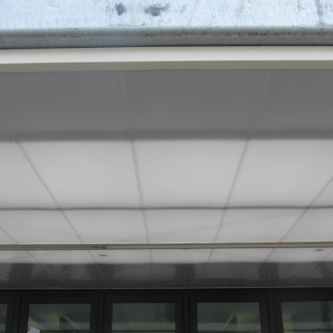
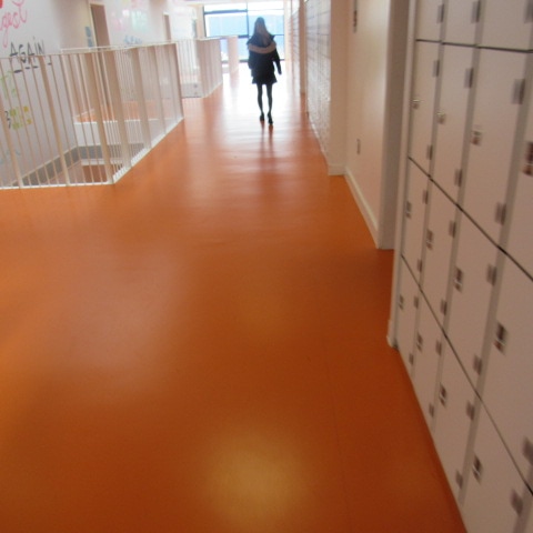
These are my 12 images of architecture around the school , I chose the theme of architecture because I thought it could make great photos of edges and also I could use the different textures of the different parts of the school to make each of my images look different. I managed to make some of my images out of focus which I like because I think that when an image is out of focus you get to see the shapes in the image more clearly which is what I wanted because I wanted to accentuate the edges in the school . An example of this is in the 10th image I did where the whole image is out of focus and you can see just the shapes around the school I like this image because it shows the range of colours , shapes and light in the school's building . I tried to really think about how I would compose my image and what I wanted the viewer to focus on when I went to capture these images . I found this task challenging but I think I extended my use of the formal elements because I was trying to think about how I could make the edges of the schools buildings look interesting and abstract . I would say that these images are a good response to the theme of edges because I have managed to capture the different parts of the school effectivley so that it looks like abstract architecture. In my photos I can see lots of the brick buildings contrasting with the colours of the sky . I like this because the colours of the school are often very unnatural i.e orange or bright green and the brick buildings that contrast with either white or the plain colours of nature around the school . I overall enjoyed capturing these photos because I went with a different theme and I think I made an effective response with to the theme of edges .
5 edited abstract images
The next task was to take 5 of our images and edit them using iphoto . I have never edited using iohoto and I llearned how to make my images have a certain theme to them like Dolores Marat had in her book 'edges' . I decided at first that I would go for warm tones in my images but then I decided to play with adding tints of colour in my images so that some of them look slightly blue and with cold tones or with a more orange tint so that the image would have a warm effect . I also learned how make parts of my images more out of focus to make it look like I have played with the formal elements more than I have . I think editing images is a key part of edges because you get to make your images look even more engaging to the viewer when I was studying Murat's work I wondered how she had managed to make her work look so contrasting and how she made the images have a certain theme to them so that they would all fit in one collection of images . I liked editing these images because it expanded my use of techniques and processes and hopefully editing my images will make them look either more minimilistic (they all are very simple and follow a certain theme) or extremely abstract and over the top with colour, I think most of these images have made a good response to edges although I do not like how I edited the last image because it has to much of a green tint and does not fit in with the cool and warm themes of these edited images .However overall I like how these images turned out and I enjoyed creating them .
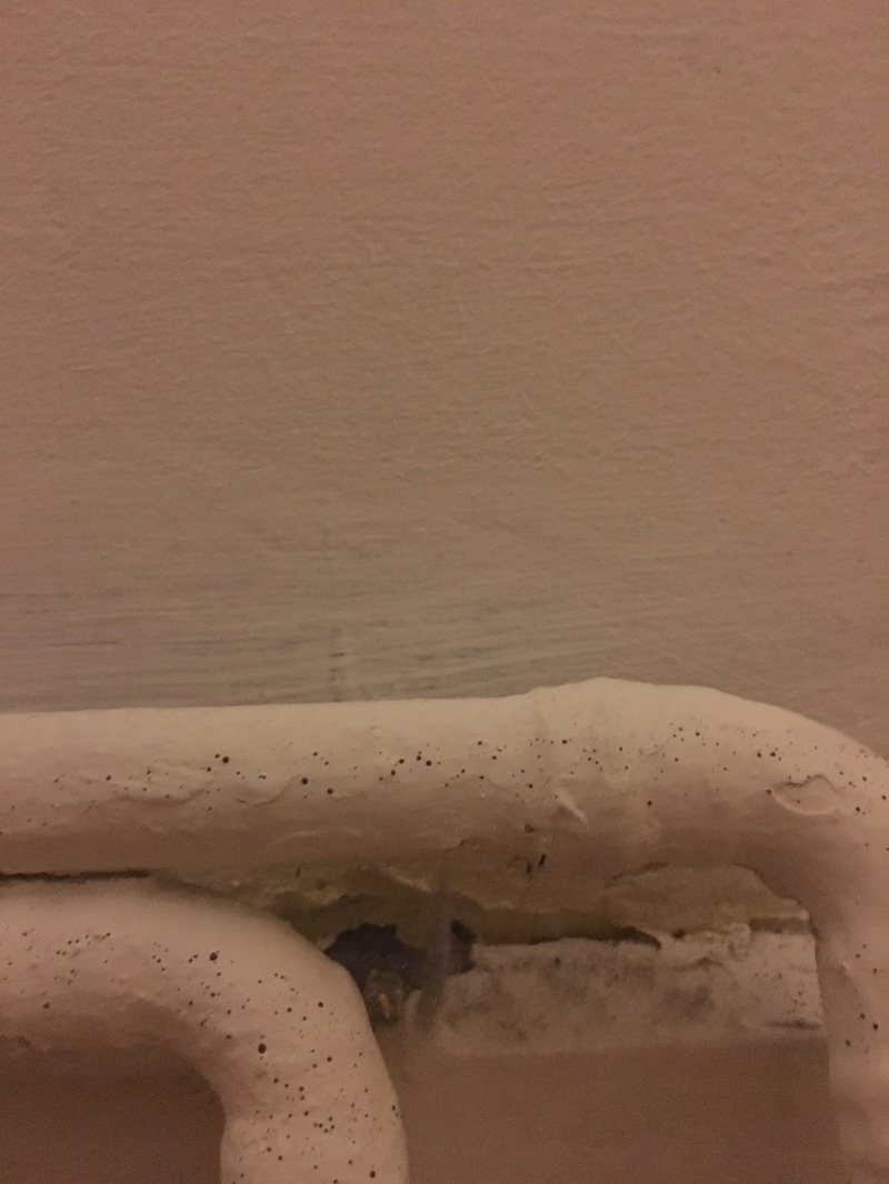
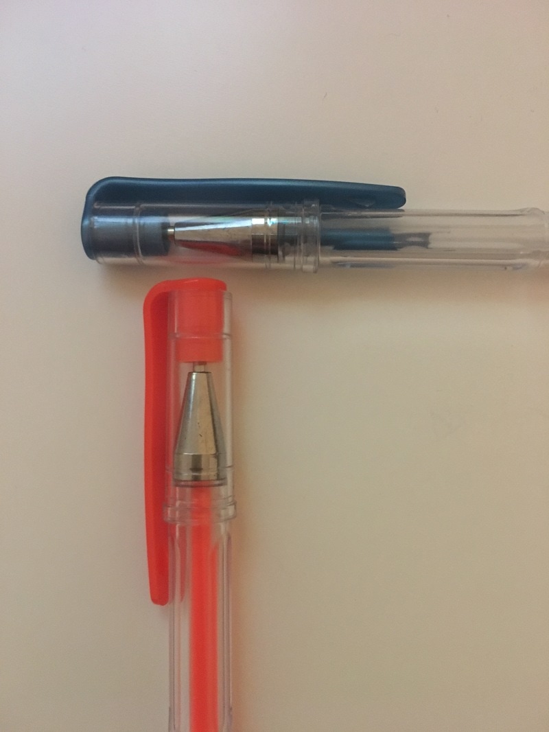
Homework - 20 images of edges around your house
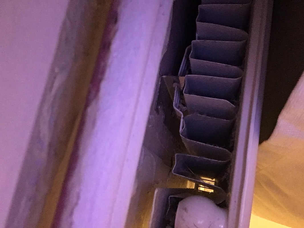
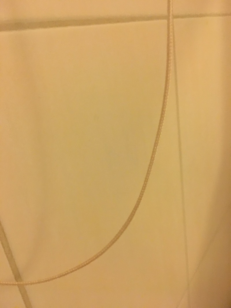
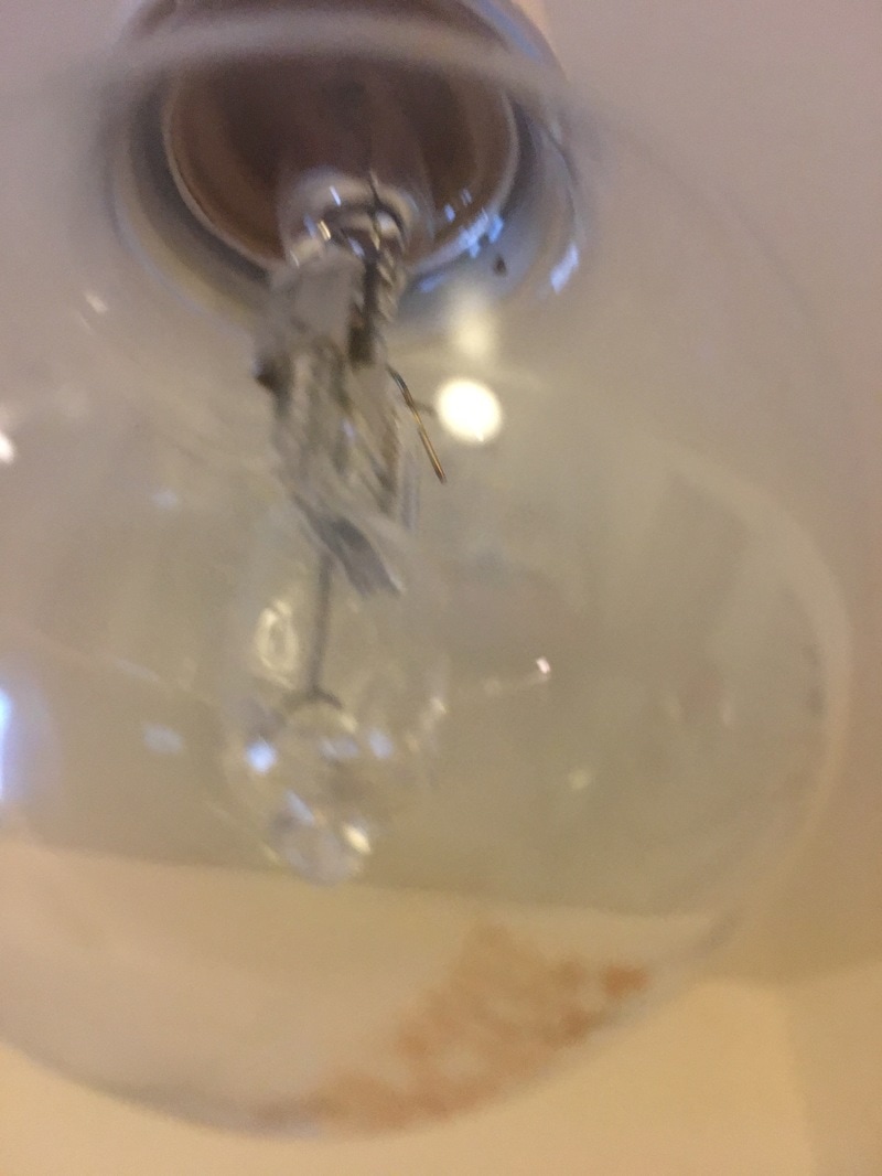
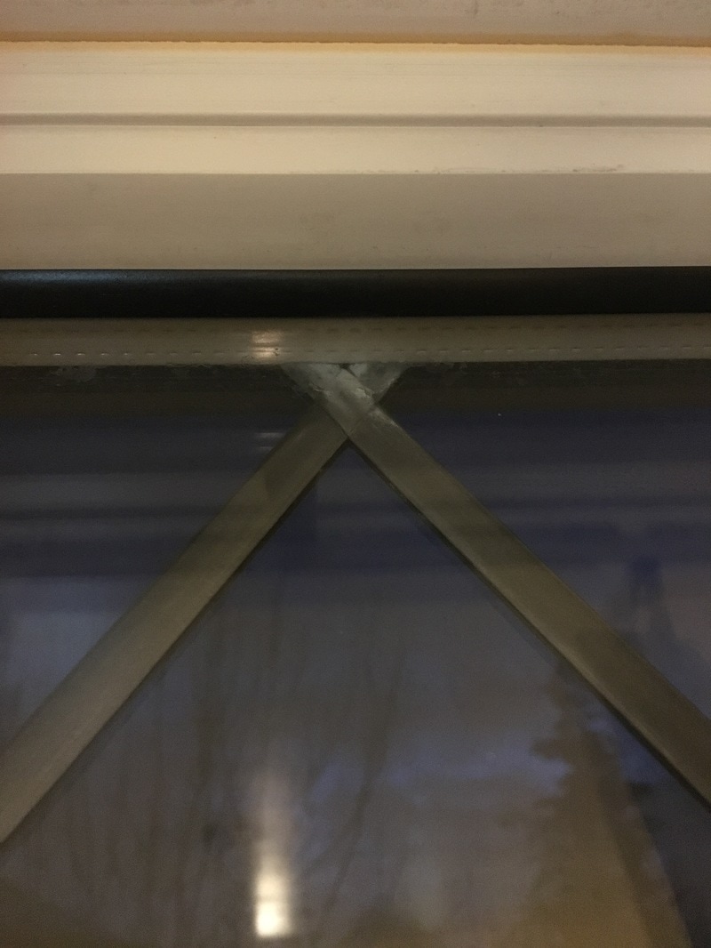
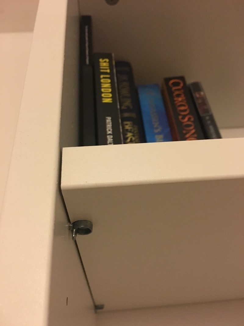
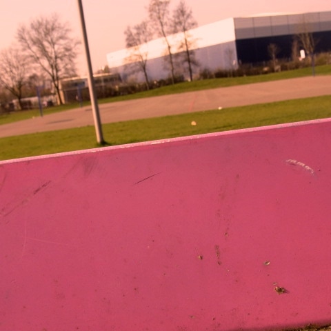
For my homework I was asked to take 20 images of edges around my home . I decided that I was going to try and play with the different textures and shapes around my home and I think I have done this quite succesfully . I found this task slightly less challenging than taking photos off around the school because I had a number off objects in my home that had lots of different shapes on them and also looked to have lots of different textures . I decided to stick inside my home and not take pictures off the outside architecture because I have done this before in previous tasks . I made sure to try and use more reflective materials in my photography in this task because I thought that I could manipulate the images so that you would be able to see the reflections of other edges in the frame of the reflection I was trying to capture. I liked using different materials and textures like the lightbulb and diamond ring to bring something different to my work and make a different response to the theme of edges.I also liked to (again) put certain parts of the image in focus and certain parts out of focus an example being the 12th image I took , I like this image because the background is out of focus which allows you to see all the details and textures of the top of the door . you can also see the geometric , sharp lines of the tiles surrounding the door which I think is a effective way of showing lots of different edges at once. If I was going to try and do these images again I would try and use more colourful materials to make my images have more of a pop of colour in them . However overall I am pleased with this set of homework because I went for a white clean , minimilistic theme and I think it worked - while still making an effective response to the theme of edges.
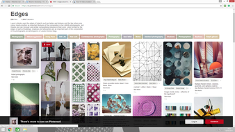
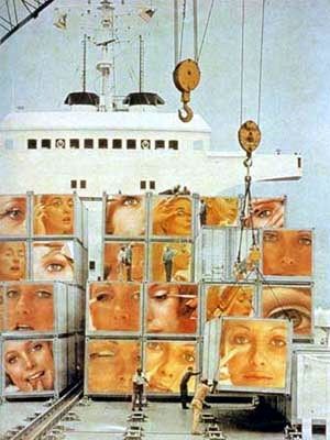
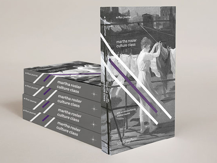
Edges task - For the task this week we were asked to choose an artist from pinterest and study their work , then we had to write an evaluation on their work and produce a set of images inspired by the artist and using techniques that they used in order to create a meaningful response to the task of edges , I chose to study Martha Rosler and I am pleased with the response I made to her work .
Martha Rosler - 12 images
“My art is a communicative act,”
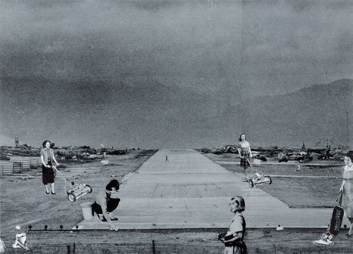
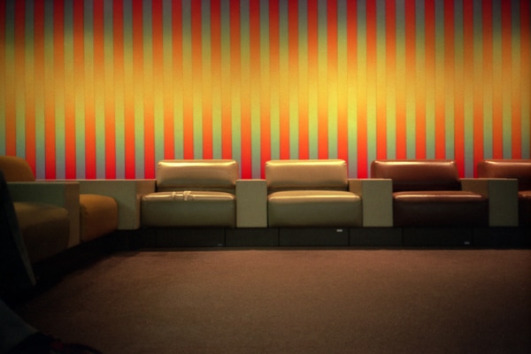
Martha Rosler is an American photographer and artist , her work is one of the most interesting we have studied thus far as she experiments with colour and composition in a way that a lot of photographers don't . Her work does not look like realistic typical photography that we have seen before and whatever she takes she manages to manipulate so it looks almost like pop art. Her images do not seem to fall under a particular theme with lots of different tones and textures to them . An example of this is that in one image Rosler has made the carpet bright and smooth with contrasting dark walls but in another image she has chosen a black and white filter with no colour at all . I would say that her work is a prime example of abstract photography because Rosler has managed to look at her images and change them so that they have a meaning behind them and they can make the viewer think. I like that she has managed to use what the characters are doing in the image to create the mood , an example being the soldiers and people protesting . This image has a lexical field of danger and makes you want to find out what she wanted to translate to you through her work. I enjoyed analysing Martha Rosler because although her work is different , it manages to hold more meaning to me than other photos have .
“My art is a communicative act,”
Martha Rosler is an American photographer and artist , her work is one of the most interesting we have studied thus far as she experiments with colour and composition in a way that a lot of photographers don't . Her work does not look like realistic typical photography that we have seen before and whatever she takes she manages to manipulate so it looks almost like pop art. Her images do not seem to fall under a particular theme with lots of different tones and textures to them . An example of this is that in one image Rosler has made the carpet bright and smooth with contrasting dark walls but in another image she has chosen a black and white filter with no colour at all . I would say that her work is a prime example of abstract photography because Rosler has managed to look at her images and change them so that they have a meaning behind them and they can make the viewer think. I like that she has managed to use what the characters are doing in the image to create the mood , an example being the soldiers and people protesting . This image has a lexical field of danger and makes you want to find out what she wanted to translate to you through her work. I enjoyed analysing Martha Rosler because although her work is different , it manages to hold more meaning to me than other photos have .
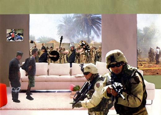
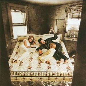
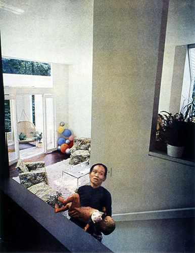
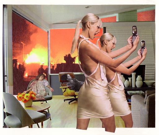
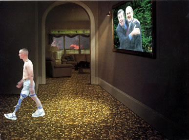
I chose these images by Martha Rosler to study and take inspiration from in order to make my own abstract photography. When I was looking through pinterest her work stood out to me because of its extremely edited quality which shows you bright neon colours but also manages to accentuate the edges in the images so that they seem extremely abstract . I could also see the formal elements very clearly in her work which is something I liked because we have been studying the formal elements a lot in class and I was glad that I could recognize that she had used those techniques in her work . I think all of her images are slightly different and unique and I like how she manages to use people's facial expressions in her work to set the atmosphere of the image , an example of this being when the women are screaming in the 8th image which makes it seem like they are extremely angry and schocked and I think the Rosler has managed to translate the feeling of her images to me using this technique which was something I liked about this set of images as well . The images are sometimes composed so that the edges are directly in front of you so you have to look at them and there is lots of things happening in the background , Rosler does not really use out of focus in her images which I think works for most of these images because you get to see all the bright colours and then while looking at the image you get to see more and more of the edges she has included in her work . I also like how she manages to use texture in her images to create grain or extremely sharp images . Overall I chose Martha Rosler because I think her response to edges is extremely different to other artists I have seen and I like how her images seem extremely edited whilst also having clear defined edges.
12 images inspired by Martha Rosler

These are my 12 images inspired by Martha Rosler , while looking at her work I wanted to take aspects that I liked from it and translate it into my own work . I decided that I would like to play with colour in my images so when editing them I went for a pink theme because I saw that very often Rosler included pink in her work and I thought it had the potential to make my images look unrealistic and abstract . I thought carefully when taking these images because I wanted to take something that would have the best results when edited , one of the main techniques that I used while editing these images was iphoto. I played with the texture of the images and the tint on them , I learned that I could accentuate the pink colour in my images by making the images more warm toned . I think that by making these images more sharp than I usually do I was able to get to get the viewer to see more of the edges that I included in my work and I like that . I would describe these images as abstract because they do not really have very natural colours in them - for example in my 4th image the sky is pink and purple , however I like this because I think that Rosler uses this technique as well and replacing naturalistic colours with abstract ones is something that can make your images stand out more in my opinion. I notice that I have managed to use the formal elements of colour , reptition and texture in my work which is why I think I like how my images turned out. If I could change something about my images I would like to include more of peoples faces in this piece of work as I like how you can use their facial expressions to make a certain atmosphere . Over all though I am pleased with how this task turned out because I think I took equal time in editing and capturing the images so that they turned out like Roslers and with a clear theme.


These 4 images are my favourite four from the set that I took because I managed to position them in the frame the most effectivley so that you can see the edges the most clearly . I also like how in these images the pink theme is the most pronounced an example being in the fourth image the board from the tennis table was pink already so I had a block of pink in the foreground and then the wildlife in the background , all with a very abstract pink taint. I managed to make part of the image out of focus in the 1st image which is something that Rosler does not really do but in photography I have been experimenting more and more with different techniques to make my images more out of focus so I was glad that I could bring some of the techniques I have learned into the task of creating an effective response to Rosler's work. When taking these photos I think I thought the most carefully about what sought of effect my images would have on the viewer and I think that is why I like these 4 images the best. I think these images show use of the formal elements the most clearly as the have good compostition , repitition and texture in them . These images compare with the other images I took because to me I can see the most clearly the techniques I used in my work and I think they are the most exaggerated and have the clearest edges which was some of the first things I noticed in Rosler's work . I overall like how the formal elements contrast and work together the best in these images to create work that is abstract and unique but also follows Rosler's theme and tehniques so that is why I like these 4 images the best.
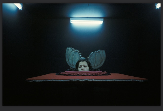
Dolores Murat -“Dolores Marat is to photography what Edith Piaf is to the French song''
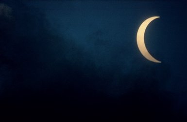
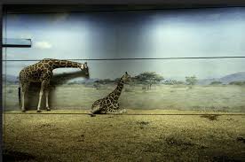
In class we studied Dolores Marat's work and brainstormed what we could see and what formal elements we identified in her work . Whilst looking at the pictures I could see that Marat rarely includes bright colours in her work and nearly everything is muted and softened . I also noticed that in her work she chooses focus on one particular object for example the moon or the man lying on the floor , this is very different to Martha Rosler who has lots going on in her images and includes neon colours . Rosler has a very clear theme and uses certain formal elements such as repetition ( use of dark colours) , geometric shapes (shapes on floor and on giraffes) and also composition (placing one object in the foreground and having a minimalistic background)
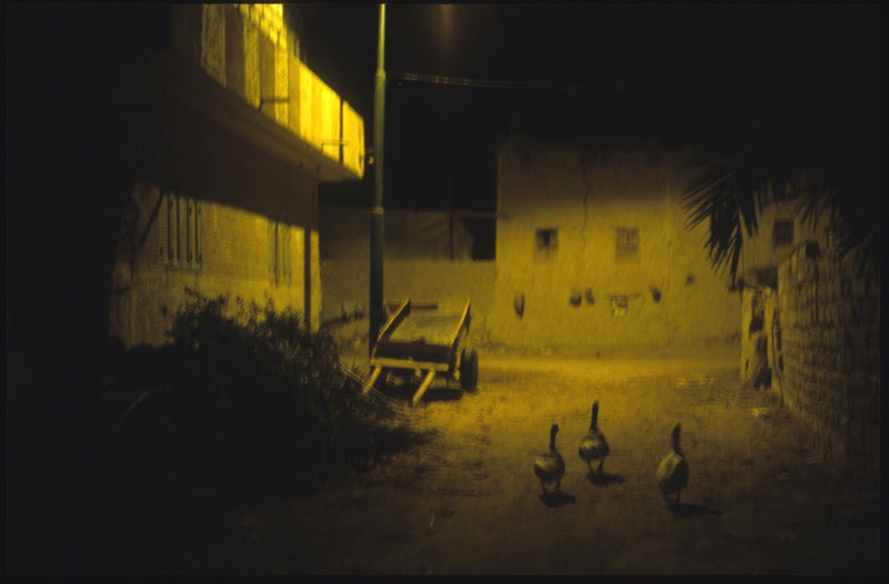

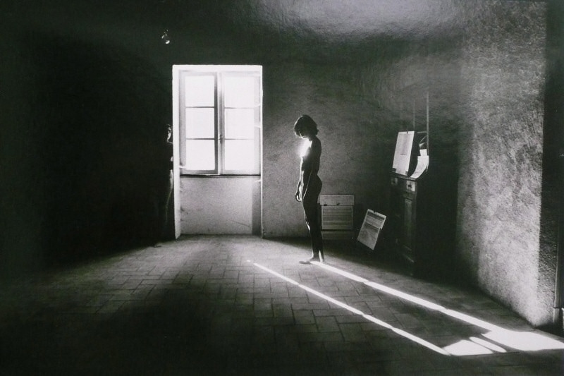
These are 12 images inspired by Dolores Marat
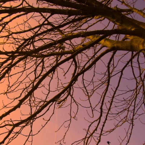
Marat's work stood out to me because of the lack of colour in it but also because she has managed to accentuate all the edges through nature or man made objects . Marat's work is very inspired by gothic and grunge themes and I think that if you put her work all in the same place in a gallery you would be able to see a connection between her pieces of photography. Her images are abstract and normally don't have much light round the edges so they have an almost pinhole photography look to them , Marat's work uses lots of shadows which create good edges in her work and give her work a more abstract theme . When trying to create a good response to her work I studied all of these techniques and saw that in order to achieve the look that Marat has I would need to edit my images to make them darker and give them more of an isolated feel .I used a different editing app later on in order to achieve Marat's dark filter quality and I wonder what techniques and processes she uses to make her work fit into a theme and make all the images play with the same textures and colours .
Marat's work stood out to me because of the lack of colour in it but also because she has managed to accentuate all the edges through nature or man made objects . Marat's work is very inspired by gothic and grunge themes and I think that if you put her work all in the same place in a gallery you would be able to see a connection between her pieces of photography. Her images are abstract and normally don't have much light round the edges so they have an almost pinhole photography look to them , Marat's work uses lots of shadows which create good edges in her work and give her work a more abstract theme . When trying to create a good response to her work I studied all of these techniques and saw that in order to achieve the look that Marat has I would need to edit my images to make them darker and give them more of an isolated feel .I used a different editing app later on in order to achieve Marat's dark filter quality and I wonder what techniques and processes she uses to make her work fit into a theme and make all the images play with the same textures and colours .
16 photos inspired by Dolores Murat -
In these images I have tried to apply Dolores Murat's techniques to my work . I found this task hard because when studying Dolores Murat's work I thought that many of the techniques that she uses come into play when she edits and it is mainly in the editing where you can make your work look like it has her stamp on it . However I think that when taking these images I was able to think about things such as the composition and play of light in order to have the best images I could so that the editing would be easier .From this work I have learned that Dolores Murat must put thought into what she takes before she captures the image as there is only so much editing you can do to change your images .I thought about what was in the frame and also what shadows were in the image . An example of this is in the 9th image I have looked at what I was taking and then I saw that the shadows were coming from only the persons feet and showed the most on the floor ,so I moved the camera down and captured the image like this , I also learned that in iphoto you can change the exposure and shadows sliders which can make the shadows in your image stand out much more. I would say these photos are abstract as they only parts of the objects i.e the persons shoes or half of the window so that you can focus on one thing and then gradually notice the edges in the background . If I were going to change these images slightly I would like do do more techniques that we noticed in Murat's work like the gothic , limited colour palette, and grainy themes but overall I think this was a good attempt at replicating her techniques and work.
My edited images -
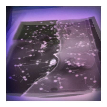
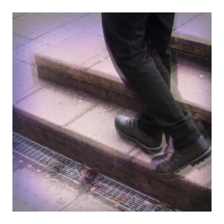
These four images are a few examples of images that I have edited to try and have a Dolores Murat theme to them , in these images I can see that I have managed to change the tints and textures of the images .If I could use certain words to describe these images I would use : soft focus , dark and extreme shapes . These type of images are not something I usually attempt because these images were edited to have very distorted edges and a vignette around them , while adding the vignette (which is a technique of Murats) , I decided that I could make a better response to Dolores Murats work by making the vignette blue and faded out . In these images the space is represented by me cropping the images so that the images could have a single object focus much like Murat's work. The formal elements come into play in these images because there is repetition in the blurring of the edges and also how my images have a slight grainy texture. I decided that in the 4th image I would try and accentuate the grey sky by sliding down the shadows slider so that my image could seem more gloomy and lonely as this is a technique that we brainstormed while looking at Murat's work . Overall I enjoyed editing these images because I think their one image focus makes them striking and I think they compare well with the original stimulus . I managed to explore more editing applications than just iphoto to make the best response I could .
Some more edited images :
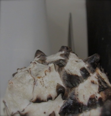
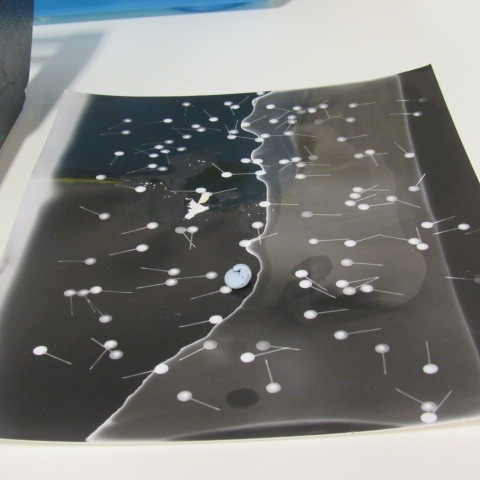
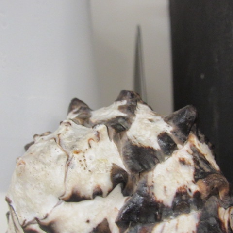
These are some more of the images I have edited . With these images I went for more of a dark and less distorted theme , I noticed that in Murat's work she uses lots of dark tones to make her images seem more gothic and lonely, I think they make a good response to Murat's work as they follow her theme clearly and have cool tones and blurred edges just like she does . I have learned lots from Murat's work about how she uses play of light and must edit her photos to give them a gloomy effect. These images compare with others I have done because they do not feature bright colours which was challenging for me as I had to think of more ways to make my work stand out . I would say that the genre of these photos are not really abstract because you can clearly see what features in the images and I have not made abstract objects rom every day objects . The formal elements that I would say are important in this image are : shadows , edges because the images have clear geometric lines repeating through the images sometimes blurred out using editing which is something I noticed Murat does. I would say that these images are different from real life because they have very dark tones and shadows and nearly all of them have purple and blue hues in them. There are lots of 3d shapes in these images especially on the shell and I think the dark tones make the sides of the edges more pronounced which overall makes these images a good response to Murat's work .
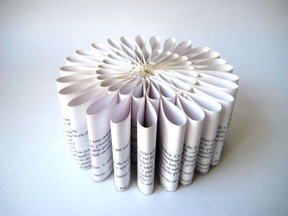
Planning my own lesson

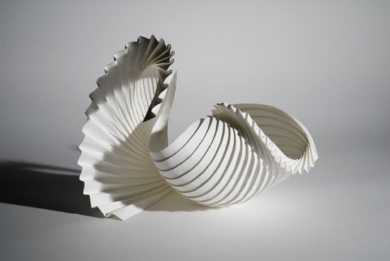
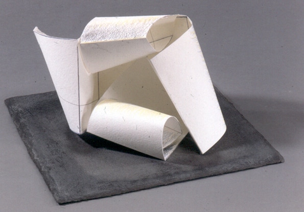
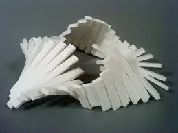
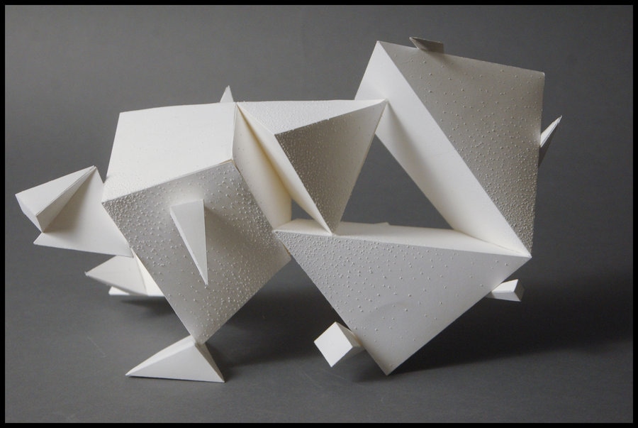
For a task we were asked to plan our own lesson and to follow the assessment objectives to create a piece of work that can feature a 3d shape sculpture. We have to research , improve and perfect and then evaluate. Here is some of the research I did , I wanted to in the end create a sculpture made of card and some images that I have edited I thought this would be a good response to the theme of edges my images are edited to have lots of shapes in the first place but also I would like to make the sculpture into a geometric 3d shape which would accentuate the edges further. For research I have looked at artists who make 3d sculptures out of paper to gain inspiration and I have also looked at how photography has been used in sculpture making so I have an idea of how I can make the two themes relate . My plan is to take lots of abstract images of edges all with a common theme of colour and abstraction I will then print them and stick them onto card so that the sculpture will be stronger and last longer , I will construct the sculpture into an abstract geometric shape and I will photograph it and write an evaluation about they final piece on my site . I think the research I have done such as reading about artists who have worked with sculptures and how they manage to make their work stand out will help me because I will be able to take inspiration from them and use some of their techniques to make something I have not done before . I would like to do a 3d sculpture because this is something new and challenging for me and will expand the types of work I do. I would like my work to turn out like the images above but I would develop on those pieces of work by instead of having just plain white paper I will have the images making up parts of the shape .
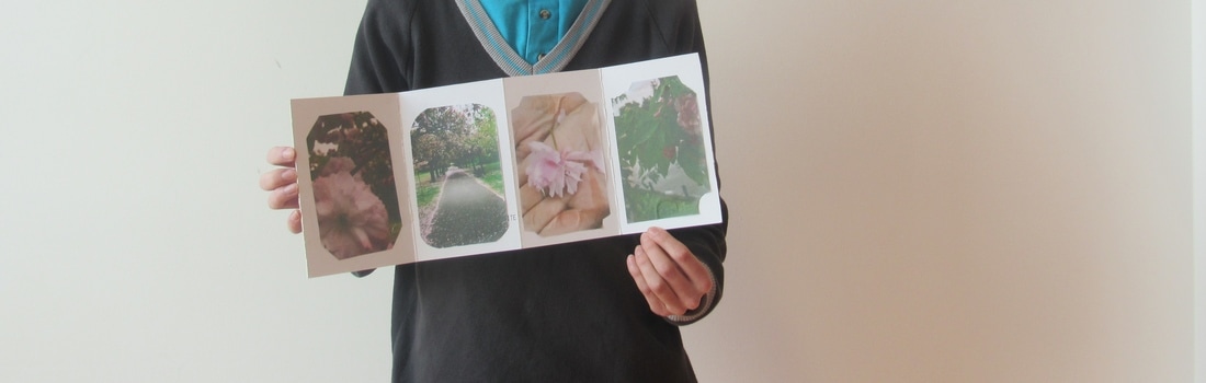
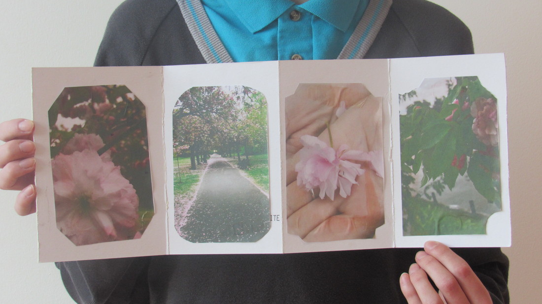
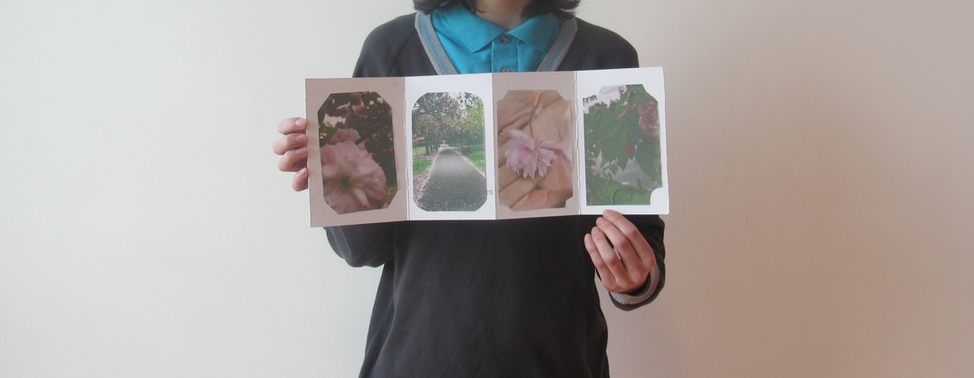
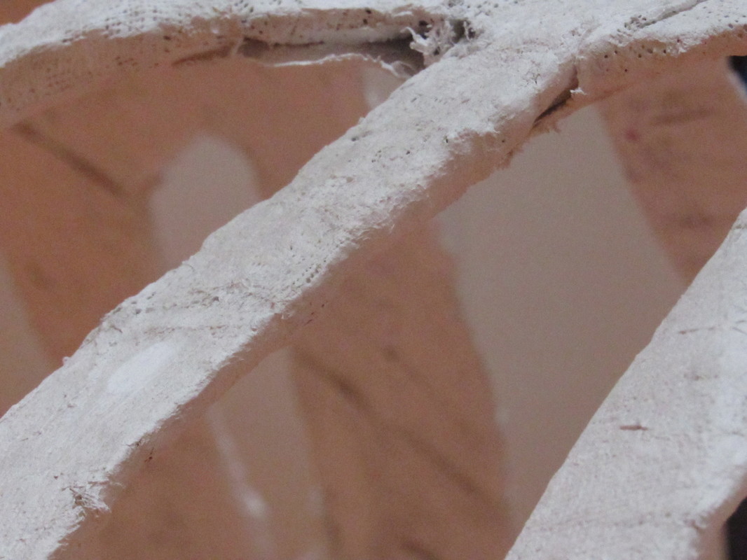
Final Piece 2 -

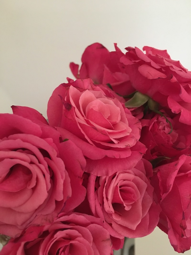
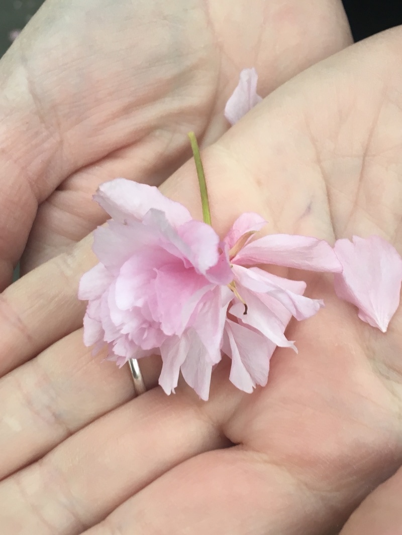
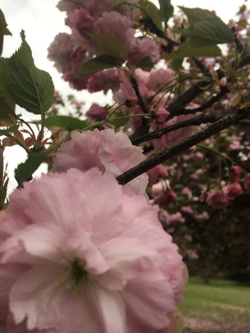
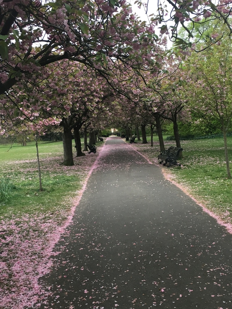
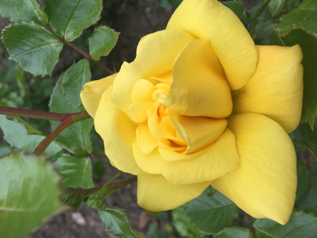
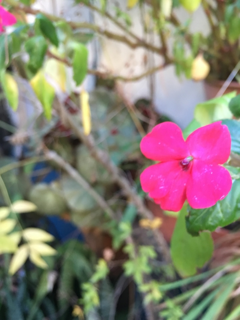
These are the images I will be using for my final piece . For my final piece I decided to do the edges of nature - particularly flowers . I chose flowers because I they grow in a range of colours and there are very different edges on each flower so I would be able to get a range of content for my final piece . I have decided to create a sculpture with straight edges where you can see all of my photos . I then decided on a dressing screen shaped sculpture because it has clear edges an displays my work clearly . I think through this topic I I can show what techniques I have learned through the topic of edges and how I can manipulate these images so they look professional. I have taken ideas from pinterest and artists like Johannes Hulsch and Simosh to make the best work I can .
The equipment I will be needing for this task is :
1x - camera
1x-piece of card
1x-glue or glue gun
6x-printed images
1x - camera
1x-piece of card
1x-glue or glue gun
6x-printed images
Final Piece evaluation -
For my final piece I have researched many artists such as Heather Angel , Frans Lanting and also Elliot Porter . I have selected parts of their work that I like an have decided to include them in my final piece , I discovered most of the artists that I like through scrolling pinterest and making my own pin boards of what I like and don't like .From studying artists work I have discovered that I now like more colour photographs than black and white images which is something new for me , I like looking at the images they make and seeing what equipment they use to get the best image possible . I explored themes of colour , nature and shape and form. When I first began exploring the theme I thought that I would struggle to make my work interesting and that it may be hard to find a good range of processes to edit my work with . My ideas changed as I explored the theme because I saw how photographers edit their work and how I could make my work have a common theme which I have not explored with before . Although I am not overly pleased with how my final piece came out I think that I have explored the Threshold Concept of '' photographs are not fixed in meaning ; context is everything , I have explored this by seeing throughout the process of making my final piece that people can interpret my work in any way that I want and that is something I find very interesting . I can only make my work in a certain way and show my interpretation through my art but my work is open to anyones ideas and people can analyse my work how they want. The experiments I have carried out are - changing the editing programs I use four times , taking lots of different series of images and also trying to refine my work as much as possible . In my final piece I managed to make the images look good and stand out with their colour but along the process certain things changed such as the fact that I was originally going to make a cuboid shape for a sculpture but then changed to a dressing screen because I thought it would present my work in a more simple way. I find making final out comes very challenging as I do not feel that I am best at physically making sculptures and making my work the most polished but I did try my best and I put a lot of thought into my work. I was hoping to create a large dressing screen but I made a smaller one and I think `I should have made the photos with real photographic paper so that my work would be more neat. I do however think I have explored the theme well because I have thought about accentuating the edges in my work as much as I could in order to make the best response I could. If I had had more time I would like to have my work bigger and more neat so that it looks more like professional art work . My work is personal because I have used my own personal images in my work taken outside of school which gives the viewer an insight in to how I view nature . I hope this will translate to the viewer . During my work I have refined it and looked at what I wanted the final piece to look like , things such as measuring the card to make sure its equal , cutting the images into shapes and reprinting the images again in higher resolution mean that I have tried to refine my work as much as possible .I hope that my viewers can understand my intentions and see what formal elements I have included so that my work is as meaningful as I want it to be.
For my final piece I have researched many artists such as Heather Angel , Frans Lanting and also Elliot Porter . I have selected parts of their work that I like an have decided to include them in my final piece , I discovered most of the artists that I like through scrolling pinterest and making my own pin boards of what I like and don't like .From studying artists work I have discovered that I now like more colour photographs than black and white images which is something new for me , I like looking at the images they make and seeing what equipment they use to get the best image possible . I explored themes of colour , nature and shape and form. When I first began exploring the theme I thought that I would struggle to make my work interesting and that it may be hard to find a good range of processes to edit my work with . My ideas changed as I explored the theme because I saw how photographers edit their work and how I could make my work have a common theme which I have not explored with before . Although I am not overly pleased with how my final piece came out I think that I have explored the Threshold Concept of '' photographs are not fixed in meaning ; context is everything , I have explored this by seeing throughout the process of making my final piece that people can interpret my work in any way that I want and that is something I find very interesting . I can only make my work in a certain way and show my interpretation through my art but my work is open to anyones ideas and people can analyse my work how they want. The experiments I have carried out are - changing the editing programs I use four times , taking lots of different series of images and also trying to refine my work as much as possible . In my final piece I managed to make the images look good and stand out with their colour but along the process certain things changed such as the fact that I was originally going to make a cuboid shape for a sculpture but then changed to a dressing screen because I thought it would present my work in a more simple way. I find making final out comes very challenging as I do not feel that I am best at physically making sculptures and making my work the most polished but I did try my best and I put a lot of thought into my work. I was hoping to create a large dressing screen but I made a smaller one and I think `I should have made the photos with real photographic paper so that my work would be more neat. I do however think I have explored the theme well because I have thought about accentuating the edges in my work as much as I could in order to make the best response I could. If I had had more time I would like to have my work bigger and more neat so that it looks more like professional art work . My work is personal because I have used my own personal images in my work taken outside of school which gives the viewer an insight in to how I view nature . I hope this will translate to the viewer . During my work I have refined it and looked at what I wanted the final piece to look like , things such as measuring the card to make sure its equal , cutting the images into shapes and reprinting the images again in higher resolution mean that I have tried to refine my work as much as possible .I hope that my viewers can understand my intentions and see what formal elements I have included so that my work is as meaningful as I want it to be.
Pictures of my final piece -