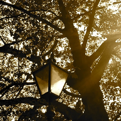
For my extended project I chose to study openings , I chose to study openings because I think that I can use lots of different techniques and processes and will be able to make my work look intriguing to the viewer . With openings you can use a range of textures and techniques to develop your experiments which will be more interesting . I think that I will be able to develop better ideas if I study the artists who create photography openings because their work is unique and uses a different approach with covering parts of images or only exposing the part you want the viewer to focus on , which allows you to control what the viewer sees and what they don't which in my opinion makes it easier to understand what the artist wants you to know .
Brainstorm - The task to b
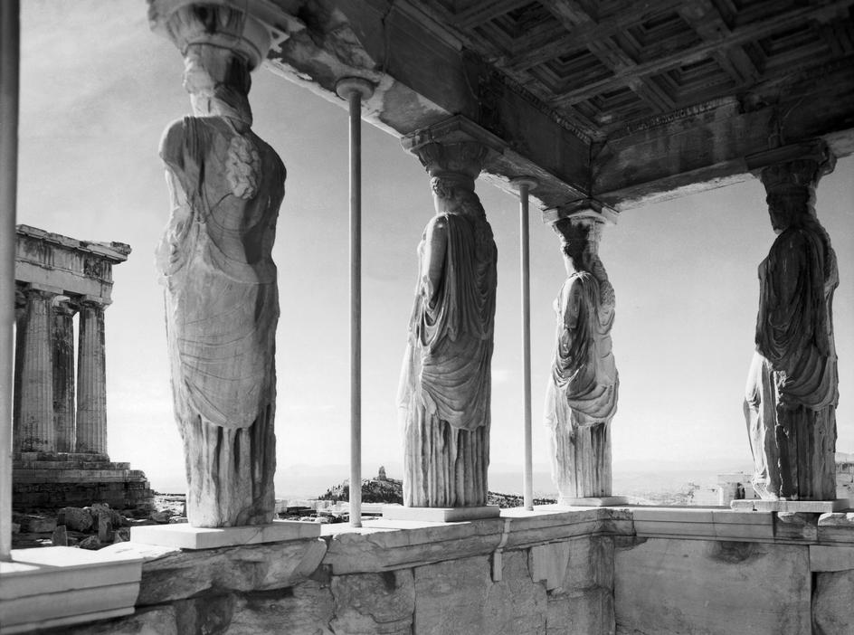
Here are some of the other pieces of work I have looked at . Examples of artists I have looked at are : Lee Friedlander , Uta Barth , Lucio Fontana and Shizuka Yokomizo .
Artist research - Lucio Fontana
Photographer Lucio Fontana
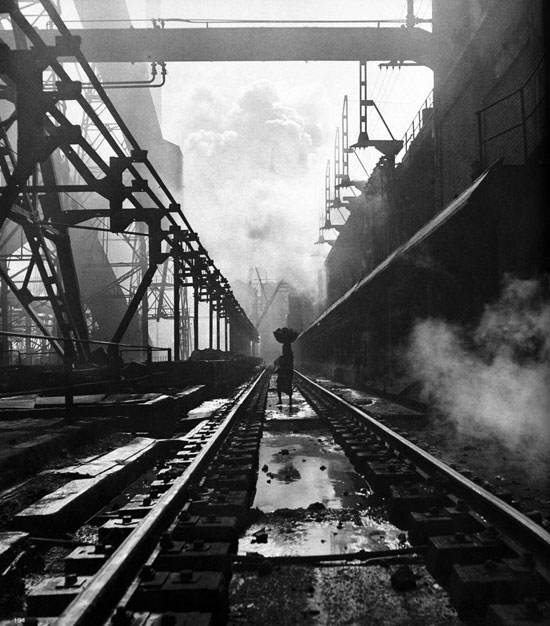
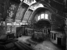
Artist research - Werner Bishcof
Werner Bishcof is a Sweedish artist and photographer who is known for his black and white photos of openings , I chose his work not just because it is of openings but because I was interested in the subject matter of the images . I think they are extremely interesting because they feature a lot of architecture and people . The people in the images are often expressing themselves with their faces or their body language which I think captures the viewers attention more than just photos of trees or wildlife . I notice that in Bishcof's work he often takes images from lots of different angles and they are often framed in lots of different ways which I think makes his work effective because every image is different and every image tells a different story . In these images I recognize that the photographer has thought about each image before he has taken them because in every image the composition is different and he manages to capture the different subject matters as they do something or are about to do something , an example of this being in the 10th image where a child is crying and leaning out of a window . I think this is a very effective image because it portrays emotion to the viewer and still shows you the opening of the image which is a window . Through research I have leaned that the artist plays with lots of different elements in his work and does not stick to one type of photography which is something I am trying to achieve in my work because I would like to try lots of different ways of taking images for my final piece .
Werner Bishcof is a Sweedish artist and photographer who is known for his black and white photos of openings , I chose his work not just because it is of openings but because I was interested in the subject matter of the images . I think they are extremely interesting because they feature a lot of architecture and people . The people in the images are often expressing themselves with their faces or their body language which I think captures the viewers attention more than just photos of trees or wildlife . I notice that in Bishcof's work he often takes images from lots of different angles and they are often framed in lots of different ways which I think makes his work effective because every image is different and every image tells a different story . In these images I recognize that the photographer has thought about each image before he has taken them because in every image the composition is different and he manages to capture the different subject matters as they do something or are about to do something , an example of this being in the 10th image where a child is crying and leaning out of a window . I think this is a very effective image because it portrays emotion to the viewer and still shows you the opening of the image which is a window . Through research I have leaned that the artist plays with lots of different elements in his work and does not stick to one type of photography which is something I am trying to achieve in my work because I would like to try lots of different ways of taking images for my final piece .
Werner Bishcof images

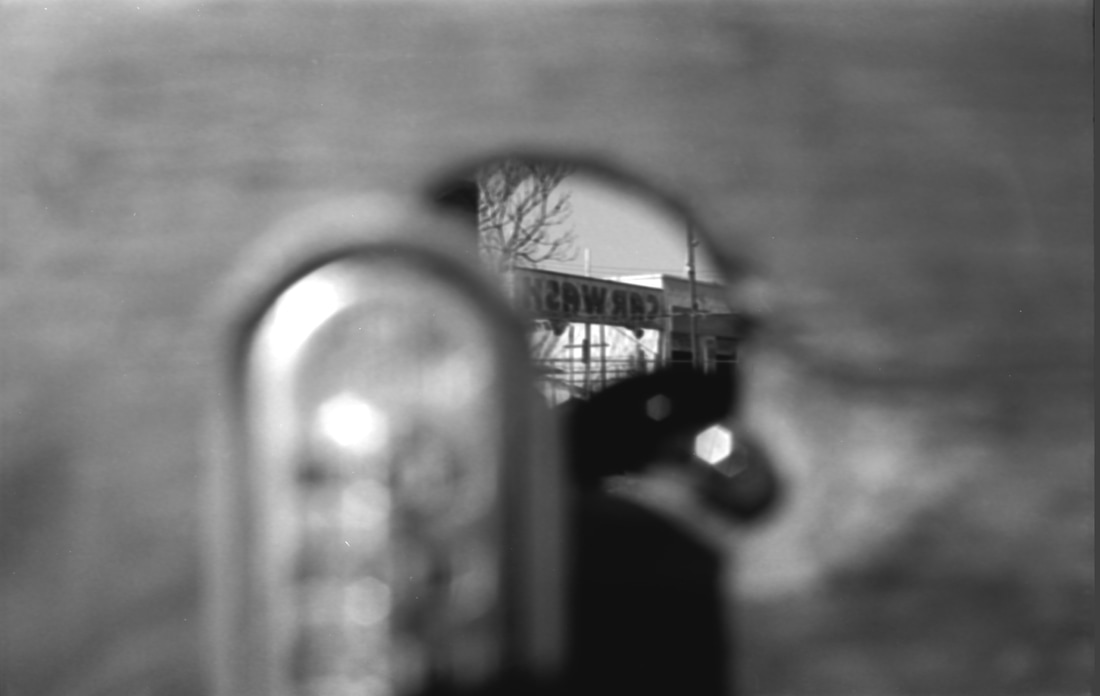
Artist research - Lee Friedlander
Lee Friedlander is an artist and photographer born in 1934 , he has done work with openings and is famous for his pictures below . I have studied his work before when researching on pinterest and notice that his images all have a similar theme and focus mainly on reflections and edges . Not much of Friedlanders work has colour in it and he plays with certain formal elements such as : repetition, composition and play of light which I think all make his work more succesful and make it easier for the audience to see the opening and the message of the image more clearly . My favourite image of his is the first one below where he does not focus on anything but the actual opening and parts of the image are out of focus to make the opening stand out even more , this image is also my favourite because he has made it easy to see the texture of the opening . Friedlander has also managed to pull the viewer in by showing only a glimpse of what is behind the opening . I think also what makes Friedlanders work a good response to openings is that he does not make his work too busy and focuses on one thing at a time , I think his play of light makes his work very effective because he shows the shadows and the edges near the shadows . This makes his work seem simplistic but when you get a better look you are able to see all of the different techniques that he has used and interpret his work differently to someone else . I think these factors make his work and effective response to the theme of openings.
Lee Friedlander is an artist and photographer born in 1934 , he has done work with openings and is famous for his pictures below . I have studied his work before when researching on pinterest and notice that his images all have a similar theme and focus mainly on reflections and edges . Not much of Friedlanders work has colour in it and he plays with certain formal elements such as : repetition, composition and play of light which I think all make his work more succesful and make it easier for the audience to see the opening and the message of the image more clearly . My favourite image of his is the first one below where he does not focus on anything but the actual opening and parts of the image are out of focus to make the opening stand out even more , this image is also my favourite because he has made it easy to see the texture of the opening . Friedlander has also managed to pull the viewer in by showing only a glimpse of what is behind the opening . I think also what makes Friedlanders work a good response to openings is that he does not make his work too busy and focuses on one thing at a time , I think his play of light makes his work very effective because he shows the shadows and the edges near the shadows . This makes his work seem simplistic but when you get a better look you are able to see all of the different techniques that he has used and interpret his work differently to someone else . I think these factors make his work and effective response to the theme of openings.
Lee Friedlander images
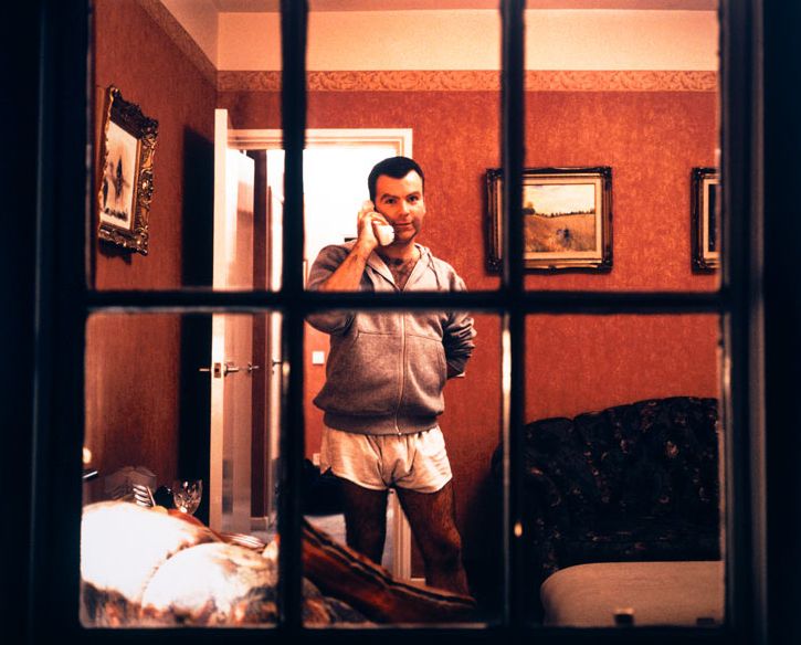
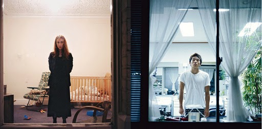
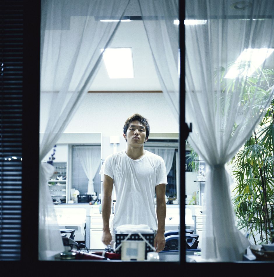
Artist research - Shizuka Yokomizo
Shizuko Yokomizo is a Japanese photographer who is very able to translate her intentions through photography and film . I am interested in Yokomizo's work because she is from a different culture to me and I was keen to see how she would interpret the theme of openings and make it her own . I would say that Yokomizo's work is not my favourite because I think that she has interpreted the subject of openings more literally : for example capturing images of actual openings like windows , however I find her work intriguing because of the way she uses light and structure . In the first image there are lots of different tones and there is the dark window frame and them the bright light from behind and also the strong red background . I think possibly Yokomizo has used an editing program to make her work have more contrast in tones but I am curious about how she was positioned to capture these images if she managed to take all of them in the city of Tokyo . I can see in her work that she represents space very well . By placing the person in the middle and the opening around them she manages to draw your eyes to the person first and then make you notice the edges around it . I can see that her work would go under many themes such as : architecture , edges , openings because she uses a lot of different formal elements in her work . I like this artists work because I can see from research that she is very versatile in her style of work and also because her work is very polished and abstract .
Shizuko Yokomizo is a Japanese photographer who is very able to translate her intentions through photography and film . I am interested in Yokomizo's work because she is from a different culture to me and I was keen to see how she would interpret the theme of openings and make it her own . I would say that Yokomizo's work is not my favourite because I think that she has interpreted the subject of openings more literally : for example capturing images of actual openings like windows , however I find her work intriguing because of the way she uses light and structure . In the first image there are lots of different tones and there is the dark window frame and them the bright light from behind and also the strong red background . I think possibly Yokomizo has used an editing program to make her work have more contrast in tones but I am curious about how she was positioned to capture these images if she managed to take all of them in the city of Tokyo . I can see in her work that she represents space very well . By placing the person in the middle and the opening around them she manages to draw your eyes to the person first and then make you notice the edges around it . I can see that her work would go under many themes such as : architecture , edges , openings because she uses a lot of different formal elements in her work . I like this artists work because I can see from research that she is very versatile in her style of work and also because her work is very polished and abstract .
Shizuka Yokomizo images

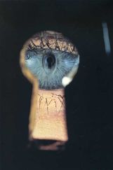
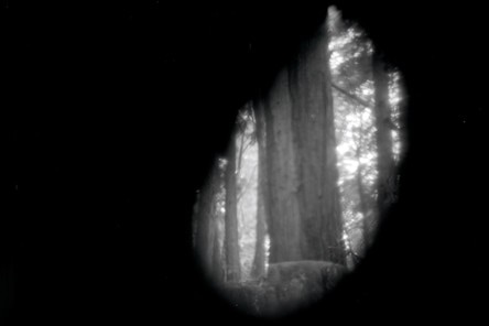
Photograph review - Irving Penn '' eye in the keyhole''
I chose to review this image because it is a very simple idea that combines all of the formal elements and looks very minimilistic. I like the colours that feature in this image as the dark background makes the blue look even more intense in the image and frames the eye extremely well . I think this image includes the theme of reflections because in the eye you can see the reflection of the camera , I like this because I noticed this after looking at the image for a while which I like because when you look at images and you gradually see more of what is in the image I find interesting. I think this image relates to the theme of openings because it is a prime example of an opening (the keyhole image has been done a lot) and also includes colour and edges which in my opinion shows that the photographer has a lot of skill. I can imagine that the photographer had to bend down to capture this image so that everything in the frame was to do with the opening and the reflections in the eye.
I chose to review this image because it is a very simple idea that combines all of the formal elements and looks very minimilistic. I like the colours that feature in this image as the dark background makes the blue look even more intense in the image and frames the eye extremely well . I think this image includes the theme of reflections because in the eye you can see the reflection of the camera , I like this because I noticed this after looking at the image for a while which I like because when you look at images and you gradually see more of what is in the image I find interesting. I think this image relates to the theme of openings because it is a prime example of an opening (the keyhole image has been done a lot) and also includes colour and edges which in my opinion shows that the photographer has a lot of skill. I can imagine that the photographer had to bend down to capture this image so that everything in the frame was to do with the opening and the reflections in the eye.
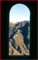
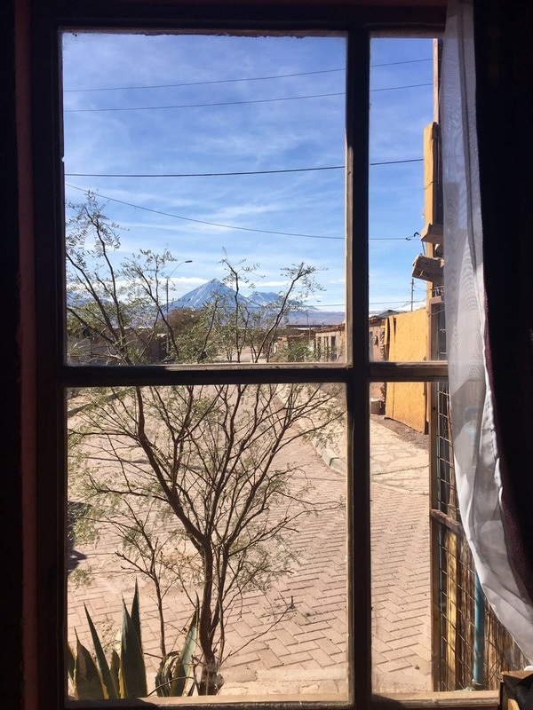
Photograph review - Karsten Peterson '' a view through an opening in the watch tower''
This image is very intriguing to me because its framing is almost like a dark shadow and in contrast there is a very bright sunny view of the mountains and sky . Although this image could be considered natural world because it features nature I think this image is a good response to the theme of openings because there are shapes , colours , repetition and shadows . The composition of this image is interesting because the framing of the image is a shape in itself there are also lots of other shapes in the image and I think this goes well with the textures in the image and, in turn , makes it even more abstract. The light is focused only in the centre which makes the background look even more intense , I think that I am going to try and translate some of this into my own work because I need to improve my skills in making simple effective work and also looking at how my work is framed and how it will look when its on my website . I noticed with this artist as well that they have a specific theme that makes their work unique and I want to use this is in my own work so that my website looks like I have used some of the techniques I have seen artists using.
This image is very intriguing to me because its framing is almost like a dark shadow and in contrast there is a very bright sunny view of the mountains and sky . Although this image could be considered natural world because it features nature I think this image is a good response to the theme of openings because there are shapes , colours , repetition and shadows . The composition of this image is interesting because the framing of the image is a shape in itself there are also lots of other shapes in the image and I think this goes well with the textures in the image and, in turn , makes it even more abstract. The light is focused only in the centre which makes the background look even more intense , I think that I am going to try and translate some of this into my own work because I need to improve my skills in making simple effective work and also looking at how my work is framed and how it will look when its on my website . I noticed with this artist as well that they have a specific theme that makes their work unique and I want to use this is in my own work so that my website looks like I have used some of the techniques I have seen artists using.
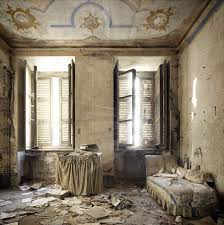
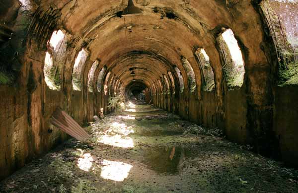
Henk van Rensbergen Openings
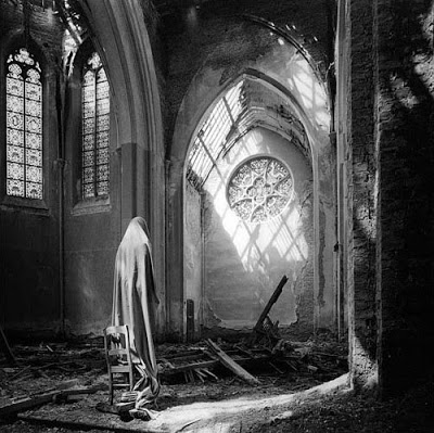
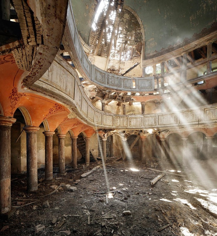
Belgium born photographer , Van Rensgergen takes lots of photographs of openings in abandoned buildings , what drew me to his work is that he has managed to capture so much different texture and shadows in the buildings even though they are unused and unwanted . In his photographs I can see that he does a mixture of colour and black and white photography and colour photography and his images seem to all seem to fit together . If I was going to use words to describe the artists images I would say : vintage , textured , shadows and play of light . The shadows are very prominent in all of the artists work and I like this because it creates shapes on the surrounding areas of the image . In these images space is often represented by having the openings repeating in the background and the texture in the foreground something else I have noticed about this artists work is that they often feature reflections in mirrors and door ways which I think is an effective technique because it adds light to the image and gives it dimension . I would describe this artists work as almost naturalistic because the images feel very light and airy and no people are featured in them , you could say that this artists work is naturalistic but features the natural world when it is decaying which I think gives these photos a gloomy feel . I think that this artist made these photographs by just taking them with a high resolution camera and then putting some of them in black and white , I like that this artists work is extremely professional and features so many of the formal elements because this means that the artists work features so much more than just the openings .
Belgium born photographer , Van Rensgergen takes lots of photographs of openings in abandoned buildings , what drew me to his work is that he has managed to capture so much different texture and shadows in the buildings even though they are unused and unwanted . In his photographs I can see that he does a mixture of colour and black and white photography and colour photography and his images seem to all seem to fit together . If I was going to use words to describe the artists images I would say : vintage , textured , shadows and play of light . The shadows are very prominent in all of the artists work and I like this because it creates shapes on the surrounding areas of the image . In these images space is often represented by having the openings repeating in the background and the texture in the foreground something else I have noticed about this artists work is that they often feature reflections in mirrors and door ways which I think is an effective technique because it adds light to the image and gives it dimension . I would describe this artists work as almost naturalistic because the images feel very light and airy and no people are featured in them , you could say that this artists work is naturalistic but features the natural world when it is decaying which I think gives these photos a gloomy feel . I think that this artist made these photographs by just taking them with a high resolution camera and then putting some of them in black and white , I like that this artists work is extremely professional and features so many of the formal elements because this means that the artists work features so much more than just the openings .
Henk van Rensbergen images
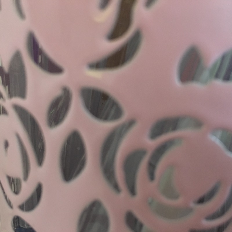
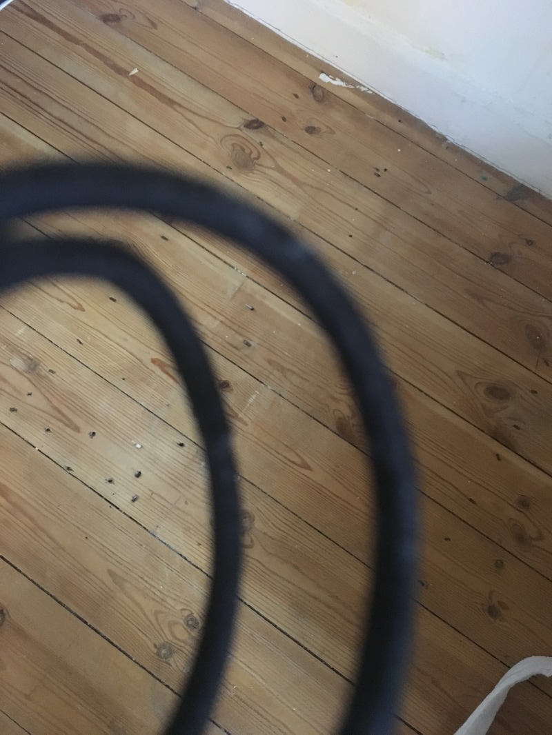
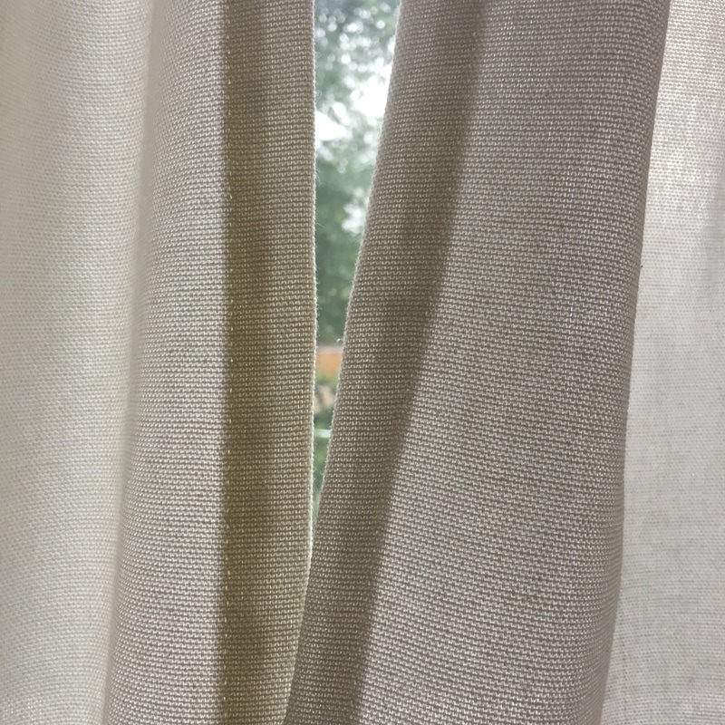
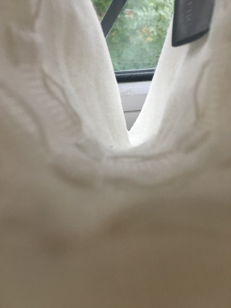
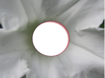
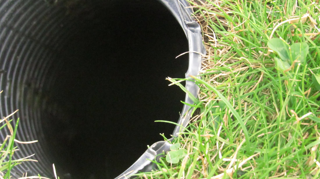
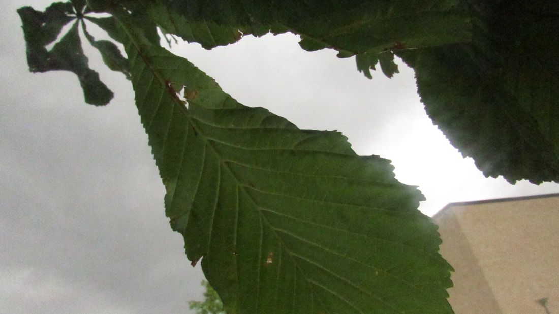
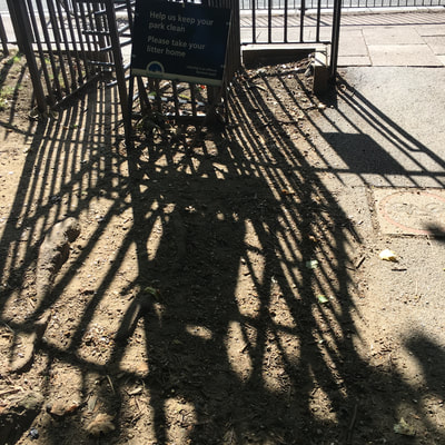
My 20 images of openings
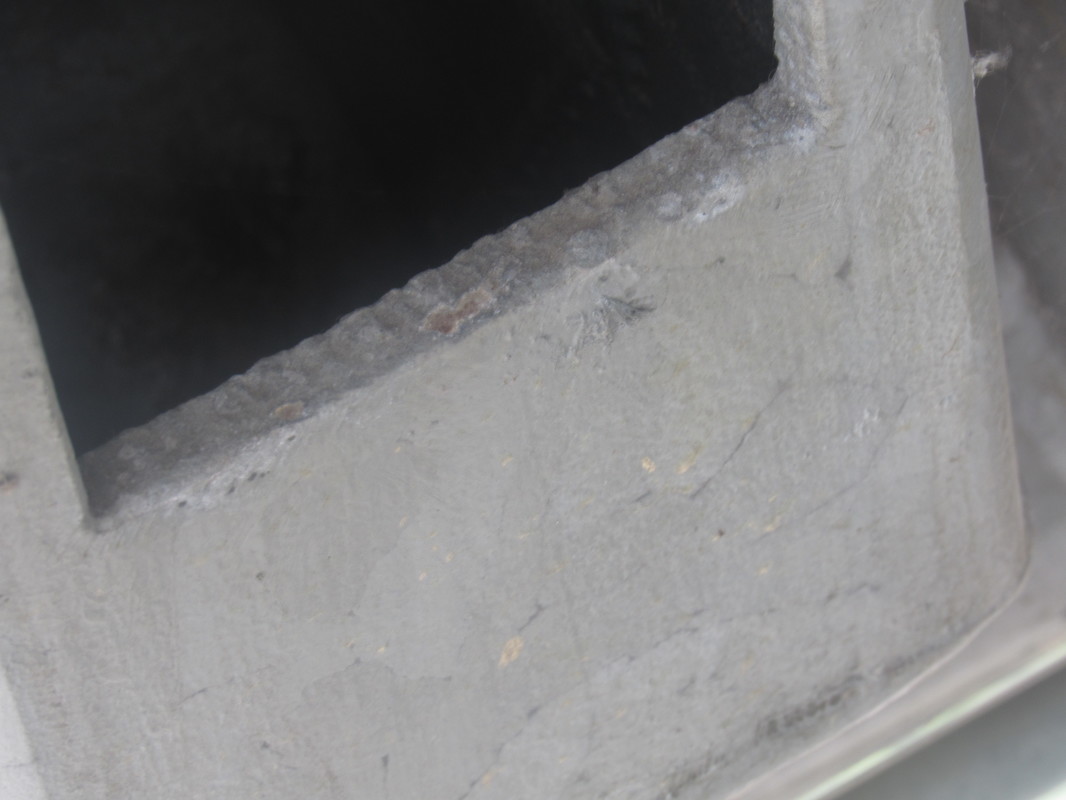
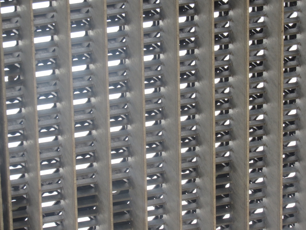
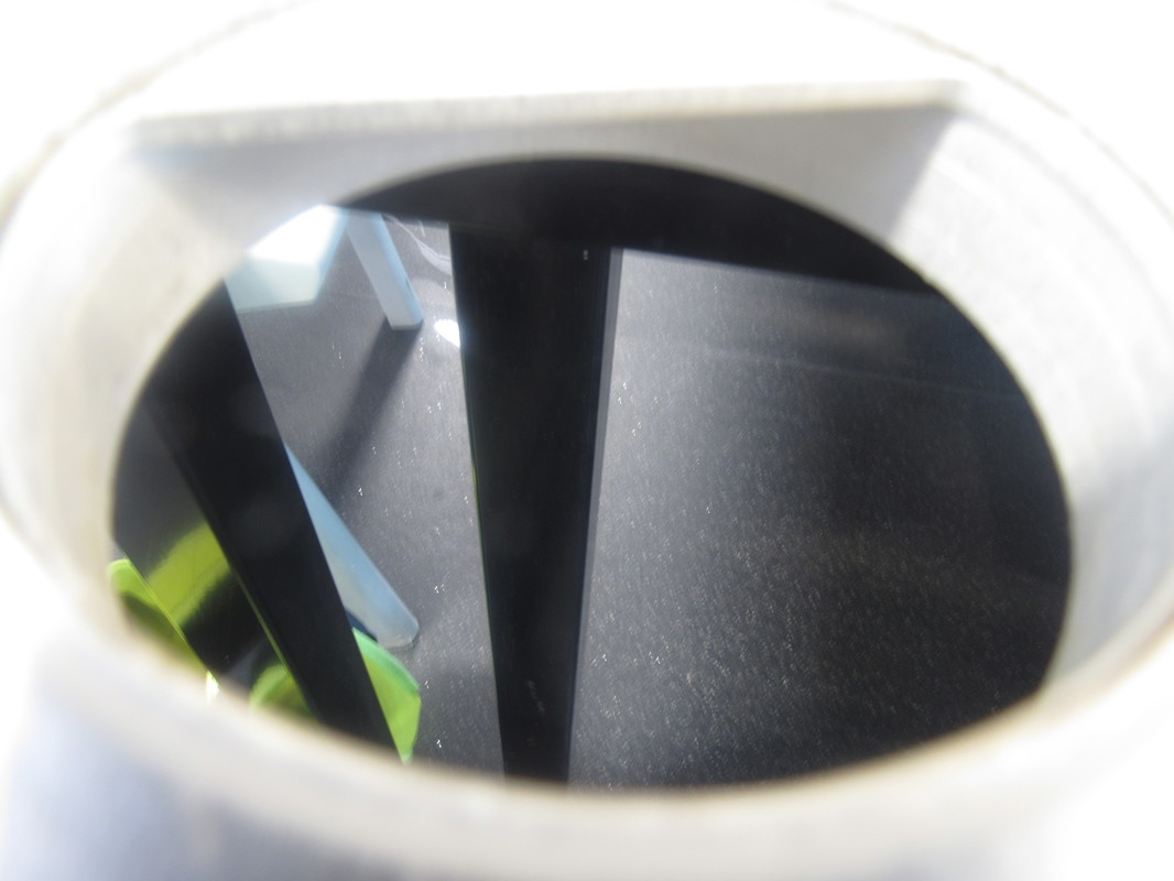
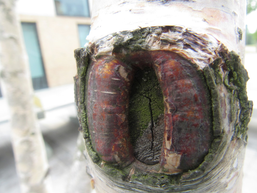
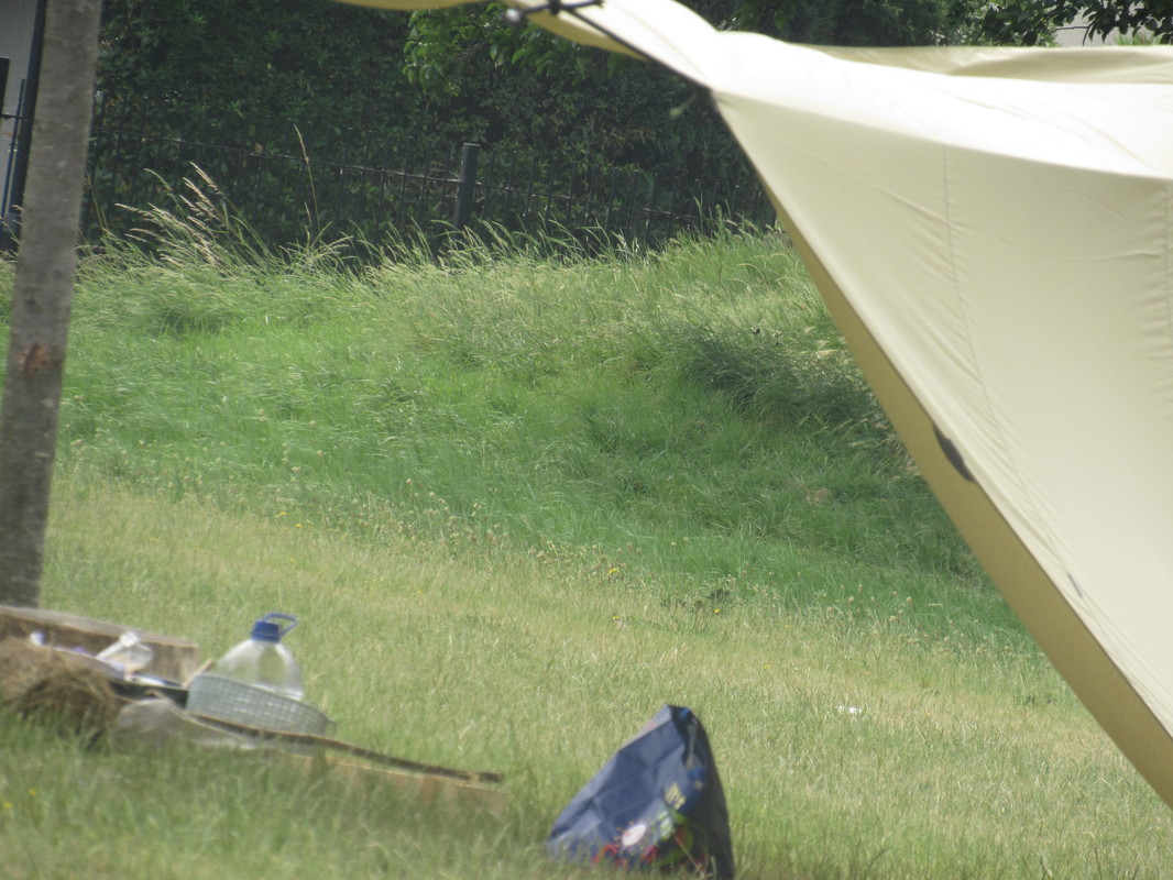
For this task we were instructed to take a series of images that would represent the theme that we had chosen for our final project . My work has been inspired by the artists that I have been studying on Pinterest , Pinterest has been a huge help to me as I have been able to study many artists work and grasp ideas for my final piece . I will definitely continue to use Pinterest as one of my resources further one in the topic to make my work more creative and original. From these photographs I have learned that I get the best work when I study the area around me before I capture an image because then I can imagine how I want to frame the image to get the best response to openings as I can . I explored the themes of natural and unnatural photography as I could see a variety of openings round the school architecture that had a range of textures and colours , the other themes I explored are : shadows , contrasting colours and minimalism . In this task I found using the schools openings easy but thinking of how to frame my images was particularly hard as I need to stope zooming in as much and use more of a variety of angles. I had ideas that I would use more of the openings in block 1 but these ideas changed quickly because I decided that the architecture outside the school was more interesting to capture . I refined my work by taking more than 20 images and then narrowing them down to the best ones so that my set of images had been looked at closely by myself - doing this makes it easier to evaluate them . I was hoping to create a set of images that responded to openings effectively and I think I have done this , the only things I would change are the angles that I used to capture the images and then the fact that I feel that a lot of these images have the same colour scheme .
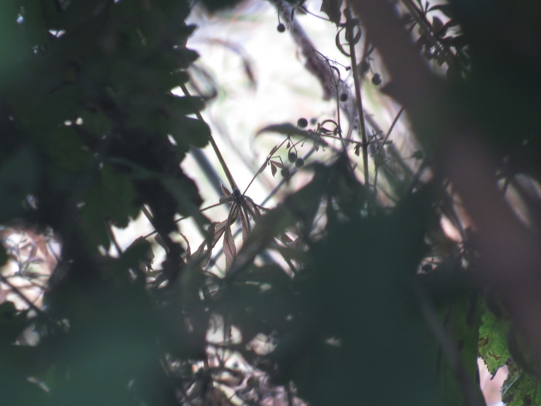
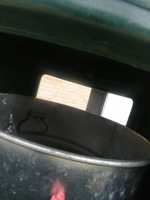
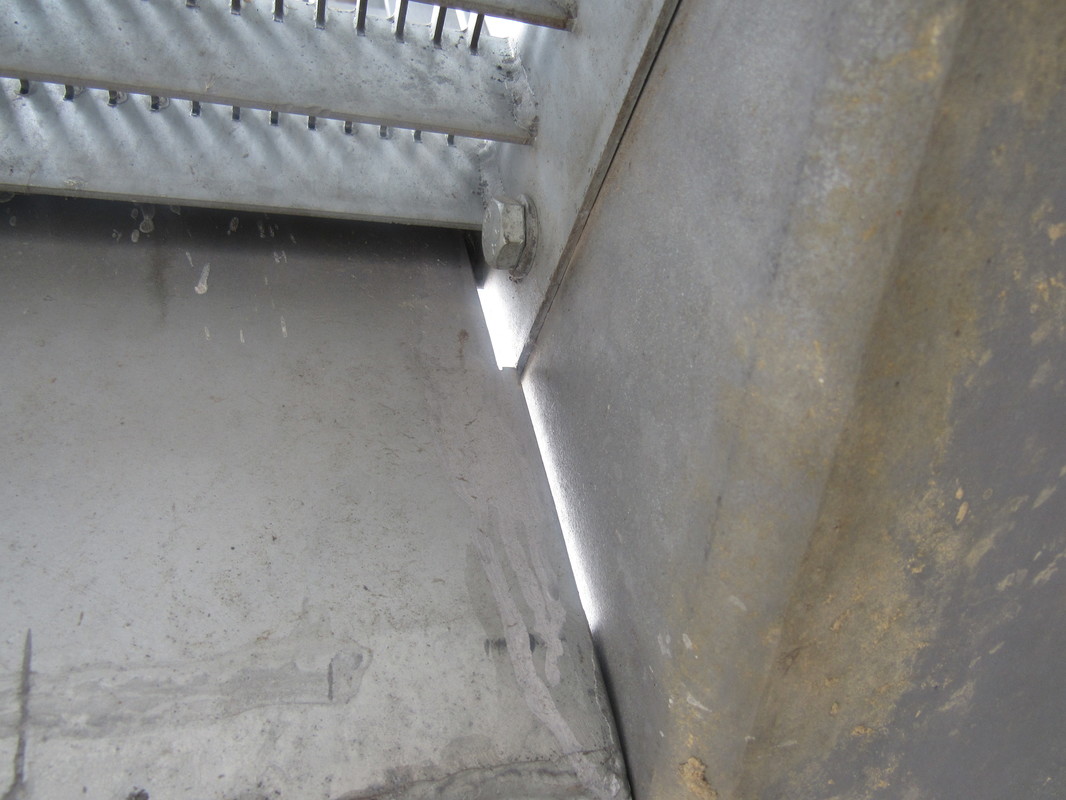
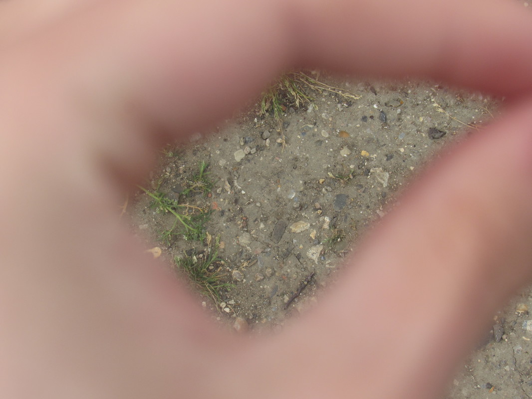
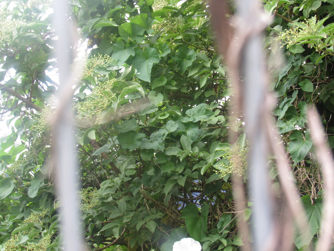
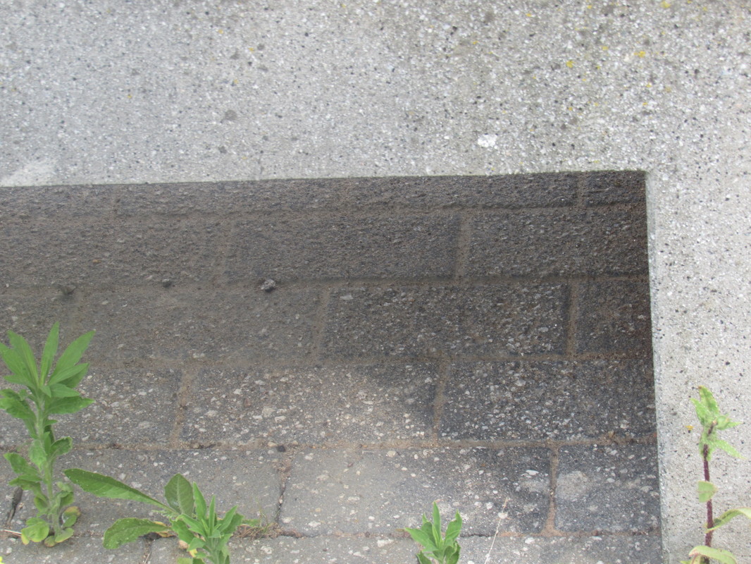
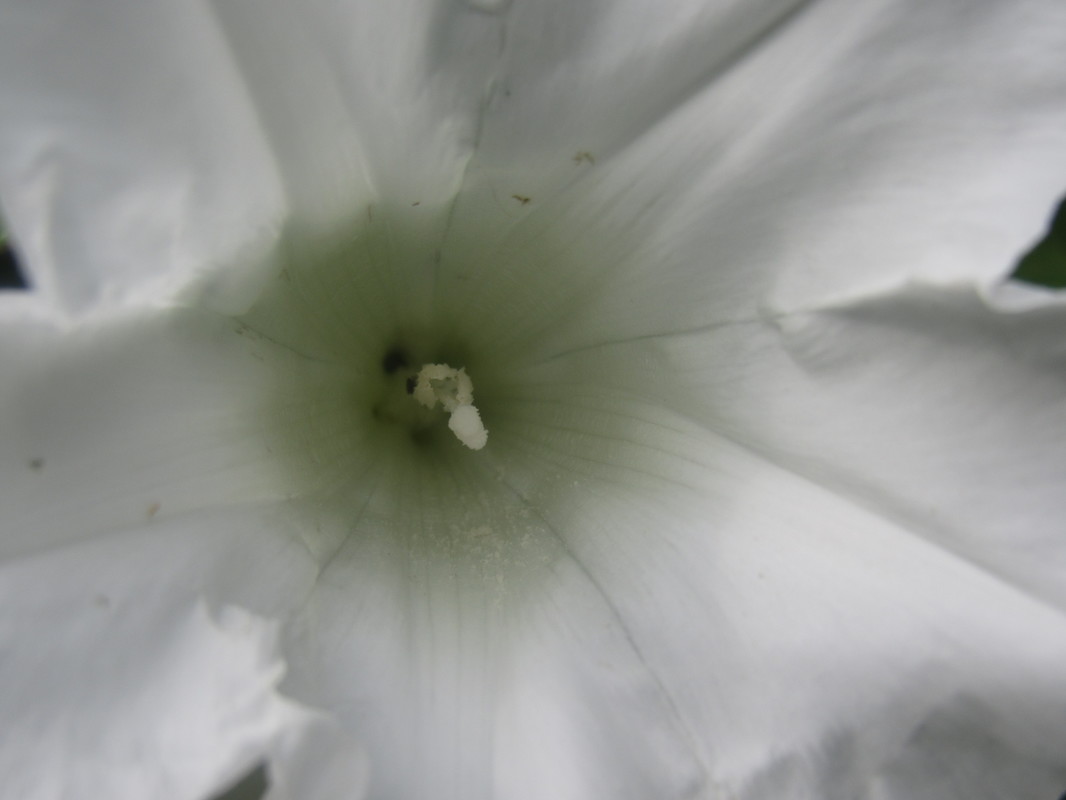
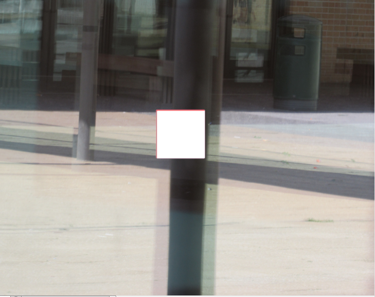
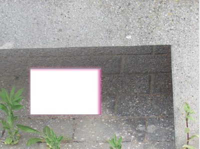
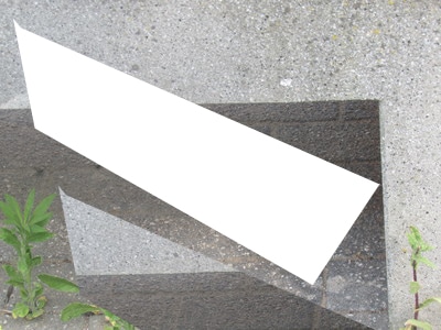
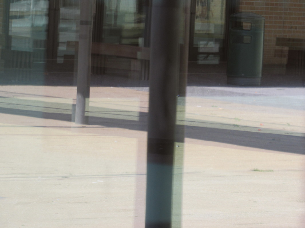
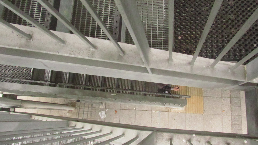
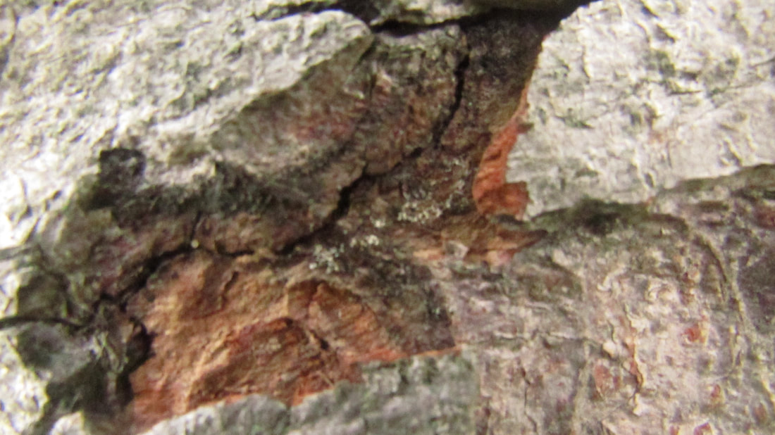
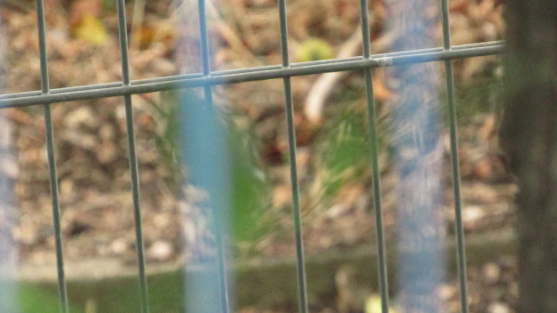
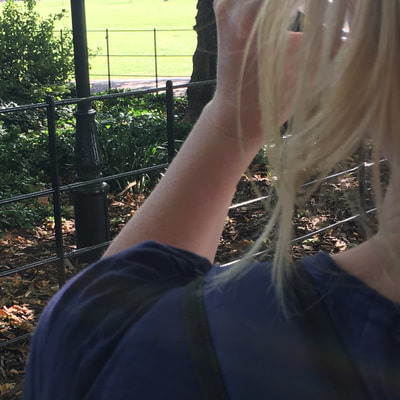
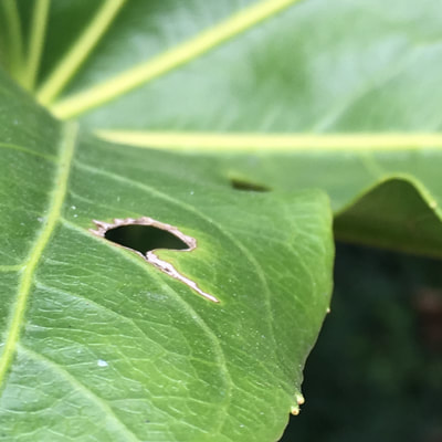
Homework - 30 images
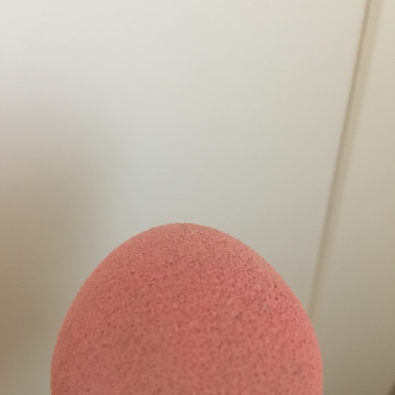
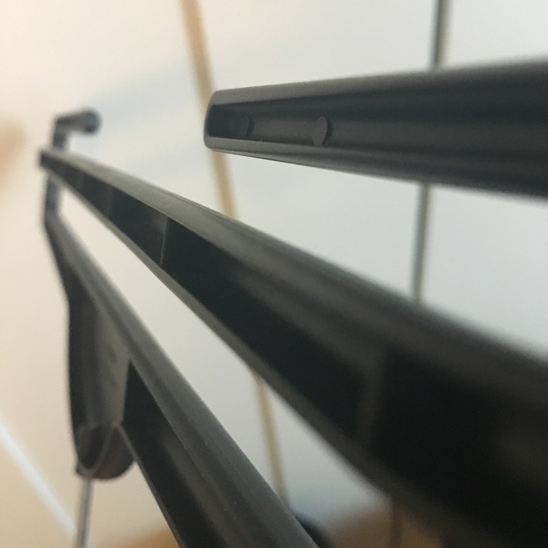
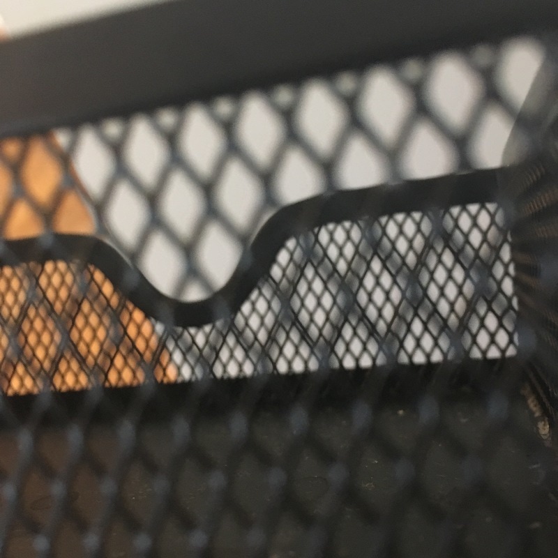
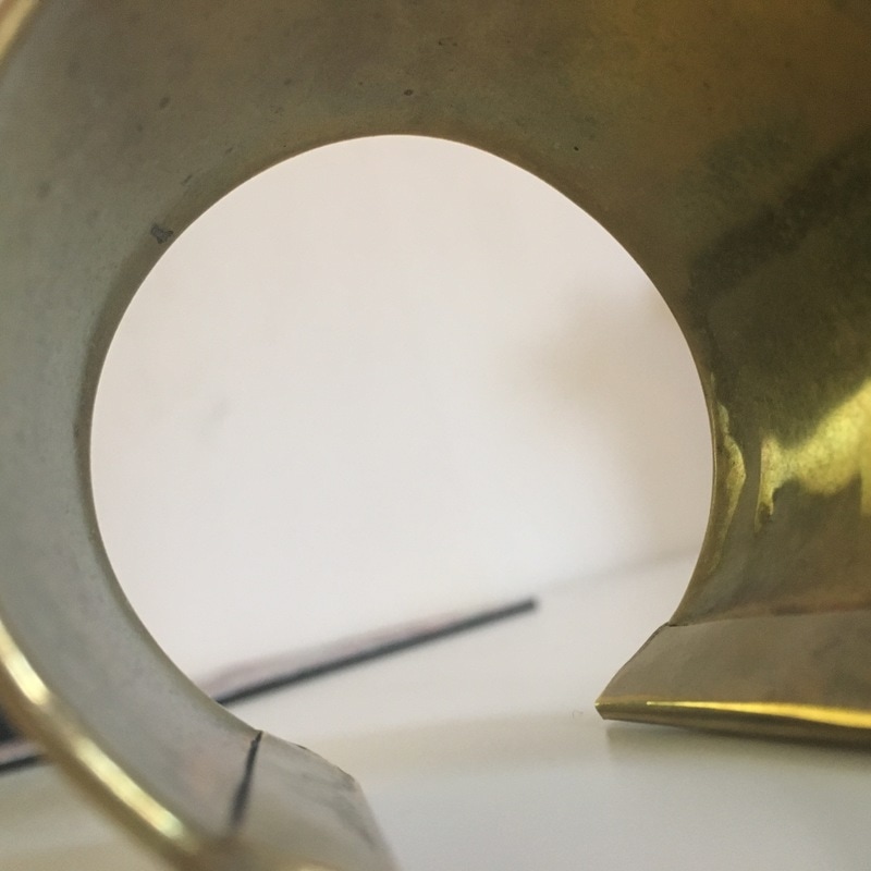
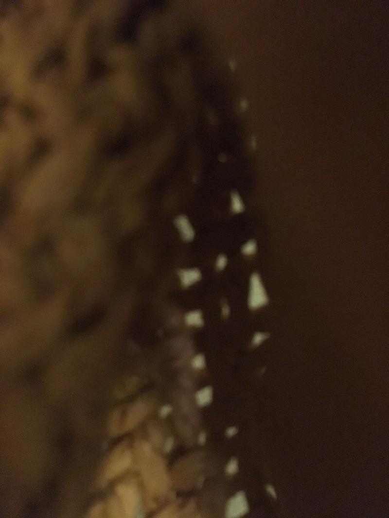
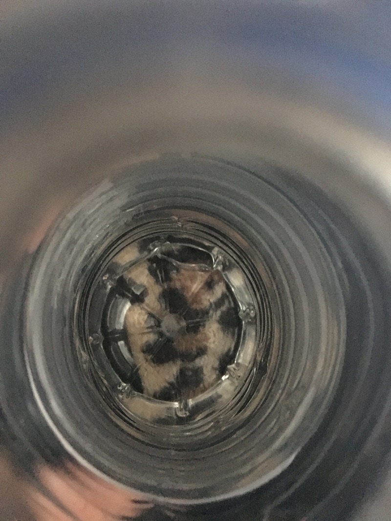
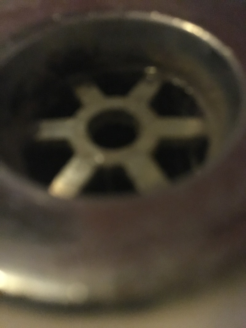
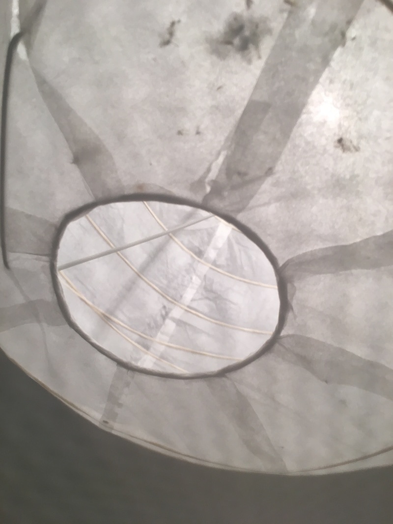
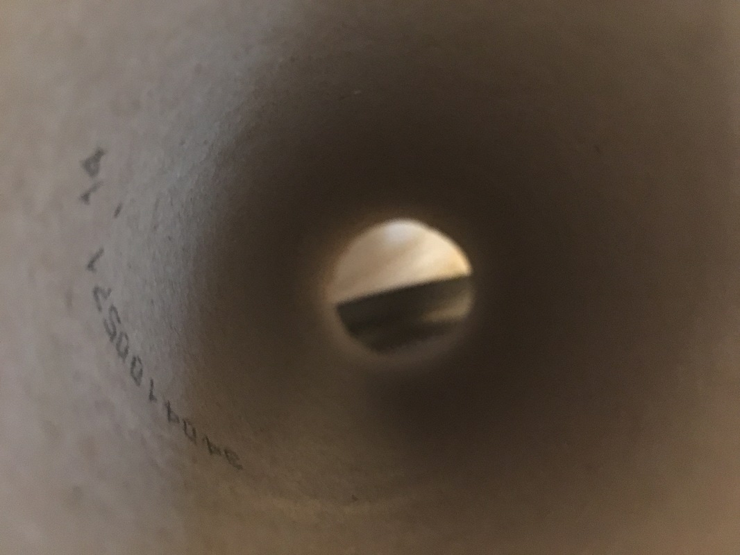
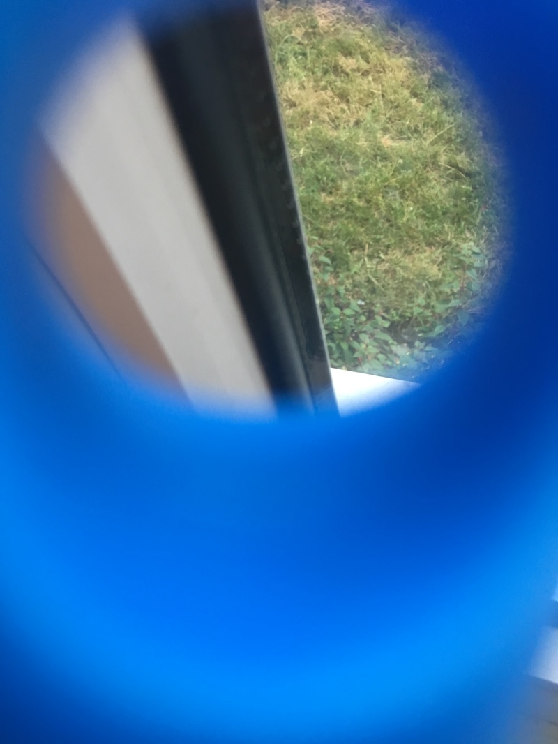
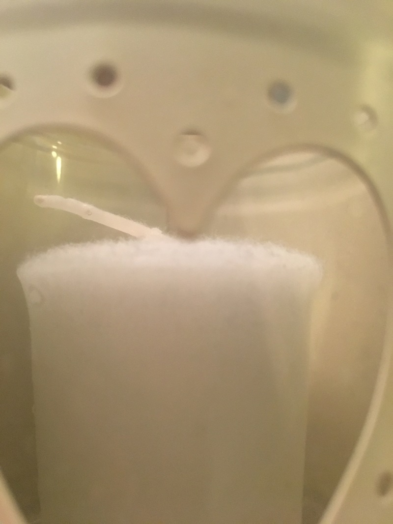
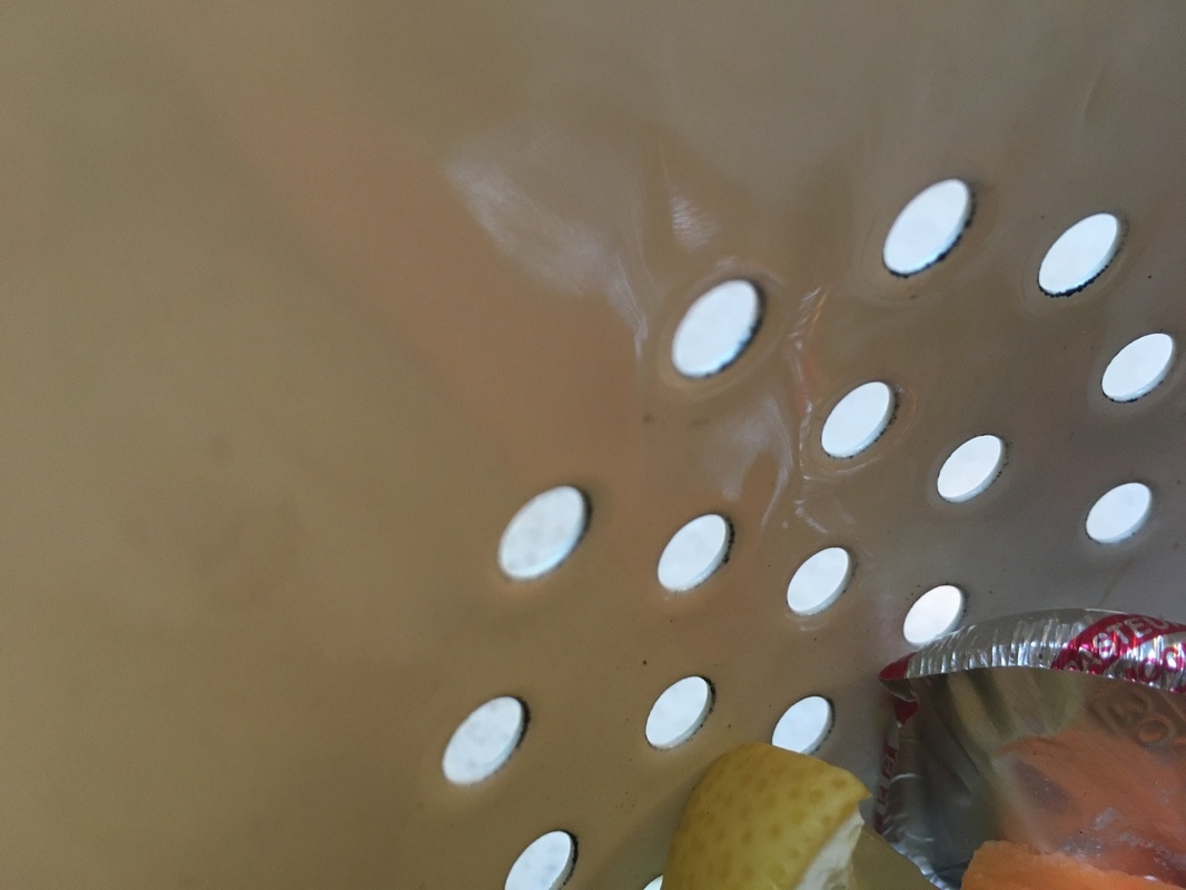
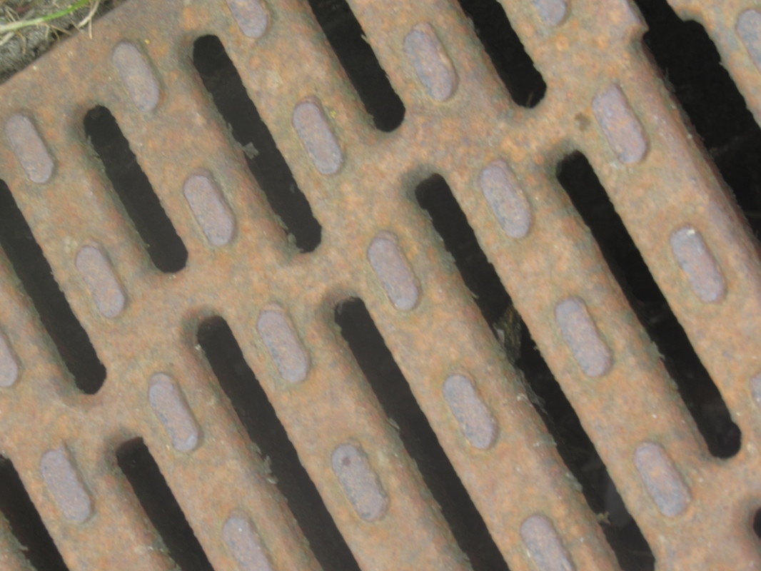
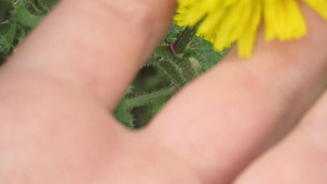
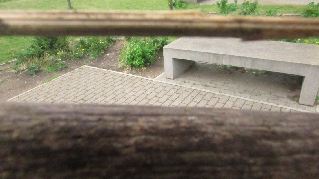
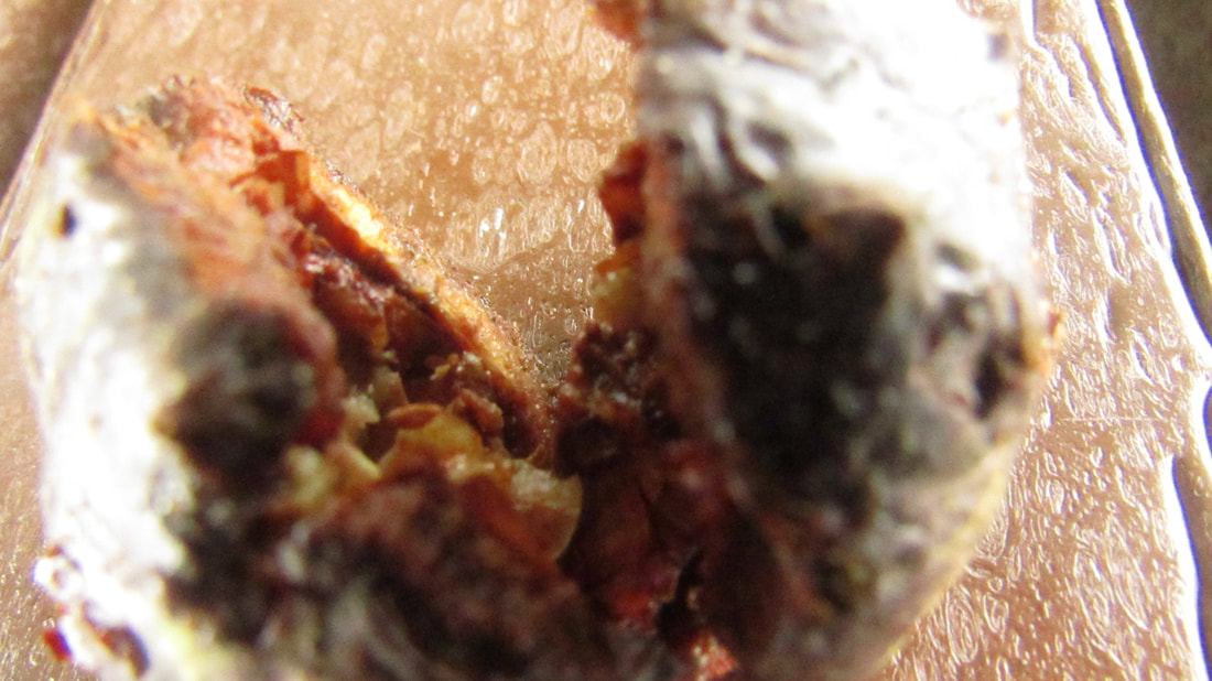
.These are my 30 photos for the homework , I took these images in lots of different locations with different lighting so that the photos would look different and have a different theme to them . I wanted the images to have different themes to them so that every photograph is different and interesting . In some images I went for reflective materials whereas some images had more of a grainy , textured feel . To make my images more abstract I played around with the angles that I took the photos at and did some extreme close ups so that some of my images mainly focused on the opening itself and not the surrounding areas which made my work more simplistic , to make my work incorporate more of the formal elements I took more typical photos of edges for example windows so that I could show that there is some repetition , geometric shapes and play of light in my work . In most of these images the space is represented by having the opening in the foreground and the surrounding areas either being part of the opening or the landscape around the opening in my work I also tried to think about edges in different ways so that I would not be dong typical photos of edges an example of this is when I took a picture of a sponge in close up because I wanted to show the openings in a sponge , I like these sets of images because they are all unique and different and do not follow a certain theme . However if I was going to change my work I would like to do more photos with a plain white background because I think this would make my work more effective and would stop me from photographing nature as much .
|
Annotations of Hunt Slonem's image -
In this photograph I can see that Slonem has stuck to particular colours and shades that are all grey , black and white which I think makes his work a good response to openings because he has blacked out all the surrounding areas of the opening and the only bits that are shown are ghostly white and grey . Slonem's work has a very gothic isolated feel to it because of the texture and how there are no people in the image . What intrigues me about this image is that the opening is almost like a tear shape which accentutates the gloomy mood of the image . In this image the formal elements that seem important are : lines , texture and repetition. I do not think that this image has been cropped because I think that if I were to zoom out of this image it would still have the surrounding areas in all black . I think this image is effective because it is another take on an image of openings that will catch the viewers attention straight away . |
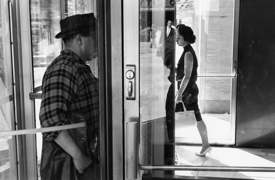
Artist research - Lee Friedlander
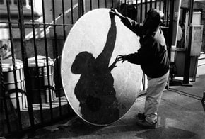
Lee Friedlander image and brainstorm
In this photograph the areas that appear clearest is the shadow on the metal object and the persons clothing . To me the metal object is not very clear because it seems grainy and also I am not able to see any details of the surrounding shops , for example what they are selling so the shops are not in detail . In this photograph the areas of the photograph that appear brightest is the metal object in the middle and the mans arm has made a big shadow on the object because he is leaning over the object which could mean the sun is directly over him . The gates of the houses front gardens make sharp dark lines that are thin but straight , the straight lines repeat throughout the image in the background . There are not really any geometric shapes in the image but a large metallic circle as centre piece which I can imagine , if I touched this image it would feel very grainy because the metal looks rusty and the paving stones look very old . I think this because this image is street photography although it has a lot of openings in it such as between the fence posts , between the mans outstretched arms etc . I know that Friedlander's wok features a lot of street photography because I have researched more of his work and lots of his images ae of every day people and cities which I recognize from our street photography theme . In this image the tones range from dark to light and parts of the image are almost black while other parts are extremely pale and sunlit which I think is just how the sun and shadows are in cities in the day time because of the man made shapes and architecture in a city .
In this photograph the areas that appear clearest is the shadow on the metal object and the persons clothing . To me the metal object is not very clear because it seems grainy and also I am not able to see any details of the surrounding shops , for example what they are selling so the shops are not in detail . In this photograph the areas of the photograph that appear brightest is the metal object in the middle and the mans arm has made a big shadow on the object because he is leaning over the object which could mean the sun is directly over him . The gates of the houses front gardens make sharp dark lines that are thin but straight , the straight lines repeat throughout the image in the background . There are not really any geometric shapes in the image but a large metallic circle as centre piece which I can imagine , if I touched this image it would feel very grainy because the metal looks rusty and the paving stones look very old . I think this because this image is street photography although it has a lot of openings in it such as between the fence posts , between the mans outstretched arms etc . I know that Friedlander's wok features a lot of street photography because I have researched more of his work and lots of his images ae of every day people and cities which I recognize from our street photography theme . In this image the tones range from dark to light and parts of the image are almost black while other parts are extremely pale and sunlit which I think is just how the sun and shadows are in cities in the day time because of the man made shapes and architecture in a city .
Developing my first outcome -
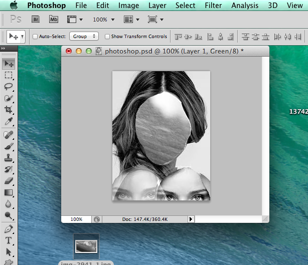
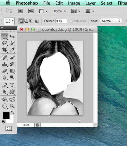
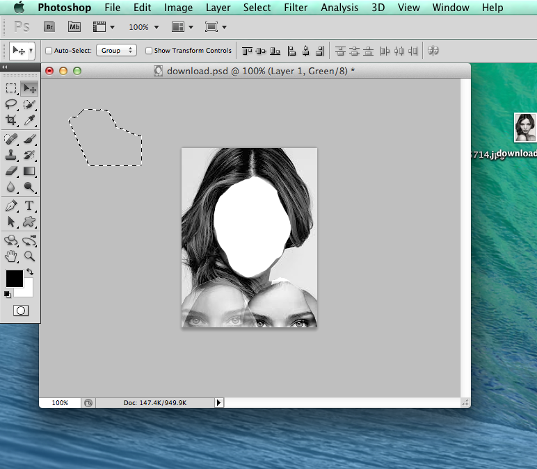
These are the images that I , I developed them using certain techniques like photoshop to make the geometric shapes in the image and to make the edges of the opening have colour round the edges so that it gives it dimension and looks almost like it is starting to light up with heat and fire . This is not completely finished because I need to do more images and try different subject matter but I am happy with what I have done because I took my time to make my work of better quality and it also took me a while to figure out how to work photoshop . I explored the theme of openings and I took inspiration from an art project where the students burned part of the images out which I thought was a very unique way of exploring edges as it gives the images an almost 3d quality. I was originally thinking of actually burning part of the image but then I decided that I should use photoshop as I could give the illusion of burning without actually making my work dirty . To refine my work I would check it with my teacher and would also edit it numerous times to change the amount of pixels and changing the colour scheme to see what would work best which meant that I followed the thresh hold concepts because I included the light and also managed to show my perception of what openings is which meant that I did not want to take images of typical openings like windows but do something abstract that involved shape , repetition and colour .
These are the images that I , I developed them using certain techniques like photoshop to make the geometric shapes in the image and to make the edges of the opening have colour round the edges so that it gives it dimension and looks almost like it is starting to light up with heat and fire . This is not completely finished because I need to do more images and try different subject matter but I am happy with what I have done because I took my time to make my work of better quality and it also took me a while to figure out how to work photoshop . I explored the theme of openings and I took inspiration from an art project where the students burned part of the images out which I thought was a very unique way of exploring edges as it gives the images an almost 3d quality. I was originally thinking of actually burning part of the image but then I decided that I should use photoshop as I could give the illusion of burning without actually making my work dirty . To refine my work I would check it with my teacher and would also edit it numerous times to change the amount of pixels and changing the colour scheme to see what would work best which meant that I followed the thresh hold concepts because I included the light and also managed to show my perception of what openings is which meant that I did not want to take images of typical openings like windows but do something abstract that involved shape , repetition and colour .
Final pictures
|
WWW :
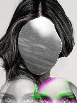
I think these images have dimension to them and look very defined The edges are very prominent I have altered the background to be out of focus so the shapes are more prominent In the second image the shape is very prominant and 3D |
EBI
Use bigger shapes Use a bigger range of subject matter Try using all the same shapes in each images different range of colours shapes need more impact Could have used more textures |
Examples of experiments that failed
To me these images did not work because they did not have enough dimension and there was not enough colour in them . To refine these images I added colour to the edge of the shapes and increasing the brightness of the images so they looked less gloomy , I did not feel that they represented the theme of openings well and looked to like images I have used before . I wanted to use more techniques and processes and to expand my use of photoshop so I decided that I would try more features in photoshop and I researched more peoples work by looking on pinterest . That is when I found the images of the photos being burned and heated in the middle and I thought this would be a more interesting way of presenting openings .
Experimenting with openings further

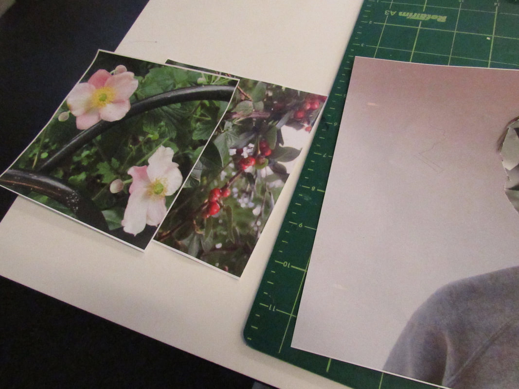
These are my second set of images for experimenting with my final piece , I took them because I needed to take a better range of close ups , reflections and more texture in my images . I am possibly going to use these for my final piece because I think they better show the openings around the school and also represent lots of textures . I think that you can see the artists that inspire me in my work for example using the two branches to make a shape that shows the table and making certain things in and out of focus as well as using more architecture around the school . If I am going to develop my work further I should try taking my photographs in black and white so that I do not rely on colours so much to make my work effective and I can focus more on the openings in the image .
|
WWW
Includes lots of edges A good amount of openings some parts of the image are in and out of focus lots of different textures I have used techniques such as extreme close up Lots of these images look like the photographers that have inspired me |
EBI
Include more people Brighter colours Take images from different perspectives More architecture I have used what is around me to create openings I should have tried to stick to more of a theme in these images |
Experimenting in photoshop - Focussing on one image
I decided that I needed to experiment more with the shapes that the openings were , I chose my favourite image from this series and made more shapes so that my photos would look more appealing , I think this work is effective because of the different shapes and hoe reflective the water is . On the other hand I would prefer the images if they had a different tone to them so I decided to edit them in iPhoto , I also prefer the shapes to be more simple because I think they make more effective openings whereas complicated shapes
I changed the tones of this image to more cool toned and I like how the reflection is more prominent . I am going to try and take some photos of architecture because I would like to show that I can use different subject matters within my work and also I think that I could make my work more interesting by looking at final pieces online and taking inspiration from them so I can experiment more with my own work . I have included lots of formal elements in this image because I thought carefully about the image before I took it , however I think that in order for my final piece to be of better quality I need to try lots of different ideas and develop more .
Inspiration for my final piece
I decided that I would like to do something similar to these two images because I think that they represent the theme of openings in a creative and well thought out way . I have taken these photos from pinterest and i think I am going to try and make my own photographs as bright as they are . I think that I am going to take inspiration from these artists work and try and create something of my own but in a bigger size , I want to try and experiment and see if I can make my work on either photoshop of practically . I like the second one because I think it is a good chance to include colour and different textures . I think that if i experiment I can create something that is like these images but has my own photographs and has been developed lots so it is of the best quality .
I decided that I would like to do something similar to these two images because I think that they represent the theme of openings in a creative and well thought out way . I have taken these photos from pinterest and i think I am going to try and make my own photographs as bright as they are . I think that I am going to take inspiration from these artists work and try and create something of my own but in a bigger size , I want to try and experiment and see if I can make my work on either photoshop of practically . I like the second one because I think it is a good chance to include colour and different textures . I think that if i experiment I can create something that is like these images but has my own photographs and has been developed lots so it is of the best quality .
.What I am going to do next ( update) -
To develop my project further I am going to experiment more with different apps online and on my phone , I will
photograph this so that I can upload them to my website . I am also going to look at more artists like Kawauchi and
make responses to them so I have more interesting images to use in my final piece , to sum it up I am going to try and experiment with different techniques and processes and also try and respond to more artists work so I have some interesting final outcomes , I think that I will try to take some image with reflections so maybe I can include reflective glass in my final piece . I am not saying that my final piece will definitely include reflections in my final piece but that is an idea I would like to pursue . I would like to take techniques from previous projects such as street photography to make my work different and challenge myself .
Experimenting in photoshop
I have recorded these experiments in photoshop however I do not think they are very effective and they need a lot of refining , if I was going to develop these images I would use my own photo of a door could maybe make the door 3D . However I think this is a development and I expanded my skills in photoshop by learning to add an image to another image and make it look blended . Next I am going to try and change what I feature in my photographs so they are more interesting , I like this photo though because it features an over the shoulder shot which is a technique that I learned from older projects .
I have recorded these experiments in photoshop however I do not think they are very effective and they need a lot of refining , if I was going to develop these images I would use my own photo of a door could maybe make the door 3D . However I think this is a development and I expanded my skills in photoshop by learning to add an image to another image and make it look blended . Next I am going to try and change what I feature in my photographs so they are more interesting , I like this photo though because it features an over the shoulder shot which is a technique that I learned from older projects .
Photographs I plan on using in my experiments - from past projects
I have chosen these images from past projects to use in my future experiments because I think they are effective and the subject matters are different in each image as well as the fact that I have repetition of lines , geometric shapes and also reflections but I have also included different viewpoints such as over the shoulder .I would like to do some experiments where I could cut parts of or all the persons face off and us images to fill the space . I would also like to start experimenting without a computer to see if I can use different materials in my work rather then doing every-thing digitally . However these are the photos I am going to start experimenting with and I hope I can get a final out come from these images ( which I will edit the colours and tones of ), as I experiment more I would like to use these images because I think that each of them represent different parts of the formal elements as the first image represents lines and geometric shapes , the second image represents point of view , the third image is texture and the fourth image is reflections . I also like these images because I have chosen these from over 100 images so I have thought into every detail and I think that each image is very unique .
Third experiment - inspiration is Lara Lisa
First outcome from projects
Evaluation
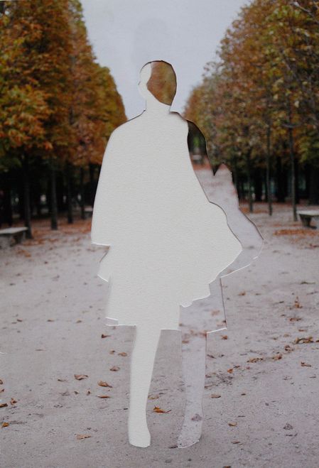
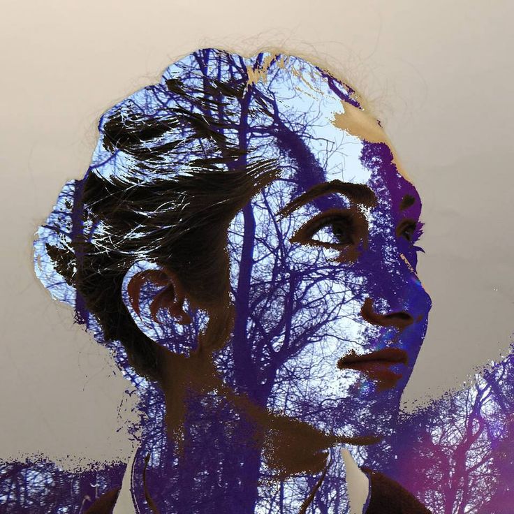
This was on one my first experiments where I decided to try and cover parts of the face with my own photographs like the artist Lara Lisa , I think that this image is effective because it has reflections in it and the face represents the opening . I think that this photograph is both a mixture of abstract and naturalistic and I think that covering the face with water makes the image mysterious and the formal elements that seem most important are : reflections , repetition and organic lines . This image has lots of different layers and the only pop of colour is the bottom red and blue lights which show where the face has gone . If I were going to develop this image I would use a colour photo and would try to specific parts of the face such as the lips of the eyes .
This was on one my first experiments where I decided to try and cover parts of the face with my own photographs like the artist Lara Lisa , I think that this image is effective because it has reflections in it and the face represents the opening . I think that this photograph is both a mixture of abstract and naturalistic and I think that covering the face with water makes the image mysterious and the formal elements that seem most important are : reflections , repetition and organic lines . This image has lots of different layers and the only pop of colour is the bottom red and blue lights which show where the face has gone . If I were going to develop this image I would use a colour photo and would try to specific parts of the face such as the lips of the eyes .
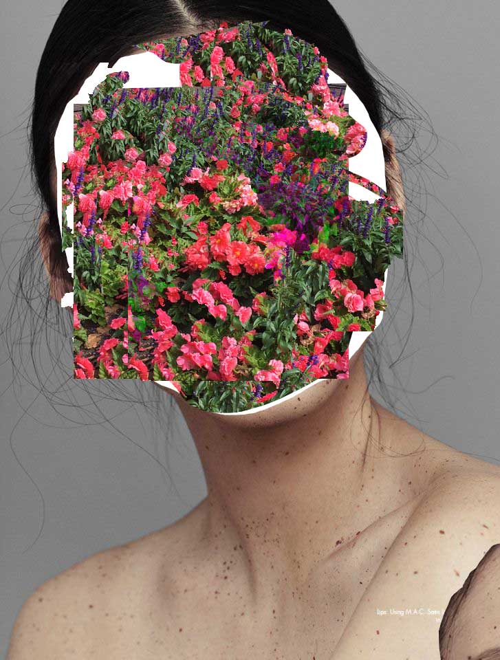
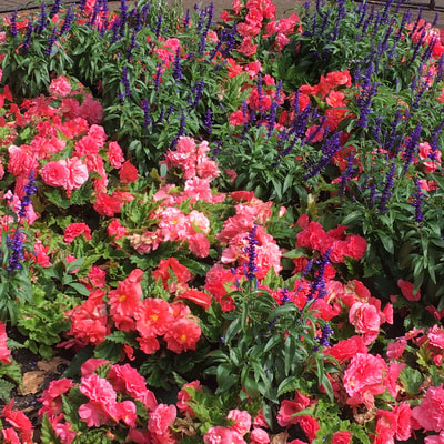
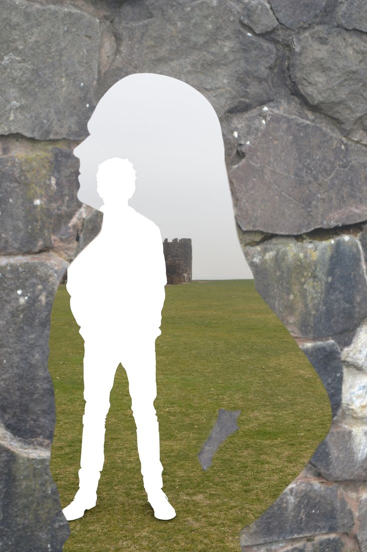
Second outcome - Now I have finished with black and white I decided to use a colour photo the model and use a brightly coloured image of flowers . In this image I can see that I have developed my work by using more of a patterned image to replace the face and have also zoomed in to the model more so that the viewer is focused on the face and the image makes a bigger statement. In this image the only thing the camera focuses on is the flowers for a face and the rest of the details are very minimal . The light is not very natural at all and seems very studio made . The techniques that I have used during this process are photoshop and iPhoto to make the image more vivid and to add the flowers to the face , the space is represented by having the face in the foreground and nothing in the background except a grey background which sets off the vivid pink in the flowers nicely. What I think is effective about this image is that there are very bright colours and the image is not too small and the image almost looks 3D , on the other hand I think that this image could be improved by making sure that there are none of the flower image going over the edge of the face . Next I am going to try and cover specific parts of the face with my photography such as the lips .
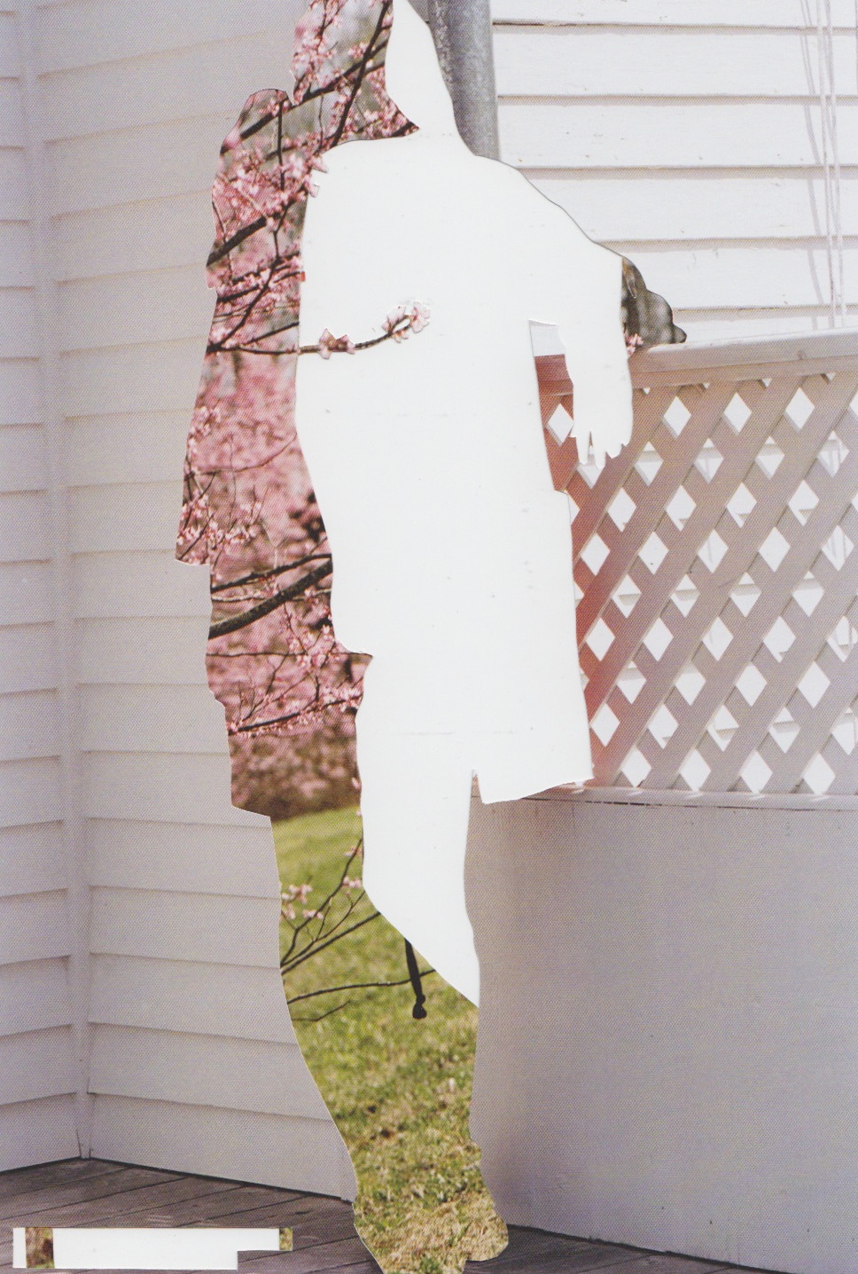
This is my third experiment where I have successfully covered the lips , if I was going to display this work I would show the images with parts of the face covered next to the original image of the woods which I have edited to make darker in iPhoto . However this image is no where near finished because I would like to try and experiment more by taking picture of someones face so that I am working with all of my own photography . I am thinking of maybe splitting an image into four and covering up a different part of the face in each segment of the image which I could do with either photoshop or paper and scissors . One part of the image I could cover the eye , one part I could cover the lips and another part I could cover the eyebrows . I think that I have included lines and different textures in my work and this image is different from real life because naturalistic elements have been used in an abstract way which makes my work different from work I have done before . I have improved my photoshop skills during this project but would like to now take pictures of people and use my photography in a different way to portray the topic of openings in a unique way .
Outcome from fourth experiment
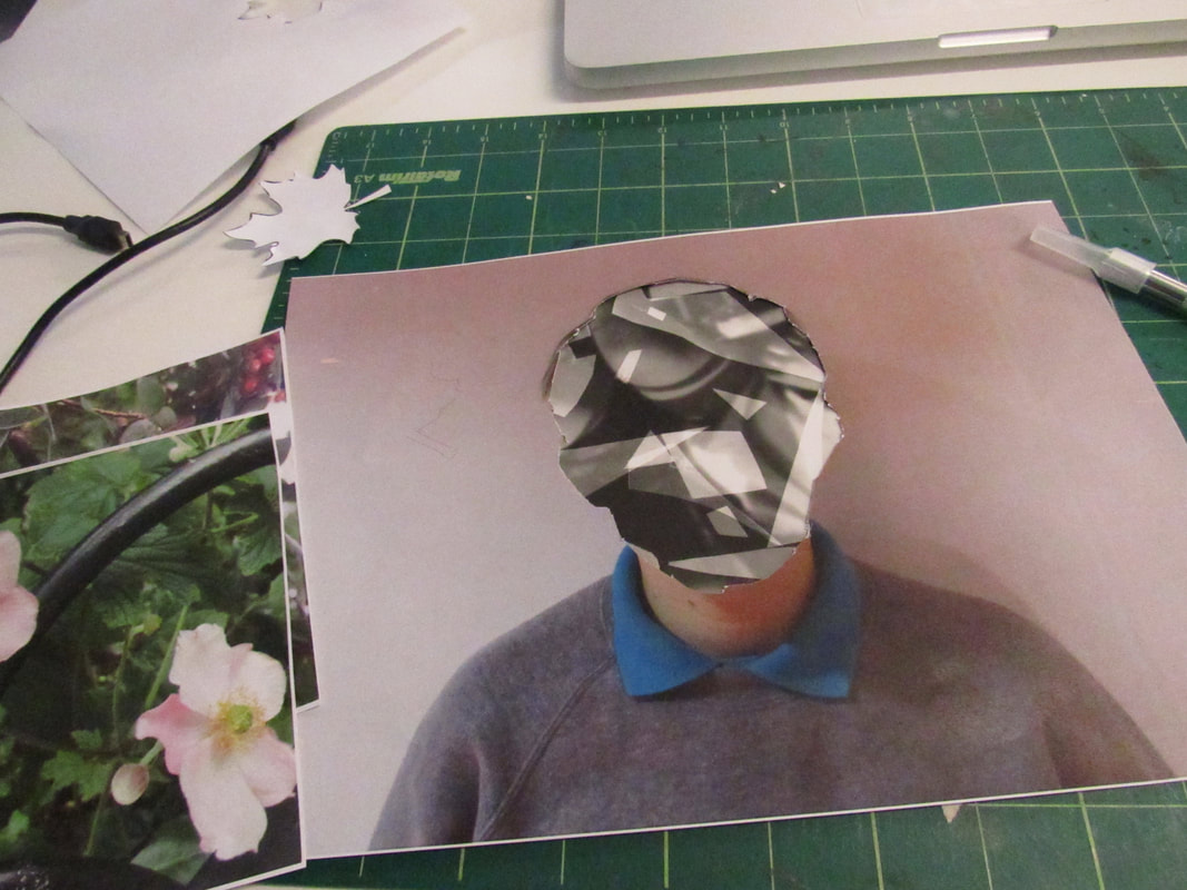
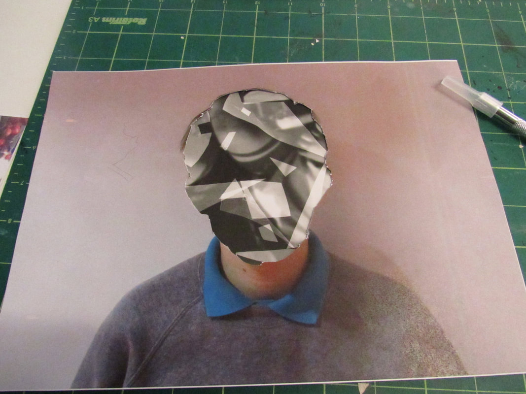
This time I decided to try something different used a photogram to fill the face instead of images that feature nature , I think this is a good development from my past experimentation because I have not featured any nature and have used almost transparent shapes in the photograms and cut the face off using a matt and a scalpel which I think represents openings very accurately . This work is more abstract and I think that by not using photoshop I was able to make my work physically , by using one of my own photos to cut the face off I have been able to incorporate my every day photography more then using the models faces and photoshop .
My 60 Photos
Openings plan -
To continue with this topic I am going to , cut out the shapes out of the portraits and put the photograms behind them for my final piece . Take a photo of the final piece and evaluate it and then catch up of my street photography page . I am going to experiment some more and see whether I want to cut out geometric shapes , flower shapes or two with flower shapes and two with geometric shapes . I would like to finish my final piece before the exam so that I have time to research and make an outcome in January , for my final piece I want to combine all the elements from previous artists that I have studied and also what I have learned from failed experiments so that my final piece is a good outcome from all the coursework I have completed , my final piece had to be edited many times to make sure that it would be off gallery worthy quality , this included cutting out the shapes again and printing out the portraits again so that they were all the same size and would look visually pleasing . My final piece has developed over many weeks because I have made many wrong turns .
To continue with this topic I am going to , cut out the shapes out of the portraits and put the photograms behind them for my final piece . Take a photo of the final piece and evaluate it and then catch up of my street photography page . I am going to experiment some more and see whether I want to cut out geometric shapes , flower shapes or two with flower shapes and two with geometric shapes . I would like to finish my final piece before the exam so that I have time to research and make an outcome in January , for my final piece I want to combine all the elements from previous artists that I have studied and also what I have learned from failed experiments so that my final piece is a good outcome from all the coursework I have completed , my final piece had to be edited many times to make sure that it would be off gallery worthy quality , this included cutting out the shapes again and printing out the portraits again so that they were all the same size and would look visually pleasing . My final piece has developed over many weeks because I have made many wrong turns .
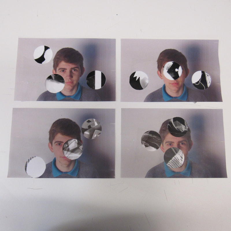
Final outcome evaluation -
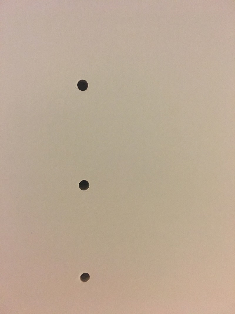
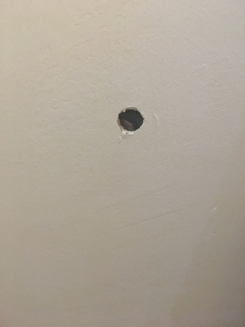
I made one final outcome for the topic of openings , the final piece that I have made features 4 A4 images on some mount board with holes in the face that reveal the photogram beneath . I think that my final outcome turned out successfully because I managed to incorporate the artists that have inspired me into my work and have created a final outcome that has been developed over the course of the two days given for the exam .I have refined by constantly changing the techniques and processes that I use in order to achieve a high quality final piece . I was hoping to create a final piece that is different from the work I have created before and responds to the theme of openings in an abstract way , in my work I have thought carefully about the work I wanted to create and have decided to go for a final piece that is more minimalistic rather then complicated like I had experimented with before . An example of how I have refined this final piece by only using the circle shapes instead of the many shapes that I used in past experiments , before I had decided to try and cover the whole face and expose pictures of flowers beneath . However I developed this piece because I thought that I had over used nature in my work and covering parts of the face would be a more abstract way to represent openings . In this final piece I have also explored portrait photography and have used different techniques to achieve getting an image by using photograms . I recorded my learning by taking screenshots of photoshop projects an images of experiments that worked and didn't work . Some of the decisions I had to make along the way were whether to change from geometric shapes to just circles , where to place the circles so that they were effective and also to redo the whole experiment halfway in order to refine my work so that it looked of gallery quality . In the end I made a final outcome that is more simplistic and I have refined again and again , I chose to display my final piece on a simple piece of mount board with the final four images selected .My work reminds me of artists such as Werner Bishof because of the grey quality of my photographs and how there are not any warm colours featured , I would describe my work as abstract because I have used lots of shapes instead of natural photography and have distorted the face . To me my final piece means a different way of exploring openings with a persons face being the opening to them and their personality , by cutting out parts of the face and revealing the photograms behind them I hope to use the photograms to almost have an X- ray image behind the persons face and make my images look more abstract , like revealing what is beneath a person . This is how my final piece represents the theme of openings .
I made one final outcome for the topic of openings , the final piece that I have made features 4 A4 images on some mount board with holes in the face that reveal the photogram beneath . I think that my final outcome turned out successfully because I managed to incorporate the artists that have inspired me into my work and have created a final outcome that has been developed over the course of the two days given for the exam .I have refined by constantly changing the techniques and processes that I use in order to achieve a high quality final piece . I was hoping to create a final piece that is different from the work I have created before and responds to the theme of openings in an abstract way , in my work I have thought carefully about the work I wanted to create and have decided to go for a final piece that is more minimalistic rather then complicated like I had experimented with before . An example of how I have refined this final piece by only using the circle shapes instead of the many shapes that I used in past experiments , before I had decided to try and cover the whole face and expose pictures of flowers beneath . However I developed this piece because I thought that I had over used nature in my work and covering parts of the face would be a more abstract way to represent openings . In this final piece I have also explored portrait photography and have used different techniques to achieve getting an image by using photograms . I recorded my learning by taking screenshots of photoshop projects an images of experiments that worked and didn't work . Some of the decisions I had to make along the way were whether to change from geometric shapes to just circles , where to place the circles so that they were effective and also to redo the whole experiment halfway in order to refine my work so that it looked of gallery quality . In the end I made a final outcome that is more simplistic and I have refined again and again , I chose to display my final piece on a simple piece of mount board with the final four images selected .My work reminds me of artists such as Werner Bishof because of the grey quality of my photographs and how there are not any warm colours featured , I would describe my work as abstract because I have used lots of shapes instead of natural photography and have distorted the face . To me my final piece means a different way of exploring openings with a persons face being the opening to them and their personality , by cutting out parts of the face and revealing the photograms behind them I hope to use the photograms to almost have an X- ray image behind the persons face and make my images look more abstract , like revealing what is beneath a person . This is how my final piece represents the theme of openings .
My final piece